Since GOV.UK launched 6 years ago it has been the home of government’s online content and the starting point for online services.
Every week millions of people use GOV.UK to do complex and sometimes life-changing tasks, such as learning to drive, registering a birth or starting a business.
We want to make these tasks as easy as possible - by making content simple and user journeys intuitive. This is good for users because it makes it quicker to get things done. And it’s good for government because it reduces unnecessary contact and casework.
Why we need to look at end to end services
We know users face challenges carrying out tasks. There’s a lot of information to find for a start. Depending on the task, there might be appointments to book, forms to fill in, applications to be made and tests to take.
And what makes this even harder is that each step needs to be done at the right time and in the right order.
That’s why government needs to look at every step of this task. From the first thing the user does, to the last thing they need to do. We need to look at services from end to end.
The difficulty government faces when trying to make this easier is that people’s real-world tasks do not always fit neatly with the way government is organised into departments and agencies.
For example, a business wanting to hire their first employee needs information and services from 5 different areas of government before they can hire them:
| Step | Government department or agency |
|---|---|
| Check you can afford to take on an employee | Department for Work and Pensions |
| Register as an employer | HM Revenue and Customs |
| Check a potential employee’s right to work in the UK | Home Office |
| Check a potential employee’s criminal record | Disclosure and Barring Service |
| Set up a pension scheme | The Pensions Regulator |
Organising GOV.UK by topic and task
Rather than organise GOV.UK around the structure of government, we’ve been working to organise content around user needs at scale. So, rather than being organised by department, content on GOV.UK is now organised into a single site-wide system of user-centred topics.
This topic structure will power new ways to search and browse the site, making things much easier to find.
But we want to go further - we want to make things easier to do.
So about a year ago we started experimenting with a new way for users to navigate GOV.UK. These experiments evolved into what we now call step by step navigation.
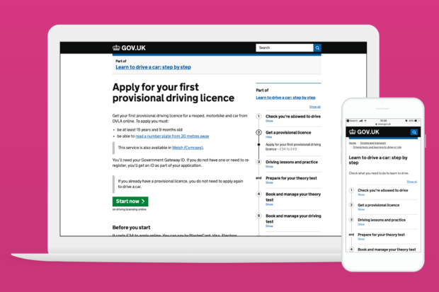
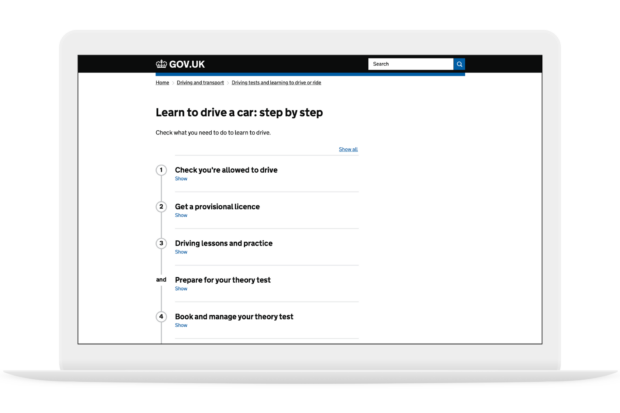
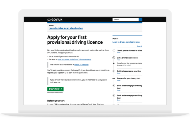
It looks like this on GOV.UK:

It means that, for the first time, we can show the user everything they’ll need to do to complete a task, whether that’s Learning to drive or Employing someone.
The navigation follows you throughout your journey, indicating what to do now and next. It also shows you previous steps you might have missed. For example, getting a provisional driving licence before booking a driving theory test.

Step by step navigation is designed to work with all existing content types and transactions on GOV.UK. Where appropriate, transactions can be broken down further using the separate task list pattern.
Developing the design
The design evolved over 8 rounds of research and iteration, including an in-depth review at the brilliant Digital Accessibility Centre in Neath.
Around half way through the lab research we began testing the pattern on GOV.UK. Analytics data showed that the first examples of step by step navigation were getting a lot of traffic. For example, learn to drive a car was used 1.24 million times in the first 6 months.
We ask users for feedback with the ‘Is this useful?’ survey banner at the bottom of every page on the site. This showed users were finding it useful.

We also ran a remote user research study where we asked users to complete a series of tasks before and after 3 step by step journeys were published.
The study showed the step by step navigation resulted in a significant increase in users’ successful task completion, as well as an increase in confidence they could use GOV.UK to find what they needed.
Scaling the approach
With encouraging data coming in, over the past 6 months we’ve been working to scale this approach so it can be used for the more complex tasks users need to do. These include:
| Step by step journey | Departments involved |
|---|---|
| Visit the UK on a standard visitor visa | UK Visas and Immigration |
| What to do when someone dies | Department for Work and Pensions HM Courts & Tribunal service HM Revenue and Customs Land Registry |
| Employ someone | HM Revenue and Customs Home Office Disclosure and Barring Service Department for Work and Pensions The Pensions Regulator |
As this table shows, the content that sits within these journeys often crosses multiple government departments and we need a collaborative approach to make these journeys better for users. Creating a new process for cross-government working to support this has been equally as important as designing a new way of navigating.
Over the past 6 months we’ve collaborated with more than 15 different departments to publish 25 step by step journeys.
We’re also indebted to the team at the Driver and Vehicle Standards Agency who helped us map the first journeys: Learn to drive a car and Become a driving instructor when our work was still in prototype form. They’ve written a great blog post about the process.
Next steps
We’ll be continuing to work with departments to map and publish step by step navigation for some of the most high priority and complex user journeys within government. As we do this we’ll keep a close eye on performance data to ensure this approach is still working well for users.
Update: February 2019
Working with a range of departments we’ve now mapped and published 36 step by step journeys on GOV.UK
These include:
- Get childcare: step by step
- Get undergraduate student finance: step by step
- Visit the UK on a business trip
- Set up a limited company: step by step
- Set up a charity: step by step
If you’re in a department or agency team and want to work with us to put together step by step journeys, we’d love to hear from you. You can send us an email.
Follow Sam and follow Gabrielle on Twitter and remember to sign up for blog alerts.


16 comments
Comment by Joe Garlick posted on
Hello, I love the work you guys do and always reference it in my own work as a designer of best practice UX.
I am curious about the "learn to drive a car was used 1.24 million times in the first 6 months." statement, did you perhaps screen out traffic from outside of the UK, ie designers and developers repeatedly checking out the patterns and work you have done? 😀
Thanks..
Comment by Gabrielle Acosta posted on
Hi Joe, thanks for your feedback, really great to hear!
We filter out anyone who is looking at the content in GDS, but there isn’t a way to filter out anyone who might be a UX professional outside of government. Overall, these users probably don’t make up a large enough number to influence the data dramatically.
We have considered how professional users are interacting with it on behalf of other people (for example, Citizens Advice, or someone helping somebody with a visa application), as their behaviour can be different from users doing the task themselves.
Hope this answers your question.
Comment by Joe Garlick posted on
I dunno, I wouldn't underestimate how many people around the world are repeatedly looking at and referencing the great work you've done! Anyway, it's probably not statistically significant as you say. 😀
From https://design-system.service.gov.uk/patterns/step-by-step-navigation/ you mention doing further research into "if it’s useful to add step by step navigation to pages that are related but not linked to from that step by step".
I'm really looking forward to any info on research in this area of related pages or subjects that are related but not directly part of the step by step process, so for users discovering similar and useful information. This is what we are looking into at the moment as we are using your step by step pattern as a basis for the work we are doing.
Comment by Clare Toufexis posted on
I really like the way you've stepped through this blog, making it simple, thought provoking and also exciting! Your team is doing really great things with customers at the heart - Nice work 🙂
Comment by John Son posted on
Maintain excellent work and great standards. Focusing on user experience at this level, honestly impressed!
Comment by Charlene Squires posted on
As a Lead BA analysing and implementing change across Government Deptartments I’ve experienced how challenging it can be establishing some of these inter woven processes.
You’re making a great site even better ??
Comment by Viktor posted on
Thank you for building new GOV.UK. Every time I use it, I think: Man what a clean and simple UX! Information is well organized, easy to find, easy to consume.
Keep up with great work!
Comment by Kyle Pierce posted on
The part that I am curious about is if these optimized paths are the most popular requests? Was that part data-driven or selected out of convenience. Interesting to map coverage of website visits to these checklist pages. (i.e. 70% of the website visits focus on these 10 topics.) Then focus on the 30% which could be 100s of operations.
Comment by Sam Dub posted on
Hi Kyle,
We had a few criteria for picking the first set of step by step journeys (lots more to come):
- We wanted to work on high volume journeys for maximum impact
- We wanted to choose a diverse set that would test the edges of our design pattern to make sure it worked for different kinds of journeys
- Insights from departments about areas that would benefit most from this approach e.g. existing services with high dropout rates
Comment by Kyle Pierce posted on
Glad to hear it was data driven! Hope this checklist style of interaction can get to 80% of website visitors. Would be interesting to see the visitor interaction coverage.
Comment by Stefan Buttigieg posted on
Keep up the excellent work and great standards. Sincerely impressed by the focus on User Experience at this level!
Comment by james posted on
gov.uk is a great site, as a developer I can appreciate the complexity of what you are trying to do, and how simple you are making it. It's something to be proud of. Well done and keep up the great work.
Comment by Alex posted on
+1 to this - I'm also an expat developer and I'd like to take my hat off.
This is the simplest, clearest government UI I've seen.
Thank you and keep up the good work!
Comment by Daniel posted on
This is an excellent and extremely welcome development!
As a user of the gov.uk website, I can confirm that anything to make these complex applications simpler, quicker, and easier to understand is a great move forward.
I've added a section on this development to the end of my article on Website User Experience, you may want to take a look at https://www.one-seo.com/user-experience-ux-focused-website-design/ - showing how this development is similar to the approach that User Experience Guru's like Amazon, Ebay, and Google use...
Comment by CrookedNose posted on
I'm an expat and I've frequently used GOV. UK for a variety of reasons. I have never been less than impressed by its capability and have happily commented on this on each occasion. Well done, more power to your elbow!
Comment by NewWorldToOldWorld posted on
Same here. Compared to the U.S. gov websites (which to be fair, are getting better recently), the GOV.UK sites have been fantastic. Keep doing the good work team!