Mobile use on GOV.UK has increased significantly since launch in October 2012, moving from around 15% to 23% of the overall audience.
We are now starting to improve the experience for mobile and tablet users accordingly, so here’s an outline of a couple of simple initial changes we’ve made.
Prioritising content
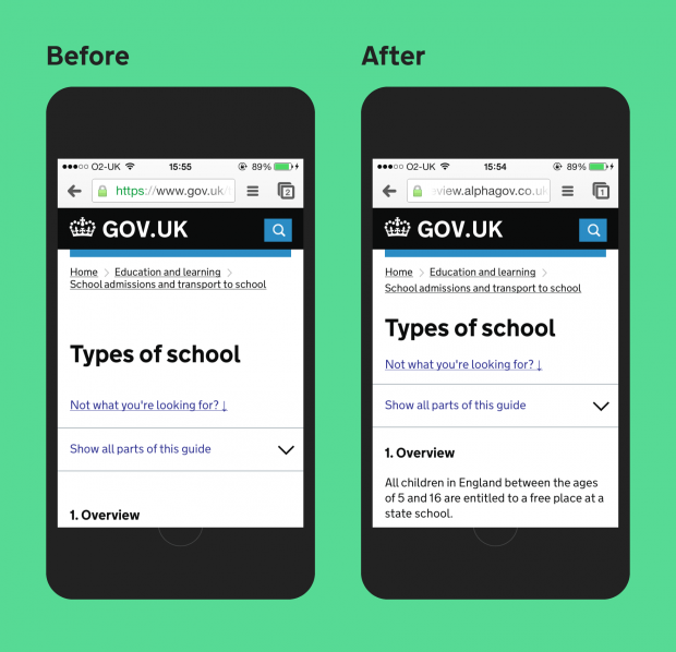
Screen space is in short supply on small devices. So making good use of what’s available is really important.
One thing that had troubled me for some time was how little content was actually immediately visible in the view on a lot of pages when browsing on mobile. The navigation and titles dominated too heavily.
We’ve just deployed some changes that help tighten up this space and get more of what our users need in front of them — content.
It’s a subtle change, but an important one.
Testing our assumptions
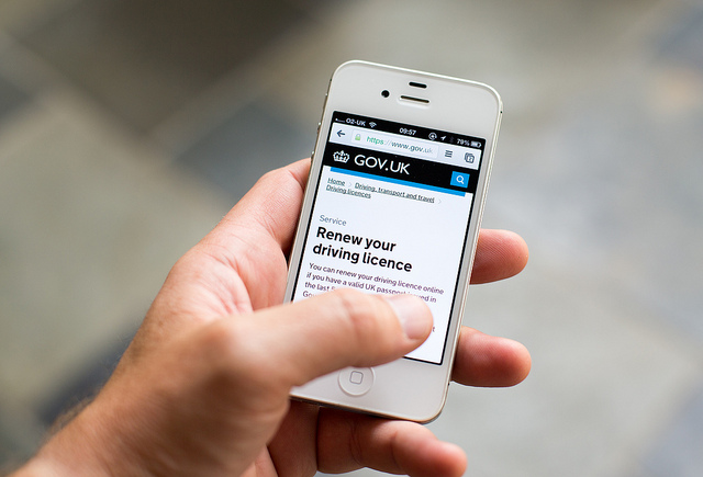
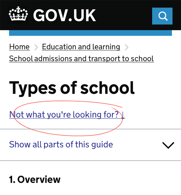
Another thing that I think we’ve needed to address for a while is the ‘Not what you’re looking for’ link in mobile views seen above, and below in more detail.
Some background
On desktop screens, related links are shown to the right of the main body of content. This is to help users navigate to content that is associated with what’s in front of them (and in some contexts may be more useful). Though this depends of course on how they found their way to the page.
On small viewport screens however, there is no space to show these links in the same position, so instead they sit at the foot of the page.
The ‘not what you’re looking for’ link was originally added in the belief that it was still important to allow users immediate access to these ‘near-miss’ pieces of content on mobile.
What’s never sat right is how jarring it is to be presented with a statement ‘Not what you’re looking for’ as soon as you arrive on a page. It assumes a user is in the wrong place and second guesses their intentions.
Decisions based on data
We don’t like to remove things based on hunches. Our iterations are based on users’ behaviour and research.
So, we added click tracking to the ‘not what you’re looking for’ link at the end of last year with a view to waiting and letting the data do the talking.
The result was unanimously in favour of the redundancy of this link.
Just 0.352% of pageviews in mobile viewports resulted in the link being clicked.
So, we have removed this item, safe in the knowledge that it will not be missed and that the related links are still there at the foot of the page where they are still useful.
What’s next
We have more improvements in the pipeline to improve the experience of GOV.UK on different devices and will keep you updated as and when we ship them.
Follow Guy on Twitter and sign up for email alerts.
You may also be interested in:
When will more people visit GOV.UK using a mobile or tablet than a PC?
The mobile question: Responsive Design
Mobile’s role in bridging the digital divide


12 comments
Comment by Anna posted on
Really good to see the changes being implemented as I've got a keen interest in mobile optimisation. In fact, my masters dissertation was all about the difference between desktop and mobile design and how important it was for organisations to optimise for each device.
Comment by Jess Scott-Lewis posted on
Beautiful illustration of how subtle differences can make a difference. I'm wondering though... what research, standards or ux activities did you do to determine what was an acceptable 'tightening up' of space? Or was it a matter of best guess?
I'm thinking about space for content vs space for fat fingers!
Comment by Guy Moorhouse posted on
Hi Jess,
Thanks for the comment.
We don't have any hard and fast rules with regards to how much space is given for fingertips, but that said, of course links, buttons, navigation etc all need a bit of clearance to allow users to touch or click individual elements.
A sensible rule of thumb (bad pun, sorry!) is set out in Apple's iOS design guidelines — ‘ensure that the minimum target area for each item is 44 x 44 points’. I'd certainly use this as a guide for the main calls to action on a page.
We've had no complaints about the touch target sizes as they stand, but of course would adapt them if users were having issues.
In this update, most of the adjustments to the layout were geared towards removing redundant white space, and the touch/click areas remain unaffected by the changes.
Comment by Mark posted on
At the moment I've got a Samsung Galaxy Y - pretty much the smallest smartphone out there (240 x 320 pixels). If you can make a page look good on that it'll look good on anything!
Comment by John Beale posted on
Great example of always wanting to improve and acting on real evidence when you do
Comment by Nathan Wall posted on
Great update Guy, how long was the click tracking in place?
We're doing exactly the same type of evidence gathering for New Zealand's equivalent to Gov.uk - for Govt.nz we're tracking a number of design elements. Our mobile usage isn't quite as high as yours yet, but we're also not fully in production so we're expecting that will change in the next few months.
I'm really interested to see if we see similar data on our site.
Keep up the good work guys and thanks for sharing.
Comment by Guy Moorhouse posted on
Hi Nathan, thanks for the comment and great watching govt.nz progress.
We originally put the click tracking in place towards the end of December with a view to leaving it over Christmas and planned to base our decisions on a week's worth of data.
As it turned out, we had about three weeks of data by the time it got looked at again and the outcome was pretty conclusive as mentioned in the post.
I think a week would have been enough though as it would have been a good enough sample to get a clear picture of the numbers.
Thanks again and hope this helps, be great to hear if you have a similar outcome.
Comment by James Coltham posted on
Excellent post. I love the point about testing assumptions using data. This chimes nicely with my own piece about the dangers of making assumptions when designing for mobile users: http://www.prettysimple.co.uk/blog/index.php/2013/07/what-is-a-mobile-web-user-5-assumptions-to-avoid/
Comment by Ross Chapman posted on
Looks great. I'm interested to see how this progresses.
I'm also interested in the decision for the logotype "GOV.UK" - looks like a text variant is being rolled out - is that because a font is better for responsive design than a logo image?
Comment by Guy Moorhouse posted on
Hi Ross,
Thanks for the comment.
We switched over the way "GOV.UK" is presented a little while back.
It used to be rendered in Gill Sans as the site was originally set in Gill Sans and Georgia, but this never got updated.
As the whole product is typeset in New Transport now, it made a lot more sense to consolidate the title too. And switching from an image to properly rendered type also made more sense.
Thanks.
Comment by George posted on
Just a quick point. Perhaps the image used when a user adds gov.uk to their phone home screen should be updated to reflect the new New Transport logo? Obviously a minor thing. I expect you were probably in the process of doing it anyway.
Comment by Guy Moorhouse posted on
Hi George, thanks for the comment.
Good idea. The touch icon has not been updated in a while — I'll add it to our backlog.