Today we released a new module on the Performance Platform that enables exploration of how the individual components of GOV.UK and Inside Government are being used.
For each piece of content, we show the number of views it had in the past week along with measures of how users engaged with it.
It’s something we’ve primarily built to support our product managers and content designers but we think some of our users will also find it interesting.
The tool is useful in all sorts of ways:
- we can see how individual items of content are performing
- it helps our product managers prioritise which content, template, or subject area needs more investigation
- we can see how content sits within the context of similar or related content
- it enables us to share with everyone how content is being used.
Sharing information about our content like this also reminds us of the great variety of user needs being served by GOV.UK.
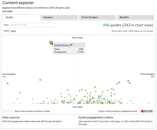
It also reinforces that many of the people coming to GOV.UK every week come for the same things - for example, the student finance guide on GOV.UK gets more than twice the views of the next most popular guide.
Supporting our product managers and content designers
The Content Explorer helps our product managers and content designers as they identify, prioritise, and evaluate content.
“It’s going to allow us to see quickly and in a really visual way all of the thousands of items on the site, which of them are performing well and which are falling short... ...we can work out where we need to prioritise our resources, either to make a fix, or to make it work even better than it already is.” ~ Ross Ferguson, Associate Product Manager, Inside Government
Content designers often work on specific pieces of content or topics, and being able to see where these sit in comparison to other items is really important.
A bit on engagement
When a user visits a piece of content on GOV.UK, depending on what they do, we classify them as engaged or not engaged.
This can only ever be an estimate, but across millions of visits (GOV.UK had 5.52 million visitors just last week) we’ve found it a useful way of seeing how content is being used.
We’re open with our engagement criteria; we’ve blogged about them, and we’ll refine them over time.
Differing views
In most browsers you will be able to choose between two views - a scatter plot and a table.
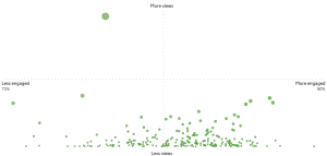
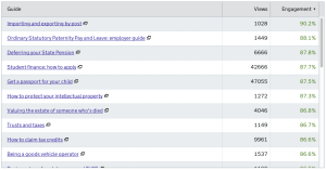
The scatterplot is helpful for seeing items in context and to spot items which are noticeably different to the group. The table lists all the items, and is great for sorting.
The horizontal axis of the scatterplot scales automatically between the minimum and maximum engagement scores for that format as we’re usually interested in the relative distribution across content of a similar type. Similarly, items with more views have larger 'bubbles', which puts extra emphasis on high-use items.
Filter all the things
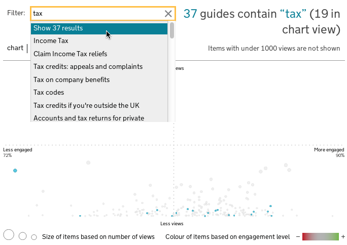
Something we’re really happy with is our nifty filter. It lets you search within a format for keywords, helping you to find specific pieces of content.
Importantly, this lets you see how the items you’re interested in perform in the context of all other items.
Using the Content Explorer
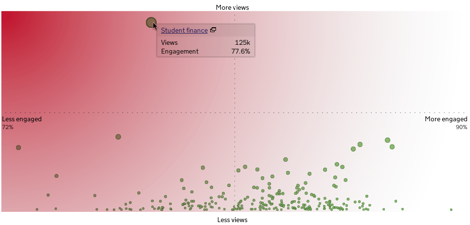
When identifying content to look at, we're interested in items with lower engagement that also get a high number of views.
This is just one of the ways we'll use to prioritise work, and in many cases we expect the Content Explorer to provoke further analysis and research.
Details
We only show view counts and engagement scores for items with 1000 views or more. Below this level the engagement scores appear to fluctuate week on week and are not a good representation of performance. However, it does mean that some GOV.UK content is not shown in the chart, although all content is listed in the table view.
We’ve also made an exception for Inside Government news content where we only show items updated in the last 2 months, or those that had over 1000 views.
We’re using our red/green colour shading to add additional emphasis to those content items which probably require further investigation.
Raw data
You can get the data used by the Content Explorer as json:
(These are the internal URL's we use, and are subject to change.)
Iteration
There are lots of ways in which the Content Explorer might get used, so we’re going to watch what people do with it and what they ask for, and look at how that might apply in the future.
We are particularly interested in being able to filter on metadata, and give some context of history (where has this piece of content been?, has it changed significantly?) to see what impact this has on our performance measures.


5 comments
Comment by Rob posted on
This is an interesting development. What are your plans for giving individual Departments access to all of the visitor stats for the content that they own? For example, will Departments be able to use the portal to run reports tracking visitor stats over a period longer than a week as we currently can with Google Analytics?
Comment by Ed Horsford posted on
For the Content Explorer we're interested in letting users filter by department (or other applicable metadata), and in showing the history of the page.
Departments on Inside Government should already have access to analytics for their content.
Comment by Matt posted on
Looks very useful. Will you be cross referencing the figures with feedback you receive via the "Is anything wrong with this page?" comments facility?
Could help you to:
* check the assumptions used to measure engagement, e.g. figures say page is performing well but comments say otherwise
* gain a better idea of what the actual issues are (where there are problems)
Comment by Ed Horsford posted on
Absolutely. We've already done a bit of comparison, and will be looking at it more in the future.
Comment by This week at GDS | Government Digital Service posted on
[...] big releases this week, with the new additions to Inside Government and the release of the Content Explorer, and we’ve visited DFID and the Student Loands Company up in [...]