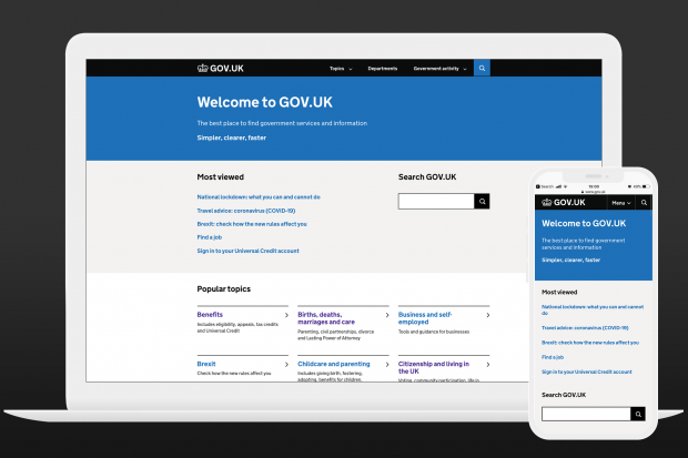
One of the Government Digital Service’s (GDS) priorities for the next 5 years is making sure that GOV.UK remains reliable, accurate and continues to meet user needs.
That’s why we’re always looking to improve the navigation on GOV.UK.
GOV.UK is a big site. It’s made up of more than half a million pages, and in 2021 has averaged 17.8 million users a week. This scale of the site, and the huge range of user needs, means ensuring people can find what they’re looking for is one of the most important things we do.
This isn’t a new or unique challenge for GOV.UK. All large websites constantly need to look at the findability of their content to reflect new technologies and their users’ habits.
There are lots of different strands to our work in this area; recently we’ve improved how GOV.UK information appears in search engine results, trained an algorithm to provide useful related links and made the mobile experience of the site better.
As part of this work on findability, we’ve been looking at how we can improve browsing on GOV.UK. By ‘browsing’ we mean when a user clicks through GOV.UK using menus, topic pages and links.
This is a blog post about why we focused on this, what we learned, and how we’re going to make it easier for users to find what they need from government.
Our discovery
At the start of last year before the coronavirus (COVID-19) pandemic, a small team on GOV.UK ran a discovery to understand how the site’s navigation might be improved.
We decided to look in-depth at this area because the way most users browse the site has remained largely unchanged since 2014. Our main navigation elements - our homepage, topic pages and menu bar - have only had minor iterations in this time.
What we learned
Our first step was to validate whether browse navigation was the right area for us to be focusing. We found that while most users start from a search engine, around 15% use topic pages to navigate.
Looking closely at these browse journeys we found a number of specific problems to address.
1. A confusing information architecture
We have 3 different kinds of topic page on GOV.UK. These are pages designed to list the information and services the government provides in a particular area.
- Mainstream topics: a set of around 200 topics meeting users’ most frequent needs that you see on the GOV.UK homepage such as voting, driving licences and benefits
- Specialist topics: a set of around 400 topics for specialists, often people who need detailed information from government as part of their job, such as commercial fishing, climate change agreements and HGV tests
- Taxonomy topics: a set of around 4,000 cross-cutting topics to which all content on GOV.UK is tagged, such as transport, environment and welfare
This triple-system, which has substantial duplication, causes confusion for users who can easily find themselves in the wrong part of the site for their needs.
It also makes things difficult for publishers, the civil servants who write the content on GOV.UK. They currently need to tag their content to multiple topics, and to multiple topic systems, without a clear indication of how this tagging affects where their content will appear.
2. We need to improve how our navigation works on smaller screens
The devices used to browse GOV.UK have changed a lot since 2014, with most of our traffic now coming from smartphones. Our work on coronavirus navigation exemplified the value of a mobile-first approach to design, and we know there’s potential to improve GOV.UK’s mobile experience sitewide.
3. Navigation feels overwhelming for some, limited for others
In our user research sessions some people told us they felt lost on GOV.UK, overwhelmed by the volume of content and number of options available to them. Equally, users looking for specialist content struggled to find this using GOV.UK’s primary navigation system.
What happened next
The discovery work wrapped up in February 2020, and then the team pivoted to help with the coronavirus response. This meant we could apply some of this early thinking to gov.uk/coronavirus, which was designed to be mobile-first, and used expanding sections and carefully curated content lists to avoid overwhelming users.
One year later, with the GOV.UK team growing, we’re excited to have sitewide navigation on the roadmap again, applying the lessons we learned during the pandemic.
We’ve now been able to move into the Alpha phase of this work, building prototypes to test out ideas for how to solve these problems.
Ideas we’re testing
We’ve still got more research to do, but wanted to share some of the ideas we’re working on that are looking promising.
1. A consistent sitewide menu bar
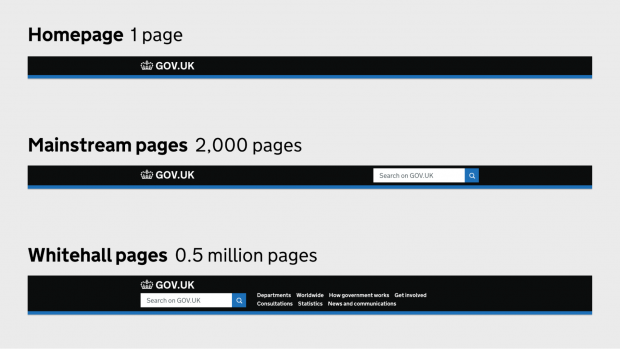
GOV.UK today
 Our prototype
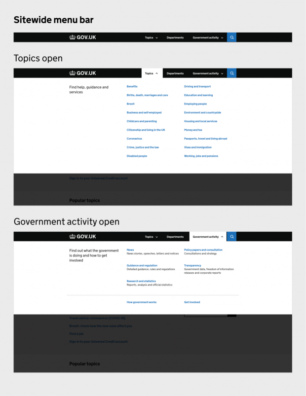
Currently GOV.UK has 3 different menu bars depending on what kind of page you are on. In our prototype we’re testing a simpler but more versatile ‘megamenu’ pattern that would provide consistent navigation on every page of the site. This would provide clear routes to browse by topic, department or content type.
2. A unified topic system
We’re in the early stages of thinking about how we might bring together mainstream topics, specialist topics and the taxonomy into a single tagging system. We’re keen to provide a system that’s easier for users to navigate, and for publishers to tag to.
There are no plans to change the ownership of these topics, but our research findings suggest that aligning and de-duplicating these systems will provide a better experience for users.
3. An improved topic template
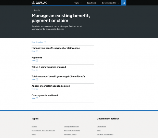
Drawing on the insights from the coronavirus and Brexit landing pages, we’ve redesigned GOV.UK’s topic page template, the underlying page design for every topic on the site
The new template groups sub-topics into a grid, and the categories below into expanding sections called accordions. The aim here is to provide simple, clear navigational paths without overwhelming users with options.
Topic page
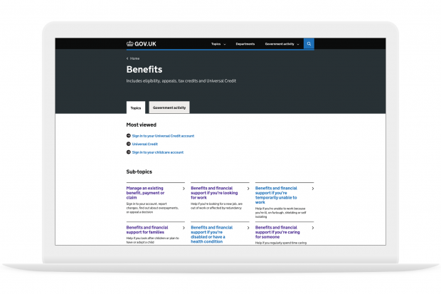
Sub-topic page
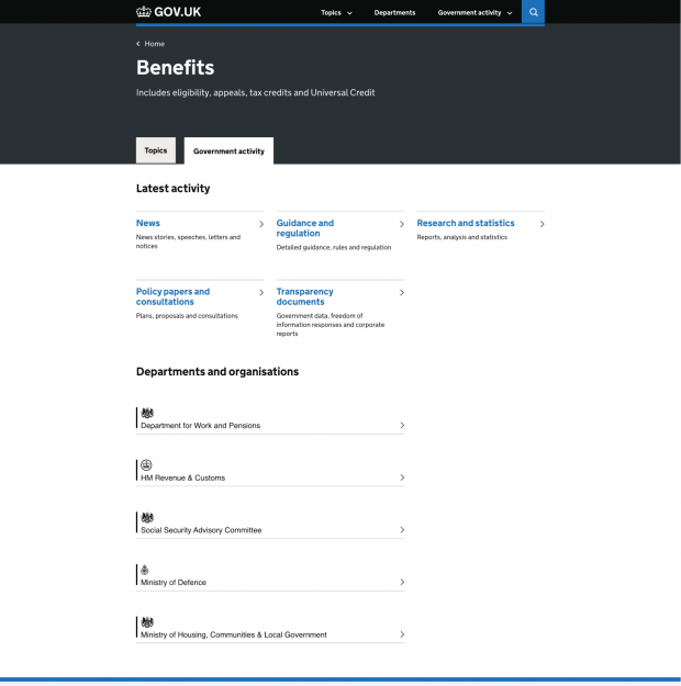
 Another new idea we’ve been exploring is providing 2 tabs on each topic page.
The first tab labelled ‘Topics’ provides a curated view of content to help users get to guidance and services quickly and without distraction. The second tab (shown below) enables users, for the first time, to find things like the policy documents and statistics relating to that same topic.
Our hypothesis is that the simple curated view will provide speed and simplicity for most user journeys, while the second tab will provide routes to greater depth for those who need it.
Government activity tab
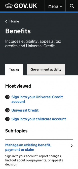
4. Mobile-optimised components
We’ve been working closely with the GOV.UK Design System team to test new designs for a number of GOV.UK components including topic links and accordions. With mobile and tablet users in mind, these new designs significantly increase the size of the tappable area around links, making interactions easier and more accessible.
Our next steps
This work is currently in alpha phase, which means we’re evolving it rapidly based on findings from multiple rounds of research.
Once we’re comfortable that this system of new elements is accessible and working well for users, we’ll move into beta phase. This would involve an incremental rollout of these new elements across the site. We’re likely to do this using A/B tests to assess whether the improvements we’re seeing in research are replicated at site-scale, building in time to iterate as we go.
We know any information architecture changes we make could impact the way that departments curate and tag content. We’re committed to working closely with departmental content teams should any changes be needed, and ensuring these don’t add to their workload. For this reason, any changes we make need to represent a simplification of the content tagging and topic curation process, as well as an improvement to user experience.
Please get in touch with us if you have any questions or comments. You can email us or leave a comment below. Subscribe to the Inside GOV.UK blog to keep up to date with our work.
GOV.UK is hiring throughout 2021 to 2022. Keep an eye on GDS’s recruitment page, read about our technology plans and discover 4 tips to help your job application.

36 comments
Comment by Michael posted on
Hi guys.
Great job on the entire Gov.uk website. This must be the best government website in the world.
Thanks for the continuous improvements.
Once you have finished tinkering with the navigation please can you take a look at the search. This is for me the most important way to get around the website. The on site search needs some work - I find myself going out to do a search on Google to hopefully find what I am looking for on Gov.UK.
A search for "business funding" brings up pages like travel to Spain close to the top of the relevant result.
Another useful feature, for search, is auto-suggesting as I type - after x characters or words.
Keep up the good work guys.
Comment by The GDS Team posted on
Hi Michael,
Thanks for your kind words! Regarding site search, hopefully some welcome news is that we’ve a parallel team recently started up that is reviewing ways we can improve this over the coming year. Accessible auto-complete is something that’s on our radar, and something we’d be definitely keen to test.
Thanks,
The GDS Team
Comment by Joel Samuel posted on
This is super interesting thank you (I am in the B test group - yay!). I'm mildly curious as to why 'government', is that something based on the frequent use of GOV.UK by the civil service itself (like I do) or because general citizen users of GOV.UK do want to know about the structure of government?
Comment by The GDS Team posted on
Hi Joel,
That's a good question, the 'Government activity' section covers many of the links previously listed in the menu bar of pages of specialist content on GOV.UK. We know there are a significant group of users (beyond the Civil Service) who need access to things like policy papers, announcements, speeches, press releases and official statistics. We've got an open mind about whether that route should be from the menu bar, but the usage of this section during the A/B test should give us a useful data point to help us work that out.
Thanks,
The GDS Team
Comment by Richard Bates posted on
Please reconsider having section headers occupying a full third of the screen. It isn't a good use of space, and diminishes the role of content.
Comment by Prentice posted on
Dear Sir / Madam,
This looks really interesting. I am fascinated by the idea of the website being personalised.
The only thing that I wish is that the website could display based on where you are so that it is more in sync with other area's e.g. if I wanted to find out about Welsh education e.g. how much to pay in tuition fees etc it is not easy to find this and requires me to 'Jump' through some hopes (links) to find this. I wish this could be simplified through a personalised account showing information based on location or by displaying the necessary government / councils on the homepage to choose which to go to. Maybe this could be further personalised by age so that older people see information on pensions more easily / being ranked higher up on the options etc.
Thanks for taking the time to read my feedback.
Kind regards,
Prentice
Comment by The GDS Team posted on
Hi Prentice,
Thanks for your great suggestions. This is exactly the sort of thing that the GOV.UK Accounts team is working on at the moment. In fact, personalising GOV.UK based on user location is exactly what we are exploring at the moment and we hope to have more to share about that work soon. From our team’s point of view, we can’t assume that everyone will opt-in to personalisation, so our designs need to ensure a good baseline experience without an account. But, for people who opt-in, we are thinking about how we can add in some personalised elements to make it faster to find things.
Thanks,
The GDS Team
Comment by Kaiser posted on
Thank you for the update! Is there any plan to add site-wide screen reader to help those who have a harder time reading?
Comment by The GDS Team posted on
Hi Kaiser,
Thanks for the question! For screen readers, our strategy is to code navigation elements and content so that they work nicely with native screen readers on the user's operating system or browser, rather than use a site plug-in or overlay. Having said that, it’d be really interesting to understand where you’re having issues with the site at the moment, and understand how we might be able to improve things.
Thanks,
The GDS Team
Comment by Ash posted on
I've always found it frustrating how there are no quick actions on the nav bar so much so that I've habituated to just googling, gov [service name] login. This is probably due to the fragmentation of gov services and authentication flows but still the biggest pain when access gov.uk sites is lack of true SSO.
I'd also love to see a list of recently used services/actions used, similar to how AWS web console "remembers" what services you recently used in their accordion style nav.
Comment by Elvijs Sarkans posted on
Looks awesome, thanks for all the hard work!
Comment by Jennifer posted on
When checking policy papers, consultations, and more detailed guidance for work - I can confirm that I do often look by "document type", then within that, for doc titles or official numbers. So I like that for the government activity tab, you are thinking of still splitting it up by document type.
As a citizen, I wouldn't mind having a "tasks" tab as well as a topics tab. For pages where I do something on the page.
Comment by Daren Bristow posted on
Hi Sam,
Thanks for the blog, very interesting. We're in the middle of content improvement excersize which does look at how we tag content and how users move around the site. Is there a way we could have a chat and feed in some of our research around this and the pain points we've identified?
Thanks!
Daren
Comment by The GDS Team posted on
Hi Daren,
Thanks for reaching out, that research sounds very relevant to our work, the team have followed up on email and look forward to speaking with you soon.
Thanks,
The GDS Team
Comment by Veronica Price posted on
Hi GDS /Sam. Really positive to see this review / improvement carried out. Are you able to share your timescales with us please? Thanks in advance.
Comment by The GDS Team posted on
Hi Veronica,
Thank you for the words of encouragement! The first a/b test of the new menubar is likely to start in early this month. We’ll be providing more in-depth updates around the timing of tests and their results via the cross-government content community Basecamp.
Thanks,
The GDS Team
Comment by Sam Menter posted on
I've been in lots of research sessions (about 5 years ago), where people miss content tucked behind tabs. I think this is one of the reasons they weren't part of the original GDS design system, though they have crept back in. I'm curious if those behaviours have changed?
In terms of the mega menus, it may be worth exploring making these pages in their own right. I've seen people with lower digital skills confused by mega menus - they don't understand the concept of an overlay, so after opening a menu will then click a back button which - rather than showing them the content under the mega overlay, which is what they expect - shows them the page they were previously looking at and they become confused...
I'm sure you are exploring multiple avenues but thought it might be helpful to feed this back. It's great to see design work happening with such rigor!
Comment by The GDS Team posted on
Hi Sam,
Thanks for the thoughtful feedback, regarding mega menus, that’s a really interesting insight. We’ve tested with quite a few users with low digital skills and happily haven’t yet seen that confusion yet with our relatively simple implementation. But we’ll certainly keep an eye on that in future research rounds. Our menu sections will need to be built as separate pages for users with JavaScript switched off, so that option will be easy to switch to if needed. Regarding tabs, there’s definitely more research we want to do on that, and the team share some of your hesitations about the pattern. Our core hypothesis here is that multiple ‘views’ on a single topic are more helpful than duplicate topics for different audiences. Tabs was our first instinct when prototyping that, we’ve seen no warning signs yet for this use case, but I think we’ll want to try some other interface options too.
Thanks,
The GDS Team
Comment by Terry posted on
Sam Dub: 'We’re committed to working closely with departmental content teams should any changes be needed, and ensuring these don’t add to their workload. For this reason, any changes we make need to represent a simplification of the content tagging and topic curation process, as well as an improvement to user experience.'
Regretfully, it would appear from the above that not adding to the workload of fellow civil servants takes priority over serving the needs of users. What if adding to the workload of fellow civil servants represents 'an improvement in user experience'? Aren't you all supposed to be giving us, the demos, priority over all of you, including your 'content teams'? This, surely, is what 'civil service' means, isn't it? Otherwise it's simply self-service.
Comment by The GDS Team posted on
Hi Terry,
To reassure you, there is no question that the user experience of GOV.UK comes first. Though we do need to make sure anything we build can be maintained sustainably.
In this instance, we know the content tagging and curation system that thousands of civil servants across government use when publishing to GOV.UK is currently more complex and time-consuming than it need be. If we can improve that, it helps those teams focus on serving users.
Thanks,
The GDS Team
Comment by Patrick Taylor posted on
Seems like the sheer volume of content to navigate must cause issues. Did the team look into the possible effect of revised retention polices to remove older content.
Comment by The GDS Team posted on
Hi Patrick,
You’re absolutely right on that point, and this is one of the reasons the new designs use a curated view of content within a topic in the first tab. It would be really good though to understand a bit more about how an updated retention policy might help you reduce the volume of content within your area. Is this something you could raise via department channels with the GOV.UK Content Support team? Our team could definitely advise on the effect of a change, but this would ultimately be a call for our content team to make.
Thanks,
The GDS Team
Comment by Nah posted on
🥱 🥱 🥱
Don’t mean to be cruel but how far has design fallen for this to be considered x months work. A drop down navigation that has to be prototyped multiple times, a grid for topic items.
It’s hardly rocket science.
Comment by The GDS Team posted on
Hi,
Working with well-established design patterns allows us to focus on the more complex work of refining and organising content. The design elements aren't the most important part, it's about what they contain. Because our users span all kinds of contexts, backgrounds and access needs, we need to make sure that even commonly used design elements are usable for everyone.
The GDS Team
Comment by B posted on
It's not about how much time does it take to implement the current solution but about all the options you have thought, studied and discarded to eventually decide that's the best approach. You might like or not, think there are better solutions, so just mention them and give constructive feedback and try not to diminish the work if you don't really know how design actually works
Comment by John Ploughman posted on
Hi Sam
Thanks for sharing the work that the team has been doing. I’m really glad to see the triple-navigation problem is being looked at.
Does the team have any thoughts or ideas at this stage about how email alerts might work with this new model?
Mainstream topics do not have an email sign up option to be told about changes, but specialist topics and taxonomy topics do. This has been particularly useful in keeping users updated during the pandemic.
For example, users have been interested in keeping up to date with things tagged to the ‘Driving and motorcycle tests’ taxonomy topic.
Thanks
John
Comment by Sam Dub - Senior Product Manager for GOV.UK, Government Digital Service posted on
Hi John,
Thanks for the words of encouragement, it’s interesting to hear that feedback re: email alerts. Our team hasn't approached this problem yet, but there are definitely some interesting opportunities there that we want to get to. A bit like the navigation, we’ve heard a mixture of overwhelm from some, and a need for more detail from others. If the two tab model works for navigation, we might want to test something similar for notifications.
Thanks,
Sam
Comment by Leila Lake posted on
Interesting to know what's going on & the research that been happening & research that's to come.
A relative works for you gds
Comment by Mark posted on
Really interesting work. I'm glad you're considering how Whitehall publishers tag content. The taxonomies are often ambiguous and it's not clear what effect tagging has on the user experience. Good luck in alpha.
Comment by The GDS Team posted on
Hi Mark,
Thanks! Our starting point has been on finding a structure that works best for users navigating the site. But we know that all these designs can only offer a good experience for users, if the content tagging system is simple and clear for publishers. Improvements to the tagging system are on our roadmap once we’ve worked out the user-facing patterns.
The GDS Team
Comment by Frankie Roberto posted on
Great work!
Have you considered how this header would work with GOV.UK Account functionality (eg on https://www.gov.uk/transition)? Is there space to add "Sign in", "Sign out" and "Account" links?
I’m also curious if you’ve considered how this would impact services, if at all. Some services also have navigation across public webpages (eg https://gender-pay-gap.service.gov.uk and https://www.compare-school-performance.service.gov.uk ) and users don’t always perceive those as separate websites from the rest of GOV.UK.
Comment by The GDS Team posted on
Hi Frankie,
Both really good points, and we’ve been working closely with the GOV.UK Accounts team so that if our menu test is successful, there’s a clear place for the new login options.
On services, we don’t anticipate problems with the new menu style, given services already use a pattern that’s visually consistent but slightly different in functionality from GOV.UK. If our experiments are successful, we’ll work with the GOV.UK Design System team to see if any of the learnings are transferable to services.
Thanks,
The GDS Team
Comment by Rahna Riley posted on
Please avoid using burying information in accordions. It's difficult for councils to deep link to relevant content on gov.uk in accordions and,therefore, can result in councils replicating the content, increasing costs and moving away from a single version of the truth.
Comment by The GDS Team posted on
Hi Rahna,
Thanks for taking time to feedback on that. We’re thinking a lot about how these new topic pages can be good landing pages that people can refer users to. Something that will hopefully re-assure you on this point is that we’re only using accordions to organise links into categories, and aren’t presenting information within them. It’s a similar approach to country pages on GOV.UK like this one: https://www.gov.uk/world/chile
Content pages will continue to be the single version of the truth, and the place to direct people for specific tasks (e.g. Claim Maternity allowance). What our prototype adds are topic pages (e.g. Benefits) and sub-topic pages (e.g. Benefits for families). These provide new pages that allow users to see the options available for their situation. These designs are part of ongoing user research, and we’ll watch closely for the concerns you raise.
The GDS Team
Comment by Rahna Riley posted on
Thanks muchly for your response. Based on your example how do you propose we link to your 'Births, deaths and marriages abroad' section?
Comment by The GDS Team posted on
Hi Rahna,
Existing topic links would continue to work as they do currently, so in this case https://www.gov.uk/browse/births-deaths-marriages would still be the one to use. Users would see the same options as shown currently but in an updated template. It’s only a level lower that accordions are introduced. We’re using them to compress up the long lists with subheadings you can see on pages like: https://www.gov.uk/browse/benefits/manage-your-benefit.
Thanks,
The GDS Team