Over the last year or so, we’ve been working on moving the websites of 311 government agencies and arms length bodies onto GOV.UK, as part of the transition towards a single online platform for all government services. You can read more about the transition process here.
Transitioning the websites of over 300 agencies on to GOV.UK means drastically altering the experience for users of these sites. Because of this, user research and analytics can be crucial in making the transition a smooth one.
We can’t measure all 300 of these transitions, so we’ve been focusing on some of the bigger or more complex agencies whose users are dependent on digital content to do their jobs. The Environment Agency (EA) is one such agency. Using research and analytics, we were able to identify places that were causing trouble for users, develop solutions, then use analytics to confirm that our solutions were effective.
User research pre-transition
After all EA’s content had moved over to the GOV.UK site and was ready to go, we decided to hold off a week before switching traffic over from the old site. During this time, we were able to do some remote testing with environmental professionals, in real life conditions on the site, rather than using a prototype as we had been doing for previous rounds of research. This enabled us to spot any major problems users might have, before the old site was redirected.
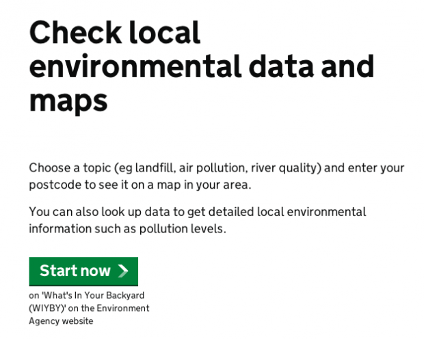
Overall, the research went very well, with users generally being able to find all the information they had regularly looked for on the old site. Only a couple of potential problems were thrown up - for example the removal of “what’s in your backyard” branding from the local environmental data checker. This confused some of the users we spoke to, as they no longer recognised the service as being the one they were used to. After transition, we were then able to confirm this was an issue through analysis of internal search term data, and made this change to the page as a result:
Analytics immediately post-transition
When the re-directs went live on April 8, we monitored the success of transition in three ways:
- on-page contacts
- analytics
- call centre volumes
Immediately after launch we reviewed the Environment Agency user experience with a Google Analytics dashboard to ensure that people were finding the content they needed. For any problems revealed we conducted deeper page-level analysis, using insight from user research, analytics and information architecture.
Japanese Knotweed improvements
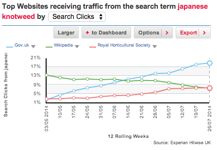
Lots of people were arriving on GOV.UK after searching for ‘Japanese knotweed’ in Google. They were landing on a browse page that had no reference to the weed, because although the Environment Agency had covered it, we hadn’t anticipated such an interest.
To improve this, the Environment Agency changed the misleading redirect to point to a relevant DEFRA page. Now the DEFRA page comes first in Google, and GOV.UK is getting the most traffic for this term. This is a great example of departments putting user needs over departmental divides.
This Hitwise graph shows that GOV.UK is getting the most traffic from Google for the term ‘Japanese knotweed’:
Review two weeks post transition
After two weeks we conducted a page-level analysis of Environment Agency content with a team including three content designers, a user researcher, an information architect and an analyst. We made 15 changes to content as a result of this review.
Two weeks later, we met again to look at whether these changes had affected the experience for users. We found that traffic had gone down 25% (mostly because of a long bank holiday weekend), but searches went down 42%, and on-page feedback decreased by 62%. Fewer people had to search or complain, because they were finding the information they needed.
Fishing licence example
One of the biggest improvements was made to the page Buy a UK fishing rod licence. On-page feedback and searches revealed that people didn't realise that they could go fishing immediately after buying a licence - they thought they had to wait to get their certificate in the post. There were 7 complaints similar to the one below, from people who hadn’t received their licences in the two week post-publish period:
![]()
So a content designer added a call-out box explaining this, and there have been no complaints on this issue since:

Call centre and on-page contact volumes
We asked the Environment Agency to inform us of any change in call centre traffic, and they didn’t report any increase. There was also no overall increase in user contacts on the GOV.UK site as a result of this transition.
Benefits of this approach:
- testing with users live on the site allows a realistic view of how successful transition is likely to be - this approach allows us to see how users find us in Google, what pages they visit, and follow the true user-journey
- combining analytics, customer feedback and user research allowed us to understand and react rapidly to issues as they came up, and validate the magnitude and importance of the problem
- working with content designers during the analysis process meant that solutions were designed to be fit for content, and actioned immediately
This case study shows that by doing research before going live, and combining that with analytics immediately after transition, we can make sure that users’ journeys are disrupted as little as possible.
Research can identify problems, and start people thinking about solutions. Findings can be validated post-publish with data from a full-sized audience, and be resolved quickly. People often take sides regarding the effectiveness of qualitative and quantitative data. But they’re natural partners, and by combining them you can overcome the inherent limitations in each.
Follow Charlotte on Twitter, join in the conversation with Lana, and don't forget to sign up for email alerts.


3 comments
Comment by Lana Gibson posted on
Hi Mike,
Because our site contains thousands of pages we need to focus our quality reviews on the content that people need the most.
Regarding the 'Rye Harbour' example you give, the GOV.UK pages I found on this topic were published directly by the Environment Agency, not GDS. Any feedback on GOV.UK content is appreciated, and can be made via the on-page feedback form.
Comment by Mike Winiberg posted on
Although GDS has a practical approach to rebuilding government websites, and certainly the clarity (both visually and of the written text) has dramatically improved, the overall impression is still one of the work having been done by an organisation that has few members with real-life skills/experience - especialy in actually having to interface with the government agencies for real.
Firstly your approach still does not really address the difficulties computer illiterate people have in using such sites, and - where the site is of a technical nature, eg The Environment Agency - the lack of real-world experience shows dramatically, with poor english, incorrect descriptions or even invalid data being given, and yet no-one, despite the much vaunted proofing and review process, has picked this up. Take a look at the page for Rye Harbour, for example, and see if you can spot the errors in it. (Anyone on your team ever sailed a vessel, read an almanac?)
Comment by Charlotte Clancy posted on
Hi Mike,
Thanks for your comment.
To add to Lana's response, we are very aware that, as you point out, we can't have in house expertise on all the topics for which there is guidance on GOV.UK. This is why we see research with (and feedback from) our users as so important - they are the specialists, so they are the ones who can tell us when something isn't right, or isn't working for them. We also make sure that the research we do is with people who have all levels of digital literacy so that we can design for everyone - not just those who are very confident using a computer.