Over the past year we’ve been writing about the ways in which GOV.UK will develop, in order to continue meeting user needs, as expectations around how and where to receive information evolve.
We’ve talked about offering a more personalised experience for users and delivering information to the channels and devices users expect to find it, whether that’s on the GOV.UK website or elsewhere. And we’ve discussed some of the ways we are looking to support this, through building a more holistic picture of how users use government information and services, developing our data science capability, and introducing early thinking on the idea of a GOV.UK account.
We’re also looking at the role content plays in connecting all of this work and how our approach to content will change as a result.
Where we are now
At the heart of GOV.UK is a publishing platform which, for the most part, is built up of individual pages that are grouped together and made findable through underlying taxonomies. Whether you’re navigating through a menu structure or searching for a term or phrase, GOV.UK helps you get to a page that is relevant to the thing you are looking for.
By taking a user-centred approach, the content on that page is designed to be understood as quickly and easily, and by as wide a range of people, as possible. But it still requires you to read through the whole page (or set of pages) in order to understand the information fully, and then interpret what is relevant to you and your personal circumstances. In other words, we can get you to the relevant page, but often it’s then up to you to find the relevant information to your situation.
We’ve done a lot of work over the years to improve the way users can navigate through complex information easily, working on site-wide navigation and taxonomies, as well as looking beyond these to other ways to access content.
The smart answers format, for example, has played a crucial part in allowing users to access information and services quickly, and continues to do so especially in the wake of the coronavirus (COVID-19) pandemic. Developing the step by step pattern has provided greater ability to join up content across complex user journeys. And the UK Transition (formerly Brexit) checker has gone even further in giving users a succinct, personalised view of information that spans multiple sets of user needs.
Some of this work has provided opportunities to apply a more modular approach to content, where information is built up using small content components that are designed to be used (and reused) in different ways based on context. But, for the majority of GOV.UK at least, the smallest component of content is currently the single page.
This makes it harder to extract individual pieces of information from within that page and serve it where needed. An example could be an item of eligibility criteria that is relevant to your circumstances on a page about applying for funding, or a prerequisite task on a page about getting a licence.
Structured information
We’re now starting to explore how we might structure content differently, at scale, so pieces of information can be reused and accessed more easily, both across GOV.UK and beyond GOV.UK.
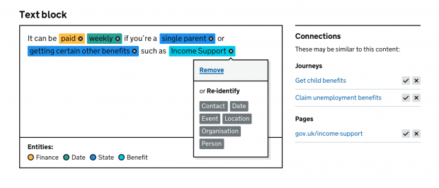
Structuring content in this way could support personalisation by identifying, extracting and bringing together pieces of content in a new context based on a user’s circumstances. It could provide better exposure of content to third parties, with benefits of search engine optimisation (SEO) and channel-agnostic publishing. It could also offer new ways to reduce duplication and efforts in content management. Ultimately, it could allow users to get the answers they need more directly, quickly, effortlessly.
Breaking content down into smaller chunks is only part of the picture, however. It’s also about understanding what characteristics each piece of content has and what similarities, differences and other relationships pieces of content have with each other.
In this way we are thinking about and investigating our content as pieces of data rather than simply pieces of text. And we’re considering what sort of data we need to get out of our content in order to develop new models, and what sort of data we need to add in.
We’ve already made progress on this, through adding structured data markup to GOV.UK content, which has improved the way content appears in search results on Google, for instance. And we’re now using artificial intelligence to increase our knowledge of the information on GOV.UK, helping us start to understand those characteristics and relationships across hundreds of thousands of pieces of content.

Thinking big
Hundreds of thousands of pieces of content is, of course, the big challenge here. To implement new models for structured information at scale we will be working through much wider decisions on governance and authorship, publishing workflows, and technical, data and content architecture.
I’m also particularly interested in what skills and capabilities will be needed to support these new content models and approaches. What does the content designer of the future look like, for example? And how can we continue to support them in their work on GOV.UK content?
Many of these decisions and questions will need insight, feedback and collaboration from across government and I’m interested to hear from other teams who have been thinking about these areas. If you’re outside of the UK government and have ideas, I’d love to hear from you too!
Old concepts, new contexts
Structuring information in the ways I’ve laid out isn’t a new concept: online shops and other commercial sites have been using and refining models of structured information for reuse, personalisation and more for years if not decades. But the scale of information on GOV.UK, together with the complexity of users’ needs and their expectations when interacting with government, present new challenges that we are starting to work through.
Structuring content in new ways that go beyond page level, and improving our use of content-as-data, provides us with a structured information source that will better support the GOV.UK of the future. We’re proving the value of going in this direction in a localised way, and so will now be ramping up our efforts. It’s a large and emerging area, covering many topics I’ve not touched on in this post. We’ll be blogging more on this as our work continues.


10 comments
Comment by David Wright posted on
Excellent content!! Seriously - a great read, including the comments. The future of gov content design (and dare I say, Knowledge management) looks sound. I'm not in this area of expertise, but it does heavily touch the work I do (data sharing product and service design and delivery to UK local government) and it's fascinating.
I'm in!
Comment by Paul posted on
Can I describe a few problems I've experienced on your website, please?
1. I received an email from HMRC telling me I'd had a tax code change. It invited me to check that the new details were correct, but didn't provide a link to the specific page where I could do that. Instead, it instructed me to go to http://gov.uk/, search for “personal tax account”, sign in and go to the “Pay As You Earn (PAYE)” section. You shouldn't be requiring your users to jump through hoops to get to where they need to be. Provide a simple link to the page and authenticate on arrival.
2. Your website seems to use this pattern of behaviour: click on a link to "Do Action A", and then on the page you land on, click AGAIN on a button to "Do Action A". At the point that I click on the first link, I've already indicated that I want to "Do Action A", I shouldn't need to click on another button. For example, I had to click on a link to "HMRC services: sign in or register", and then when I arrived on that page I had to click on a button to "Sign In". You use this concept widely. It's annoying. Why not take it one step further and introduce a third button/link that asks "Are You Sure"?
3. Your site doesn't provide email confirmation of changes the user makes. I made a change to my tax details, but didn't receive a confirmation that I had even made any changes, let alone details of what the changes were. Sending confirmation emails is an important standard practice and is useful for users to keep a record of what they have done.
I'm dismayed to find the flaws detailed above, given the budget you must have to provide this platform, and also the fact that they are "schoolkid errors" that any teenage bedroom coder would avoid. Admittedly, correcting these problems only improves the user experience and that might not be a priority for you.
Comment by The GDS Team posted on
Hi Paul,
Thank you for the feedback. We've shared your comment with the relevant team in HMRC, who are responsible for the service you’re describing.
Individual departments are responsible for developing and maintaining their own services on GOV.UK, but components and patterns are shared across government to ensure consistent user journeys, which are continually researched and tested.
We continue to develop our plans for GOV.UK's future strategy, which we hope will improve user journeys.
Thanks,
The GDS Team
Comment by Aaron Crewe posted on
Great to see gov.uk leading by example on the structured data front.
Accessibility is so very vital, as all too often those browsing websites differently (such as using text to speech readers as one example) are often overlooked.
The content available on gov.uk is not only expansive, covering a broad range of topics, but it is also some of the highest quality, most vetted content anywhere on the internet. With this said, unless the user experience is kept up-to-date with the latest user behaviours, then it can very quickly become obsolete.
Simple markup not only enables search engines to prioritise said content and display it much more clearly in the search results, but it also forces content creators to think more openly in terms of the true purpose of the content being produced.
Great to see gov.uk continuing to be at the cutting edge of content!
Best,
Aaron Crewe
Managing Director
<a href="https://novi.digital">novi.digital</a>
Comment by Aaron Crewe posted on
Worth also mentioning that if readers wish to find out more information on how to achieve this for your website, visit Google's own guide: https://developers.google.com/search/docs/guides/intro-structured-data#:~:text=Structured%20data%20is%20a%20standardized,the%20calories%2C%20and%20so%20on.
We also have useful guides on our website (https://novi.digital) also.
Comment by Stuart Jones posted on
I think the role of the content designer will just evolve on line with the communication mediums, but what is changing dramatically is the network of collaboration.
A data architect will work to manage the content meta-data, linking it and making accessible the information required to users. Data architects are forging new relationships with service designers who take a more holistic view of the entire services, and the evolution of the content designer’s relationship is with the data architect and service designer to ensure there’s a coherent structure to the content, data and service.
I think the skills exist, but often in silos, and the key is unlocking collaboration and fostering mutual understanding.
I’ve been doing work with some private sector organisations looking at exactly this problem. Happy to chat if it’s helpful?
Comment by Elisa posted on
I feel like a really key piece of this (in order to be successful) would be identifying how much context a piece of information needs in ordert to be understood.
For example:
-- A deadline for submitting something is easy and needs little additional context. (Deadline for visa applications for 2020 is Dec 19th.)
VS.
- Explaining which visa you should have would need to have a lot of background context before being able to say "this is the visa you should have." That idea is much more ambiguous and hard to nail down. The more ambiguous an idea is the more "connections" it will have to other pieces of content, and the more context it would need.
Comment by Emma-Jane Stogdon posted on
Great way of using AI for content. It's come along leaps and bounds over recent years. I'm all for it, just as long as it doesn't put writers and content managers like me out of a job, haha!
Comment by Markland Starkie, GOV.UK Head of Content posted on
Hi Emma-Jane, indeed not! I see some opportunities to make management of content easier for content designers and publishers, and also ways in which content designers' approach to content may change. But the direction of travel is about supporting people doing high-quality user centred design rather than replacing them with AI 🙂
Comment by Jon Anderson posted on
If we have publishers that don't know the difference between "it's" and "its" it may be time to hand over the controls to the robots.
Seriously though, don't believe the hype around AI.