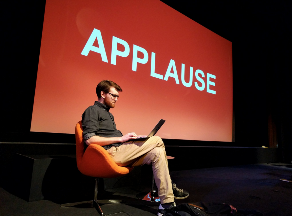
Like ‘bunting in the office’ and ‘cake on release days’, ‘slides with big words’ has become one of GDS’s hallmarks. A few weeks on from Sprint 16 I wanted to write about why we encourage that.
Our slides are very simple
Presentation software, like most software, gets used in lots of different ways. That’s normally fine – if you want to use slides to do wireframes then go for it – but it’s a problem when someone’s used presentation software to make, say, an organogram and then gets up to present it without changing a thing.
We’ve all sat through the presentation that ought to be a table emailed to the finance team. Or been shown the complex user journey that ought to be printed out on a wall. Or asked to approve copy on a slide that should, instead, have been emailed. It’s tedious. So we’ve deliberately constructed a template that forces the writer to think of the presentation as a thing they’ll be presenting.
The typical GDS slide is designed to;
- be easy to read (even at the back of a large room, or on a small screen)
- keep the emphasis on the speaker
- force the writer to be extremely clear about what they’re saying
Our ‘normal’ slide is designed to support a single short line of text. Our ‘heading slide’ is designed for even fewer words. We try to make sure our images illustrate the point the speaker is making. We enforce a strict ‘no metaphors’ policy. And, wherever possible, we encourage speakers to use screenshots or demos so they actually show the services or tools they’re talking about.
On the whole, it’s a pretty simple setup.
Clarity comes with preparation
A very plain template gets you about a third of the way. The rest comes with preparation. If you use the template but don’t prepare then it’ll be very obvious that you haven’t given much thought to what you’re saying. You have to put the work in.
The three things you should be asking yourself as you prepare are:
- What is the main point I want to make?
- What else does this particular audience need to know to understand that point?
- What is the best order for those things?
As you ask those questions your answers will start to change. You might realise your audience knows more than you thought initially, so you need to make a different point. Or you’ll see a different order emerge as you rehearse it. Like anything else, iteration will get you where you’re going. Iteration, and deleting things.
Russell Davies used to tell people that each minute onstage should equal about an hour or preparation. It’s a good rule of thumb. (He also wrote a great series of blog posts about preparing talks that’s worth reading).
Oh, and rehearse. Loads. Giles Turnbull wrote a nice thing about that on his own blog a few weeks ago.
Slides aren’t your only tool
You don’t have to rely on a presentation alone to get the job done. Need people to approve some text? Send it before or after the meeting. Need to share a chart in a meeting? Email it round or print it out (and use a placeholder slide to prompt people to look at it). Got a big diagram you want to walk people through? Print it out really big and literally walk people through it. It's ok to point to things on the internet too, as long as you use short URLs they can copy from slides quickly, or take a picture of.
We’re not the only bit of government that works like this; DVLA digital, MoJ and much of Cabinet Office use similarly plain slides and often have similar ‘rules’ about what people should include in presentations.
The end results might look extremely plain, but the slides are clear and, more often than not, gel together into a cohesive argument.
Join the conversation on Twitter, and don't forget to sign up for email alerts.

7 comments
Comment by Dawn posted on
I'd argue that sometimes the slides are too simple. As audience member, when I get home from a full day conference, I rely on the presentation to be able to share the message with colleagues who have been unable to attend. Too often the slides are too simple to allow the message to be shared in a meaningful way. So I would add a plea to consider the audience and what they need to take away or action.
Comment by Mac Bricken posted on
Slides for the presentation audience. Blog posts to share with the colleagues back in the office.
That's what I think anyway.
Comment by Giles Turnbull posted on
Hello Dawn.
Sharing slides after the event is a problem area.
Because the slides were intended to be spoken to in front of an audience, it's rarely useful to share them on their own - the reader doesn't have the context of the speaker speaking.
Personally, I believe that the speaker should do the hard work to make it simple, and turn the slides into a blog post if they want to share them.
Matt Webb (who has done some work with GDS in the past) is the master of doing this. He writes up all his talks, after the event, with notes that are almost exactly what he said. Like this:
http://berglondon.com/talks/scope/?slide=1
... that gives you the experience of being at the talk, without actually having been there.
That's a standard I'd like all GDS speakers to aim for.
Comment by Carrie Barclay posted on
In response to this comment thread, Giles has written a blog post about sharing slides - you can read it here: https://gds.blog.gov.uk/2016/05/10/doing-the-hard-work-to-make-talks-readable/
Comment by Brian McGuirk posted on
Any chance you'd like to share your template? Didn't see it in a cursory glance at GitHub, just in case. 🙂
Comment by Giles Turnbull posted on
Hello Brian - we don't (yet) have a shareable version of our own templates (although I'd like get some made).
In the meantime, I'd recommend you download Alice Bartlett's white label template, which is very similar in style and follows the same general principles. Alice used to work here at GDS.
http://alicebartlett.co.uk/blog/how-to-do-ok-at-slides
Comment by Brian McGuirk posted on
Mac - Thanks! Much appreciated! 🙂
Dawn - I think it's important that conference organizers take that into account and make sure that there are handouts/substantive summaries available. The extra work is worth it. Plus, I feel like I retain a well-designed, punchy presentation a lot better than a dry, typical one.