
The other day, while driving along a local shortcut, I was faced with a ‘road closed’ sign and had to u-turn. Beyond the sign, there was no road where road had been yesterday.
It wasn’t anyone’s fault that I couldn’t continue, but it would have been more helpful if the sign had been put closer to the last junction, 7 miles back.
Until recently, this was pretty similar to the experience we were giving some users of the Carer's Allowance digital service.
Users remind us of their emotional needs
While Carer’s Allowance is designed to help with the physical and financial aspects of taking care of someone, our users often remind of us their emotional needs. Our service design needs to consider these too.
Comments like this aren't uncommon in our user research:
... this payment could affect my life, as long as it doesn't affect my Dad's.
An emotional and ethical ‘road closed’ sign
When you receive a carer’s allowance, the person you’re caring for could lose some of the benefits they currently receive. Content about this originally formed part of the legal disclaimer at the end of the service:
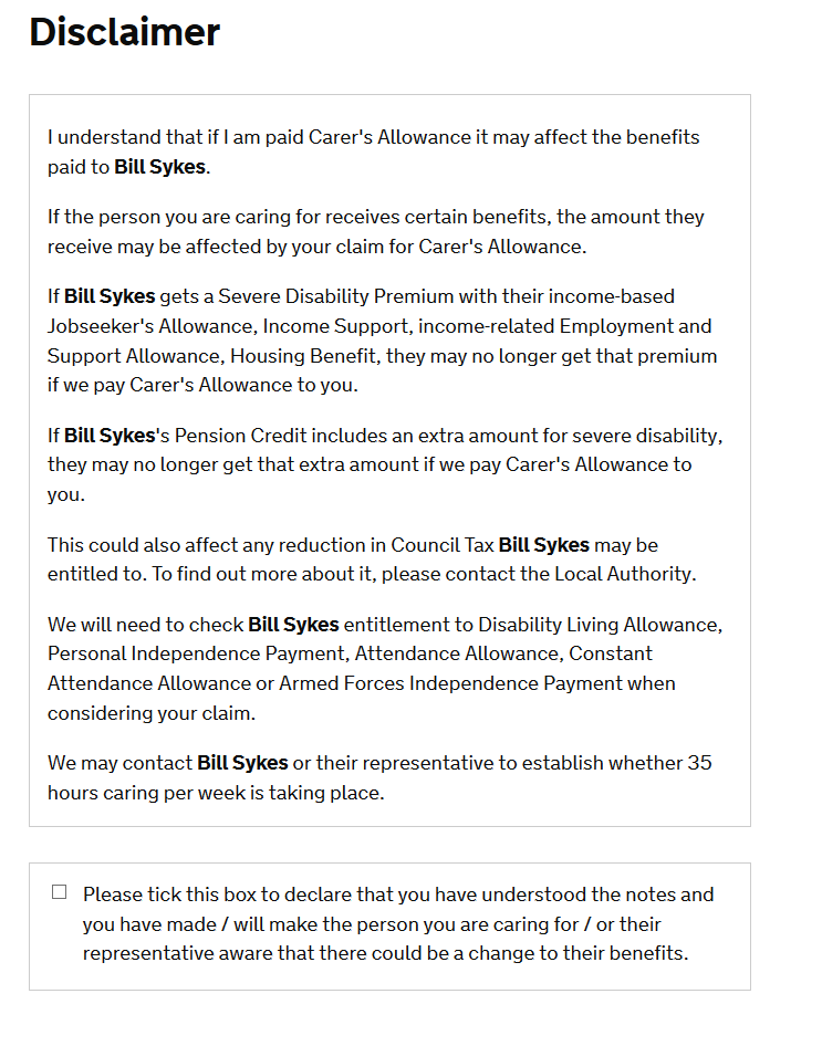
*This version of the form auto-populated the person-being-cared-for’s name into the disclaimer. In this example, Bill Sykes.
Around 5% of our first time users dropped out of the claim at this point, just 2 screens away from application completion.
The insight was clear: for some users (should they skip round the relevant content on GOV.UK), the idea that their actions could affect someone they care for was an insurmountable emotional and ethical ‘road closed’ sign. It was also a sign that appeared a long way into their application journey. It gave them no option but to abandon.
We’re not upfront
We moved the disclaimer content from the back of the service, to the front. We also reduced and clarified the message to make it clearer when the disclaimer would apply, negotiating the changes with legal colleagues from the Department for Work and Pensions (DWP) and the Crown Prosecution Service.
Importantly, in our new version (and against common practice), we gave users an exit point from the service to return to GOV.UK if they needed to:

Deliberately failing some users fast paid off
We knew that putting one of our known pain points at the very start of the service would come with risks. We immediately saw dropouts on the page rise to a whopping 9%. But, the risk paid off.
As the disclaimer now encouraged earlier dropouts, the high figure on the disclaimer page was countered by a fall in abandonments elsewhere in the service.
We saw no overall drop in applications. In fact, during the week we released, completion rates actually leapt 6% and have risen steadily to over 80%.
Separately, the completion rates for returning visitors have also risen to well over 90%, implying that taking a short detour at the right time and returning later, may be the better journey for some users, at least for now.
The most important plus was saving users time.
It used to take around 25 minutes to arrive at the old disclaimer - coincidentally about the time it takes to drive 14 pointless miles on a B road. Today getting to the disclaimer takes users around 30 seconds. If a user decides to abandon, they’ve lost little time and they’re hopefully more likely to return later and apply successfully.
We’ll keep working on reducing abandonments, but in the meantime, deliberately failing some users fast, and the first time, may just be the best option.
Join the discussion on Twitter, and don't forget to sign up for email alerts.


12 comments
Comment by Louise posted on
Great post Tom. I'm really glad to see all result of all the hard work I know has gone into this!
Comment by Steve posted on
Thanks for the insight on the change to the user journey.
I wonder if a commercial organisation (making money from the number of pages views and/or number of signups) would have taken this step?
Comment by Elena posted on
It's certainly possible for a commercial org to be user needs focused. Here's one case study: http://www.uxbooth.com/articles/banking-on-success/
Comment by Keri posted on
Importantly, in our new version (and against common practice), we gave users an exit point from the service to return to GOV.UK if they needed to
Where is the advertised exit point? I couldn't spot it?
Comment by Tom A posted on
The exit point we provided is an inline link to GOV.UK content, to find out more about how the person they care for's benefits could be affected.
General practice is not to explicitly encourage a user to leave once in a service. If we see users dropping out at a certain point our solution is usually to iterate the transaction to enable them to continue - as the reasons for users failing usually point to a technical problem or lack of clarity in our service about what's needed. The difference in this case was that some of our users' emotional needs wouldn't be served at all by completing this transaction at this time. For them, being prompted to exit the transaction at the earliest possible point was the best way to meet these needs.
Comment by Leigh posted on
Excellent blog Tom! I know just how much effort went in to make this happen. Great to see what a positive impact it has had and surely an approach that can applied to lots of other services
Comment by Gavin Stephenson posted on
Really great to see this kind of design thinking. I think the blog identifies something else really key. The interdependency of the other benefits and services and their impact on what the project is trying to fix. If there's a true desire to consider a customer journey, a fundamental re design needs to happen at the policy and legislative level - and that's hard - not impossible. However great steps in the right direction again being demonstrated by GDS.
Comment by VinceK. posted on
Reminds me of the great advice from Samuel Beckett '
'Ever tried. Ever failed. No matter. Try Again. Fail again. Fail better.'
Comment by Simon posted on
Love this blog, I'm glad that its finally been tackled and making things better for those users.
Comment by Lou Valdini posted on
Excellent combination of practical user journey design and common sense. Unusual for the public sector, but I am starting to see 'green shoots' in how some projects are implemented.
Comment by Rowan Smith posted on
I think that this kind of thinking is becoming increasingly common for the Public Sector - the work that GDS have done over the last 4 years on Gov.UK highlights that design and user led thinking is far more developed than just 'green shoots' and increasingly across the Local Government space too.
Comment by Dr Bob Mann posted on
Thanks. This is a really GREAT blog post, and a salient reminder of the need to think from the consumer's point of view when designing a digital process.