You may not have noticed, but we recently changed the bit that says 'GOV.UK' in the black banner that appears across the website. It now uses New Transport, the same typeface that we use across the rest of the website. Previously it used Gill Sans.
Early versions of GOV.UK used Gill Sans, so it made sense to have the banner using the same typeface. When we changed the website to use New Transport in 2012 we kept the banner in Gill to reassure users that it was the same website as before.
Then we got a bit busy working on more important things, before recently realising that we still hadn't updated the masthead.
Alex and I made a first release of the banner in New Transport at the beginning of January this year. Henrick (who co-designed New Transport) then helped us to finesse when he dropped by the office a couple of weeks ago.
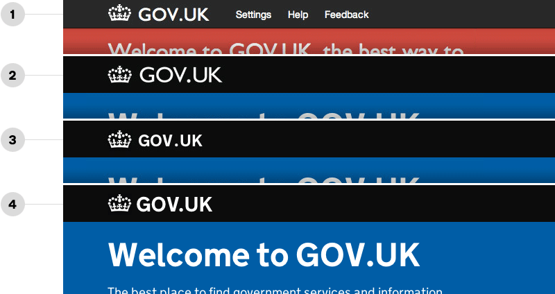
This image shows the evolution of the masthead from early 2012 to today:
Replacing the image file with text gives us a few practical advantages too:
- the text will scale better to different zoom levels, viewport sizes, pixel densities without any real effort on our part
- simpler CSS for print views
- better progressive enhancement for browsers without CSS support or images, which is a bit niche but good to do


12 comments
Comment by Anna posted on
I'm really pleased to see changes like this being communicated - though it doesn't effect much it's brought about a consistency and users can trust you'll also keep us informed of the big changes! After all, that's a huge part of change management (http://www.practicus.com/en-gb/insights/a-guide-to-effective-change-communications.aspx)
Comment by benny posted on
I really love simple and neat design from gov.uk, and also the blog, all of it. neat, fast, clean and light. not sure if all this possible in our country (Indonesia).
Comment by Richard Best posted on
I am with David and Jason.
I don't want my tax paying for expensive Apple Macs for trendy designers spending hours tweaking fonts.
Why are there so few complaints? Is it because only the luvvies visit this blog?
Comment by Chris posted on
Hi Mark
Always pleased to see attention to detail at GDS! Is New Transport available for others to use? Or if not, when will it be opened up? Thanks
Comment by Benjamin Rusholme posted on
I prefered the simpler styling of the G present in Gill Sans.
It does make sense to use New Transport throughout though, and to use text rather than an image file.
Comment by dave posted on
really? how much public money was spent on tweaking a font?
Comment by Mark Hurrell posted on
Hi Dave, the change hasn't directly cost any money. The typeface is the same one we have already licensed and used across GOV.UK for the last 18 months.
Comment by Jason posted on
Dave is right. You are paying someone a very significant salary to spend time on this. Is there nothing better to do - like fix border IT which keeps going fdown?
And you licensed the font? You paid for it? Was that money well spent?
What will a public accounts inquiry make of this?
Comment by Jack posted on
Dave/Jason,
Do you think Apple waste money by paying for consistent, beautiful and useful design in their products? Because last time I looked they seemed to be one of the most successful businesses on earth...
You know, just because 'government' is publicly run it doesn't mean stuff they do has to look rubbish and be unloved by its customers. You might want to save a few thousand quid by using Comic Sans everywhere, but when you are building a product for use by MILLIONS of people, spending a bit money on design is a good idea IMO.
Comment by John posted on
Paying attention to details like this, and the culture that encourages such attention, has numerous benefits. They're just hard to measure directly.
Spending small amounts of money on iterative maintenance and improvement tends to be cheaper and less disruptive than having to replace everything occasionally when the website/app falls into disrepair.
Comment by Lee Maguire posted on
Given the increase in screen pixel density (e.g. "Retina" screens) has any assessment been given to when it would be appropriate to replace the crown image png (and other appropriate elements) with a scalable SVG asset?
Has GDS made, or is planning to make, an assessment of the impact of switching to SVG for users to GOV.UK?
Comment by Mark Hurrell posted on
Hey Lee
At the moment for the crown we're providing all devices with the oversampled or 'retina ready' PNG, then using CSS to ensure it displays at the correct CSS-pixel dimensions for the layout. If you use web-inspector on the crown image, the PNG assets actual height is 62px, but the CSS is sizing it to 31px.
This technique isn't brilliant in every context, but with the crown image the increase in file size for the retina image is negligible and it works with any browser that supports CSS.
We're not decided against using SVG in the future, but with this context and at this time the PNG approach seems better.