On Tuesday evening we made another release of changes to GOV.UK. One of the biggest areas of discussion centered around the typography changes. Ben Terrett, Head of Design, explains the choices which have been made and why.
A few words about the changes to GOV.UK typography. I’ll write more about the other changes we’ve made later, but I think typography warrants its own blog post. It’s aimed at type geeks. The rest of you - we changed the typeface, it makes things simpler, it doesn’t work everywhere yet, we’re fixing it.
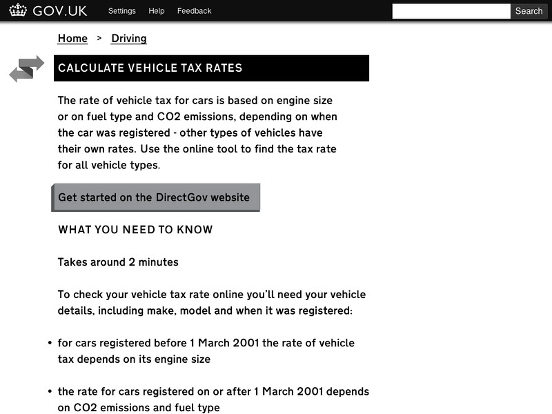
You will have noticed that we’re using a new typeface. The previous version of GOV.UK used three typefaces, Gill Sans, Georgia and Helvetica. We also used several different type styles and sizes - too many. We dropped Georgia sometime ago but we needed to go further. As a team we did an exercise where we set the site in one typeface, just one type size and we made everything black and white.
This is pretty brutal, but it focuses the mind. What are we using different typefaces for? How many different sizes do we need? We agreed to try and only use three different type styles per page. It's not a solid rule, but it's a good place to start from.
We looked around for an extremely legible typeface. Accessibility is key at GDS and ideally we'd like a typeface that's good enough for us not to need an 'easier to read' font option for the dyslexic and those with other visual or cognitive issues. We tried lots of different ones and the best was Transport. This shouldn't come as a surprise - it’s the typeface designed by Jock Kinneir and Margaret Calvert in the late fifties/early sixties for Britain's national motorway and road sign system. They spent years testing for legibility in all sorts of extreme conditions; in the rain, at night, at speed.
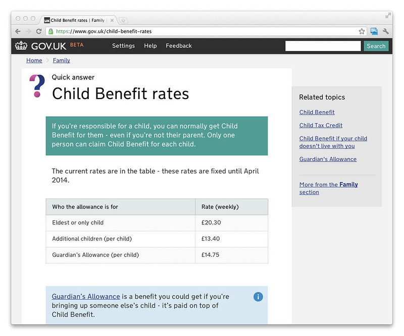
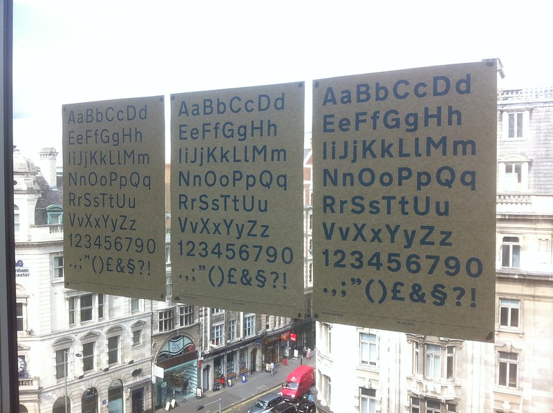
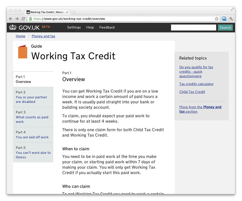
The original is a bit bold for web use, but Margaret has been working with Henrik Kubel on a new digital version with six new weights called New Transport. Calvert and Kubel have let us trial this version on the latest release, in two different weights.
It's a beautiful face, extremely legible with some nice quirky characteristics (the commas are particularly nice). There's obviously a lovely symmetry to using the typeface from the road sign project as I've written before. Or, as Margaret puts it, "It is really exciting to see New Transport used for the first time, online, for the Government's [beta] website... Almost as exciting as driving down the M1 for the first time."
We’re using New Transport as a webfont and for the first time we’re hosting it ourselves rather than using another service like Typekit or Monotype's web fonts.
Why webfonts?
By far the largest design element of GOV.UK is typography. Many pages are just text information. Pictures are rare. Type is important to any design but even more so in our case. If we don’t use webfonts we have to use a default font available to everyone such as Helvetica or Times and neither of these are right, for reasons I’ll talk about another time, so it’s crucial we find a typeface that’s right for GOV.UK.
Webfonts is a technology in its infancy and while lots of websites use it, none do at the same scale and depth, with the same issues as us. This is a huge challenge and we’re working hard to get it right.
That’s one reason why a bunch of us went to the Ampersand conference recently. It’s the only conference in the UK specifically about web typography and type, and we’ve also been working with Jake Archibald well regarded as an expert in this field. (Big thanks to Jake and Simon and Nat from Lanyrd for helping us out.)
What doesn’t work now?
Picture from John Ploughman
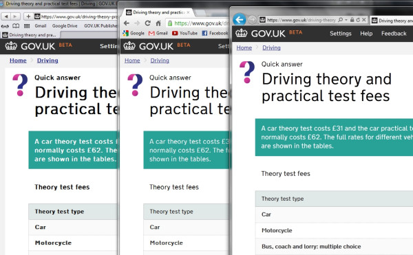
The new typeface doesn’t work perfectly everywhere, we’re aware of that. It pretty much works on a Mac in all browsers and on Windows in Internet Explorer. It’s not quite there in Firefox or Chrome on a PC.
On release the font wasn’t caching on every page, we fixed that yesterday. The hinting stuff is harder to fix but we’re working on that now and you should see improvements with every release over the next few weeks.
Here’s a bit more detail on stuff we changed yesterday:
- Telling browsers to cache the font so that it doesn't have to be reloaded on every request
- Making sure the page only loads the fonts it needs to speed up load times
- Scaling the default font so that the change when the font loads is less jarring
- Sending a slightly different version of the font which should render better for Internet Explorer users
Lots of work still to do - this stuff isn’t simple. But this is why we like to release public betas - you can do as much work as you like in the lab but you can’t beat testing in the real world. Thousands of users, many combinations of operating systems and browsers, user cases we’d never have thought of - all of this gives us brilliantly rich feedback.
Please take a look at the site and let us know what you think.


40 comments
Comment by daisylum posted on
You can license 'New Transport' from the A2 font foundry 🙂
- a2-type.co.uk
- http://www.newtransport.co.uk/
Comment by Aram posted on
The work you people do on this website is amazing. It's so, so refreshing to see something that is government funded turn out looking so beautiful — it really harks back to great British design of the 1940's to 60's.
It makes me happy to know you spent time considering correct font use. Transport has always been my favourite font — I hope I can get my hands on New Transport sometime!
Comment by Dominic posted on
What is the closest web safe font with which to follow New Transport in a font stack? Context of use: we are building an internal product for MOJ. The system uses the nta web font. The system also sends emails to users. We would like to maintain the closest resemblance to "nta" in the HTML emails, both from a branding and accessibility/legibility perspective. Your thoughts/guidance would be greatly appreciated.
Comment by Carrie Barclay posted on
New Transport
Arial
Sans Serif
If you need some more detailed help please drop ben.terrett@digital.cabinet-office.gov.uk a line.
Comment by OGA posted on
I think it is truly awful, not easy to read and makes concentration difficult, and black on white is too stark.
Comment by Lee Goddard posted on
Is the licence for this beautiful, legible font for all domains under gov.uk?
Comment by David Read posted on
GDS did not design this font, or commission it, or influence it in any way as far as I can tell. They don't have an exclusive agreement either. They merely paid to use it, just like anyone else can for any proprietary font.
Comment by Chris Hills posted on
I, too, would like this typeface to be released into the public domain for use as it was funded by my taxes. I am pleased with the new design.
Comment by James Swinburne posted on
The site looks beautiful. Brilliant job, all involved.
Comment by James posted on
@Few Baa -- I couldn't agree more. The issue is that the Government should not be spending taxpayer money creating things that already exist in the public or private domains. They should have used freely available typefaces and saved the taxpayer from funding this typeface. My point is really that because GDS have already spent our money, they should certainly make sure that the taxpayers who funded this typeface can get some benefit from it by opening the licensing terms.
Comment by Few Baa posted on
For goodness sake, just use Helvetica, arial, sans-serif!
Comment by James posted on
I think a FOI request detailing the amount spent on the font maybe useful. It is not right that we have paid for the work on this typeface and do not get any benefit from it outside of the GOV.UK domain.
Comment by Joe Gardiner (@Joe_Gardiner) posted on
In agreement with other comments above I would also love to see this font released for, at least, personal use.
Comment by Ampersand 2013 - Red Badger posted on
[…] You can read more about their typography adventure in their blog - A few notes on typography. […]
Comment by Martin Gara posted on
How have you gone with mobile devices to date? The PC combinations are somewhat easier to support than the mobile market.
Comment by Yosh Talwar posted on
If GOV.UK receives funding by the UK government (which I believe it does), and the typeface New Transport was commissioned for government use, then I think you have the responsibility to release the typeface for public use. It rubbed me the wrong way when I learnt this font isn't available for commercial use, let alone personal use. Please do the right thing.
Comment by Paul Mackay posted on
When this (https://www.gov.uk/service-manual/design-and-content/resources/typography.html) says that Transport is not licensed outside of the gov.uk domain, does that mean it can be used on any site falling under .gov.uk, or that it can only be used for http://www.gov.uk?
Comment by jeff posted on
Where can we download a copy of this font from, for use in desiging government sites linking to gov.uk?
Comment by Kenny Moran posted on
Simple question. Will the "New Transport" font be used for road sign design, e.g. incorporated into SignPlot and KeySign? And when?
Comment by Meriblog: Meri Williams' Weblog » Cake: Making GOV.UCAKE posted on
[...] and Ben both kindly helped out rolling out the white fondant and cutting the letters (in the correct font, of [...]
Comment by Typography counts « Libtools posted on
[...] the UK GDS team (responsible for launching the new website gov.uk) was deciding on legibility, so they looked to a font widely adopted for highway [...]
Comment by Designing for the long read on Inside Government | Government Digital Service posted on
[...] we discovered Henrik Kubel was redrawing the typeface with variants appropriate for longer passages of text, I hoped that by using it we would somehow be [...]
Comment by Mark O'Thebeast posted on
"a default font available to everyone such as Helvetica"...everyone on Macs, you mean...right? It's not installed by default on Windows PCs. So about 90% of users.
"It’s not quite there in Firefox or Chrome on a PC."...so it's only broken for about 3/4 of the population then.
Just as long as the public money is being spent wisely and there are experts in charge who know what they're talking about.
Comment by Joshua Marshall posted on
Hi Mark.
The font order we've chosen means that, yes, on a Mac you'll see Helvetica first, but for Windows users they'll see Arial. We know not everyone has Helvetica and, on Windows, Helvetica is far from the best choice. We've been pragmatic about our choices when the web font is unavailable.
We've since a new version of the typeface that should render much better in Firefox and Chrome, too.
Comment by gerphy posted on
Why can you not just use the user’s configured fonts? Why do you think you know better what they want to read?
That’s what *they* have chosen as a comfortable style, weight and size. The primary aim of the government sites should be the communication of information and usability in doing so. Forcing a different font, style, weight, etc on the user goes against making the site usable for all – you’re explicitly not using the settings that the user has chosen. Spending such effort trying to get a specialised font on such a site seems to me like you’re focusing on the wrong thing.
In addition to not honouring the user’s choice, you expend time and effort trying to make the font work ‘nicely’ on different systems and browsers. Webfonts have been around for many years and are still not deployed in consistent ways on all the many browsers that you are required to support. The less you rely on difficult and unnecessary technologies, the more accessible the site becomes, and the more usable it is for your users.
Comment by John F posted on
I can't say I know of anyone who changes their default fonts. For those who do, I think the browser has an option to force fonts to be the user's choice, not the web designer's.
My concern would be the lower-case a. Probably the one valid reason Comic Sans is ever used is where there is a limited selection of fonts and you need a single-story lower-case a, e.g. for dyslexic readers.
Comment by Mark Barratt posted on
John F: "Probably the one valid reason Comic Sans is ever used is where there is a limited selection of fonts and you need a single-story lower-case a, e.g. for dyslexic readers."
What makes you think a single-storey a is better for dyslexic readers? (serious question - I suspect that it's not but would be interested in any research which points to that conclusion)
Comment by Joshua Marshall posted on
While researching the choices available to us to help our dyslexic users I didn't find anything conclusive that says "Typeface A" is perfect for 100% of all users with dyslexia. As far as I'm aware that still doesn't exist since it affects people differently.
There's a great book called Dyslexia in the Digital Age by Ian Smythe that I found quite helpful - it lists a lot of the research that's been done over the years into type legibility.
Still, we're aware that one-size won't likely fit all, but we're willing to be persuaded that there are better options out there.
Comment by Mark Barratt posted on
Me neither, on conclusive research, at least to date. Didn't know the Smythe book, which looks interesting and I'll check it out.
The single-storey a (and simplified g) are hot topics among research-oriented typographers, especially those interested in early-years reading. There's not a large research base on this and what there is suggests performance differences are absent or slightly favour two-storey a etc. This doesn't tell us anything about dyslexic users - unfortunately nothing I can find does.
Comment by London Artisan Integers; distribution, Hotel Infinity, punk, an excuse & explanation of sorts. | posted on
[...] up was the font, I wanted something like Gill Sans, Johnston or having read this post on typography from the GDS, Transport. Black, solid but maybe just a bit softer and slightly less obvious, after a bit of [...]
Comment by Mark Barratt posted on
"ideally we’d like a typeface that’s good enough for us not to need an ‘easier to read’ font option for the dyslexic and those with other visual or cognitive issues. We tried lots of different ones and the best was Transport."
What do you mean when you say 'tried' and 'best', Ben?
Comment by Joshua Marshall posted on
Hi Mark.
I'm Joshua, the Accessibility Lead on GOV.UK. I've been working on the site since the initial alpha, and since we started we've experimented with lots of different additional typefaces to help users who may not feel the default face we picked worked well enough for them.
Over the months we were iterating our designs we tried lots of different typefaces, different weights, we tried things like high-contrast stylesheets and ones optimised to be more "dyslexia-friendly" which linearised the layout and removed extra ornamentation like bold weights and italics.
We tested serifs, sans-serifs, we looked at type that was marketed as being specifically "dyslexia-friendly" such as Sassoon, OpenDyslexic, Comic Sans, FS Me which was developed with the aid of Mencap, and over time we started to experiment with Transport.
What we learned from our user testing along the way was that the more we focussed on simplifying everything on the site - including the language - the site became more readable by everyone.
Stripping the site back to (mostly) one weight and one typeface has tested very positively with disabled people and non-disabled alike, and we think that's worth the tradeoff when there are a few individuals who think the typeface we've chosen isn't to their taste.
Ben's use of "best" there is obviously subjective, but we found through testing that it was the one viewed most positively by our users.
Hope that helps.
Comment by Mark Barratt posted on
Thanks, Joshua, that's very useful information - it's interesting to see you say that "simplifying everything on the site – including the language" has given you the biggest accessibility/usability gains. It seems a very open and effective approach compared with, say, ticking boxes on WCAG checklists (though I guess you have done that too!).
Comment by Steph Gray posted on
I admire the thought and effort that's gone into the choice of typeface and optimising it for the web (today's follow-up post).
I can understand that New Transport is optimised for reading short blocks in difficult conditions - e.g. road signs or perhaps headlines designed to be scanned - but is there a reason you've chosen to use it for body text too, over a designed-for-web font intended to facilitate reading longer blocks of text? Just as an amateur in these things, I personally found the previous serif typeface easier to read in longer chunks.
Comment by Webfonts in practice | Government Digital Service posted on
[...] the latest beta release on 4th July, we’ve been using a webfont throughout GOV.UK (see Ben’s post for why, and why we’ve chosen this particular [...]
Comment by Brendan Nelson posted on
Seems like the right decision to make and a great face to have chosen. Gill Sans is such an obvious choice for public service projects and GDS could have easily gone down that route, which would have let the whole identity down. Well done for spotting that and sorting it out so early on.
Comment by 设计政府数字服务(GDS) | Type is Beautiful posted on
[...] A few notes on typography, GDS [...]
Comment by applause posted on
Like the font and the principles but if only half the browsers are fully supporting it may be a bit previous.
Comment by Josh T. posted on
I thought the typeface looked familiar. Transport seems like a really appropriate one to use.
I'm guessing the rendering issues in IE and Firefox are caused by DirectWrite? When you say you're working on a different version for IE, do you mean that it uses hinting for ClearType?
Comment by Terence Eden posted on
One comment, the "at" symbol looks really weird. Like an "a" encircled by an "O" rather than the usual @.
That's probably feedback for the font designers, though.
The rest of the typography is really easy on the eye - especially when it's black text on a grey background.