Following the release of Inside Government, we’re releasing a dashboard to track progress and usage.
New departments and organisations will be moving to Inside Government in the coming months. So far there are 17. The dashboard tracks the growth of Inside Government and visualises how the content is used.
To date there have been two major Inside Government releases, with more on the way:
- 15 November - launch with 6 organisations, including DCLG and DfT
- 13 December - AGO, BIS, FCO, MOD and 13 other organisations moved across
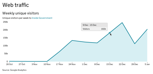
As departments and other organisations move to Inside Government, visitor numbers are expected to climb.
As with the GOV.UK dashboard, a range of modules help people understand how Inside Government is being used. But we haven't simply copied the GOV.UK modules, instead we've looked at what would be most appropriate for the type of data and content covered.
Weekly unique visitors

The weekly unique visitors module tracks visitors per week to Inside Government. As more organisations join, we’re expecting an increase in traffic over the coming months, but each department is unique so this increase won’t always be the same.
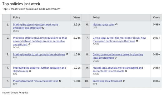
Top policies

The top policies module looks at policies which have received the most views over the last week. The results can vary depending on press coverage, public interest and if a new department or organisation has recently joined Inside Government.
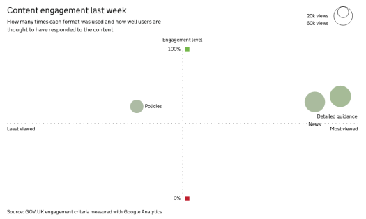
Content engagement

The content engagement module plots views to three types of Inside Government content (Detailed guidance, News and Policies) against their estimated engagement level.
The criteria used to define 'engagement' is outlined in the paragraph below. Our product managers and analytics team worked together to define the criteria for these formats. They looked at existing data, feedback from user research and drivers for publishing. Engagement metrics will be used in conjunction with other testing and feedback. Our criteria for determining 'engagement' will be refined as we learn more about how Inside Government is used.
Detailed guidance format
An example of Detailed guidance is Changes to the driving licence and categories.
An engaged user will be one who arrives at a detailed guidance item, spends at least 30 seconds on the content; or clicks on a link in the body of a page including related detailed guidance and also including anchor links.
News format
An example of News format on Inside Government is Cash boost to tackle local pinch points.
An engaged user will be one who arrives at a News item, spends at least 30 seconds on the content; or clicks on a link within the body.
Policies format
An example of the Policies format is Boosting private sector employment in England.
An engaged user will be one who arrives at a Policy item, spends at least 30 seconds on the content; or clicks on the main body of a page, including tabs, but excluding anchor links on first page.
About 'usage' not 'page views'
Much of our content is spread over several web pages. For example, a single policy may have three or more pages. We’re often interested in how the content is used, not the number of times any one of its pages was viewed (although that may also be of interest).
Web analytics tools don't always detect that two pages are related, but we do, and that’s what we’re tracking. To do this, we’re measuring ‘views’, where a ‘view’ is counted once regardless of how many pages were actually visited. It’s not the same as a page view, and for good reason.
Data feeds
Here are the json urls for the data driving our new dashboard:
Note on these urls: these are the internal urls we use, and they are are subject to change. ‘Content engagement’ in particular is an evolving concept, and our ‘engagement’ criteria for this may be updated as we learn more about actual usage.
Looking forward
Future iterations will see new modules added and further iteration based on user and departmental feedback. You can see the current version of the dashboard at www.gov.uk/performance/dashboard/government.


5 comments
Comment by Martin Owen posted on
I have worked in several different Civil Service departments. They all use different software (usually databases), to do basically the same job. I understand there may be issue's with adapting the software and also with licencing, but surely it would be more economical for departments and agencies to share software, rather than continuing to re-invent the wheel.
Comment by VITweeple posted on
Maybe I've overlooked them, but I'm not finding share widgets (FB, Twitter, etc) in your this post. Cheers and kind regards.
Comment by Ed Horsford posted on
I don't believe we have them on the blog posts. However you can mention @GDSTeam, or link directly of course. Cheers
Comment by Graham Lee posted on
Why are you using the 'k' abbreviation for figures in 'top policies' table, when these barely make it into the thousands?
It would simpler and clearer to say:
'860' (three characters) rather than 0.86k' (five characters)
'2510' (four characters) instead of '2.51k' (five)
('2,510' - with the comma separator - would use the same amount of characters and wouldn't require an abbreviation.)
The figures seem pretty low. How do they compare with stats for the websites they've replaced?
How are the other 63 policies performing? And are many users looking at information under the 'detail' or 'latest' tabs?
How are users arriving at the microsite? Are you getting a lot of traffic from redirects, or are people getting there through search or the prominent promo on the GOV.UK homepage?
There are no detailed statistics on the performance of specialist guidance, which is worrying given this probably represents a huge amount of content, and a big challenge for many organisations contemplating migration to the single domain.
Similarly, there is no data on other parts of the site - eg consultations (important, one would have thought, if we're looking at engagement levels).
More stats please!
Thanks,
Graham
Comment by Ed Horsford posted on
Hi Graham,
We're abbreviating numbers to make them simpler and easier to compare. For consistency all our modules use the same rounding. Whilst 2,510 may be the same number of characters as 2.51k, in most cases such a number will appear with other numbers also in the thousands or even hundreds of thousands, and we want them all to be comparable and consistent.
As the dashboard gets more use, we'll evaluate the threshold at which abbreviation occurs to ensure it's set at the most appropriate level.
Though this dashboard doesn't currently have details on all areas of Inside Government, our analytics team is actively monitoring other metrics about it's usage. We have lots more planned for the dashboards in the future which should hopefully address some of your ohter queries.