GOV.UK marked its 7th birthday last month. We’re rightly proud of the work we’ve done on GOV.UK since its launch in 2012.
We’ve taken nearly 2,000 government websites and combined them into a single site. GOV.UK is now the government’s trusted online communications and public services channel.
We support nearly 14 million visitors a week to find the information they need and to do the things they need to do with government – like learning to drive, registering to vote or finding out what they need to do to prepare for Brexit.
And, after all our effort to cohere and create consistency across the whole GOV.UK estate, it now works pretty well for users who know what they need to do, or what they want to find out. Like renewing your passport or subscribing to travel advice notifications for your next business trip destination.
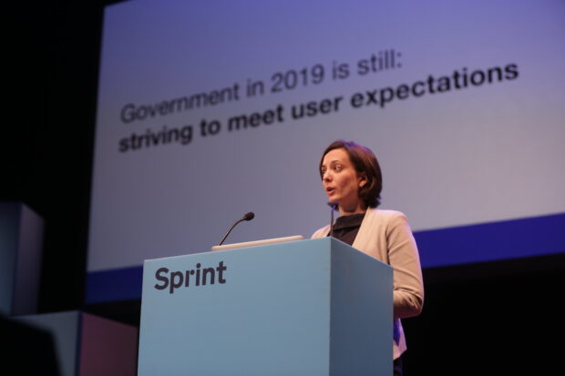
But over these last 7 years, both technology and user expectations have changed in profound ways. GOV.UK can’t continue to expect to rely on a reactive engagement with our users or to think of ourselves simply as ‘a website’. Instead, we have to shift to an offering that is proactive, low-friction, channel-agnostic and more rapidly iterating.
In practice, and on a consent-based model, this means informing users of things they need to do, helping them understand the things they may not realise are relevant to them, guiding them through complex life events and getting them to the next stage in their task. This means we need to look beyond discrete, singular transactions to whole-user journeys.
This has been our aim on GOV.UK for a while. Lots of our work over the past couple of years – such as structuring content around topic areas and building step by step journeys into GOV.UK has pointed in this direction. Now we have a vision and a plan, and we're developing a model for how to do this.
Working on whole topics – like starting a business – we will start from the premise that we want to give the right people the right access to the right things at the right time, in the way they want to consume and receive that information.
This is the next big phase of GOV.UK.
Everything based on consent
Our ambition is to serve users based on the way they want to interact with government.
While some users will want to share as little information as possible, some will want – and expect – government to effectively use data about them, and about the thing they are trying to do, to deliver a better service.
We’re researching, testing and designing the basis of a consent model that supports the spectrum of user needs about sharing data. We’re thinking about how such a model could be applied across GOV.UK and the value it would derive.
This work is reliant on a secure and privacy-centric digital identity ecosystem – which is provided through government adoption of the UK’s digital identity standards. It is also reliant on government being able to share data across departmental boundaries when there is a need.
Our work on Brexit has really highlighted the need to explore this potential. With the Brexit Checker, which provides links to content and services after users complete a checklist, we have been able to get as close to a ‘personalised’ set of results as is possible without actually collecting any data about the individual user. It does a pretty good job – and returns over 19,000 variations of the results page – but we know from research that users want an even more customised set of actions.
To be explicit, users who want to access GOV.UK and read information will always be able to do so as they can now. People who want to provide information just at the point of need will still be able to complete individual transactions. And people who want their data joined up and used will be able to receive a more proactive and relevant service from government.
Joining up analytics
In a parallel but separate piece of work, we are also looking at how we can use anonymised data across the whole of the GOV.UK estate to give us a consistent understanding of how GOV.UK is being used and how people interact with government online.
Although GOV.UK looks like a single ‘thing’ to the user, in practice the architecture is more complicated. Individual services are operated by individual departments (for instance, the part of the site where you apply for a passport is run by the Home Office), each of which conducts its own analysis of site usage.
What this means in practice is that we don't have a consolidated view of user activity across GOV.UK, which seriously limits our ability to iterate the platform in line with user needs and at scale.
Joining up analytics on GOV.UK has been something we’ve wanted to do for a while. We have been engaging with relevant departmental colleagues and with our minister since the start of the year on exactly this ambition. Eager watchers of GOV.UK will also know that this was trailed by my predecessor, Neil Williams, and those before him too. Indeed, the fact that we do not already have cross-domain tracking across the whole GOV.UK estate is unusual, as for most digital organisations this is considered standard practice.
Having joined-up analytics will allow us to design products in the way that people actually use them – not in the way we think they might be.
Meeting users where they are
Unlike many publishers or commercial organisations, we’re not incentivised by statistics like page views or the number of visitors. Our interest is in making sure we are where the user is.
Taking a channel-agnostic approach means recognising that content designers, publishers and product teams in government are no longer designing for a desktop view. They are producing services and information that are already being consumed predominantly on mobile – and may soon be consumed by channels we haven’t even thought of yet.
You might have read about our work to accelerate delivery via voice assistants, and we are making further inroads into how we present information in a better way in search engines too. We want to move to a model where we structure information once so it can proliferate across whatever medium the users wants to access it on. The rate of change in technology and user expectation is rapid. We must continue to change with it. It won’t be easy!
Tackling whole problems
Our work on Brexit has been a lived example of exactly how we want to work on ‘whole problems’. Brexit is the first at-scale example of how the GOV.UK team have brought together all the individual services and pieces of information available in order to deliver a joined-up, complete and user-centred service.
We’re already looking at the next topic areas that we may want to work on with colleagues across government, and now need to accelerate how we do this. Having a single view of users and their needs will enable all of government to work together to tackle whole problems, ensuring we can proactively help users not just with single transactional services, but with whole user journeys.
This brings together all the elements I have talked about above.
It’s about government understanding its online performance based on anonymised user data – from end to end.
It’s about government developing the methods through which users can choose how much data about themselves – and about a thing – they want to combine in order to receive a more proactive, tailored and low-friction interaction with government.
It’s about offering a whole spectrum of services based on consent – from browsing content to signing up for push services.
It’s a GOV.UK built not just for user needs, but around user needs.
It’s the next big shift in the way our digital public services are delivered by the government.
Read more about the work we're doing on GOV.UK on the Inside GOV.UK blog.


3 comments
Comment by Jason Weakley posted on
Watching your progress from the United States, and loving what I am seeing.
Comment by Sean Craddock posted on
Loving the direction and ambition.. And very happy to see you're getting those onward journeys cross-domain tracked, success measurement will be that little bit easier once that's done!
Comment by Emmanuel Quarm - CEO , Teksolutions Inc.Ltd posted on
Very impressive and as far as I can tell , the user interface is very responsive . Making it easy to navigate and browse through much more quickly and conveniently.