Earlier on in my career as a content designer someone once said to me that no one reads government websites for fun. When you work on GOV.UK every day, it can be easy to forget what it’s like for someone who isn’t as familiar, someone who needs something urgently, or someone who needs to do a thing with government before they can get on with the rest of their ‘to do’ list.
Even though I haven’t set up a business myself, I know that browsing more than 50 pages to do so is the opposite of fun.
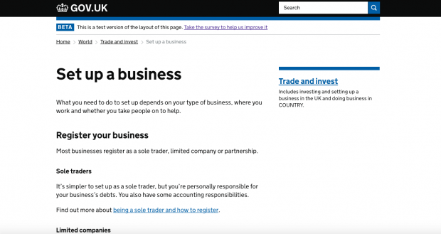
In a recent project to improve guidance for new businesses, we reduced that number of 50 down to 16 pages. As a result of our changes, we observed:
- a 25% increase in clicks to services that people need to use when setting up businesses – showing that more people were finding what they needed
- a 5% decrease in average numbers of pages per session to get to those services – showing that users were getting there more quickly
Of course, we didn’t set out to get rid of a specific number of pages. We started with user needs and talked to people from the very beginning and throughout the project.
Start with needs
We started with fresh pieces of paper, post-its and minds. For example, we had a feeling that ‘Avoid and report anti-competitive activity’, whilst important, wasn’t the first thing that sprung to people’s minds when starting a business.

We reviewed existing user research that helped give us an understanding of how people think, and go about starting a new business. Their actions, emotions and pain points were recorded on experience maps. One of the main findings was that their interactions with government were limited to compliance-driven needs. These were seen as peripheral to users’ mental model of starting a new business.
We combined these findings with data on what users are searching for and looking at now and drafted a list of user needs. We then talked to more people in the process of setting up their business. This helped us refine the list of user needs and confirm what the priorities were for our users:
I’d never go to government for help and advice, no… When it comes to tax, and limited company, then I’d go to government.
Users don’t care who does what, so we need to work together
When I say ‘we’, I don’t just mean Government Digital Service (GDS). GOV.UK content for the general public and small businesses is called ‘mainstream’. This is published and maintained by GDS, who work with government departments and agencies to ensure the facts are right.
But people don’t care about internal processes – they just want to ‘do the thing’ (for example, set up their limited company, or register for self-assessment).
We’ve always worked together to:
- validate user needs
- identify further pain points with existing content with ‘cognitive walkthroughs’
- develop content plans
- review, redesign and rewrite content
- check the facts
- plan for major changes (unpublishing, redirecting)
- establish evaluation frameworks
‘We’ included content designers, user researchers and subject experts from Companies House, Department for Business, Energy and Industrial Strategy, HMRC and GDS.
Be bold and unpublish
It can be nerve-wracking removing content that’s been there from the very early days of a website. It might be well-established in search engine results, have lots of referrals from other sites, have thousands of unique page views a day. However, if the findings from user research and analytics suggest that it’s not working, then you have two options:
- Do nothing, learn nothing.
- Be bold, do something and learn from it.
This is easier said than done. We found that real quotes and videos from user research helped show that change was needed. We also visited and talked to business support helpline advisers to share new content with them and listen to their feedback.
It’s also useful to make it clear:
- how users will be redirected from any pages you’re removing
- that you plan to measure the impact of the change
- that your solution isn’t etched in stone and you’re open to trying something else if the new approach doesn’t work
Talk to users, then talk to them again
We talked to people setting up businesses throughout this project, not just once. Not only was I inspired by those starting a new venture, I learnt something new every time and was motivated to make improvements after every session.

The last round of user research showed that the guidance provided on setting up business types is clear and, despite some minor issues, users were clearer about what to do for each business structure. We met people who hadn’t fully decided, and in most cases they felt that the content made them more confident about the best structure for their business:
It’s clear and easy to use. I could have written that myself.
Unlimited partnership
One of the most positive experiences on this project was the way in which we were able to draw on evidence from both data and user research to make the case for change. And this doesn’t stop when we hit the ‘publish’ button (or the ‘unpublish’ button).
We’ll keep evaluating how well GOV.UK is meeting the needs of people starting a business in the UK, and collaborating with our colleagues across government to make it better. We’ve also shared feedback on GOV.UK search with the teams working to improve how people find things.
We’d welcome your feedback on the ‘Set up a business’ pages on GOV.UK.
Follow GDS on Twitter, and don't forget to sign up for email alerts.


12 comments
Comment by Rie Aleksandra Walle posted on
Hi there, thanks for sharing such an insightful post! What methodology(-ies) have you been using throughout the process? Would be grateful for links and relevant resources. Greetings from Norway!
Comment by Jeni posted on
Hi Rie,
Greetings and thanks for your kind feedback. Happy to share some links and resources with you. These are all government posts published on GOV.UK blogs that help explain our processes but of course there’s lots of inspiration out there from beyond government. Hope you find it useful.
This blog post sets out the methodology of the initial user research, which gave us insight into people’s experiences and approaches to setting up a business:
https://userresearch.blog.gov.uk/2015/06/17/researching-and-mapping-your-users-current-experience/
We then combined this insight with data to develop a set of user needs. For example, we looked at what people were searching for on GOV.UK to give us an indication of what people needed, what pages people were visiting (keeping in mind that it doesn’t necessarily mean that page is meeting the need) and behaviour on the site (such as exit rates, the next page they visit). We wrote these needs following the format set out here:
https://www.gov.uk/guidance/content-design/user-needs
We did more research to check and validate these user needs. This page sets out a methodology for user research (we ran lab sessions):
https://www.gov.uk/service-manual/user-research/plan-round-of-user-research
We mentioned ‘cognitive walkthroughs’ in the blog post and we should have linked to this blog post!
https://insidegovuk.blog.gov.uk/2016/04/07/how-cognitive-walkthroughs-can-help-with-content-design/
As Holly says, it’s often hard to know how to best use the insights from discovery research. This really helped us develop our content plan so that we could prioritise things to investigate further (with even more data).
If it’s of interest, we also used Trello to manage and track the progress of our content plan actions. Alan talks about GDS’ use of Trello here:
https://insidegovuk.blog.gov.uk/2017/03/13/how-we-use-trello-on-the-gov-uk-publishing-platform-team/
There’s a lot of guidance for content designers on writing here:
https://www.gov.uk/guidance/content-design/what-is-content-design
What I valued most was pair-writing with colleagues across departments, content crits and setting content principles to keep in mind throughout the project. Here are some links on that:
https://gds.blog.gov.uk/2016/09/21/it-takes-2-how-we-use-pair-writing/
https://insidegovuk.blog.gov.uk/2016/03/03/content-crits-conquering-through-collaboration/
Jeni
Comment by Paul Grayham posted on
Very interesting, thank you. Particularly like the "unpublish" approach, or what others may call a de-cluttering approach. It's certainly behaviour which fits in well with HMRC's values and particularly innovate.
In the near future I may be using these pages for real myself, so it's great to hear it's based on "real life" experiences and not just a designers perception and that you provide links to the new pages.
How long did this process take from brainstorming to go live?
Cheers
Comment by Andy Keen posted on
There's quite a lot of history on this one! We started working with BIS (now BEIS) to clarify the proposition for small businesses on GOV.UK soon after the site launched in 2012.
These discussions led to some really insightful user research in 2013, which informed early work on the content improvement project described in Jeni's blog post. The research involved creating 'experience maps' from interviews with people who'd recently started their own business:
https://userresearch.blog.gov.uk/2015/06/17/researching-and-mapping-your-users-current-experience/
We then picked up the the thread towards the end of 2015, getting content and policy people together across GDS, BEIS, HMRC and Companies House in a collaborative effort to apply what we'd learned about users to GOV.UK content. After two more rounds of user research, we published the second phase of changes in January 2017 - so just over a year in total.
Comment by Ben Rusholme posted on
Great work, nice clear guidance that is easy for me to understand. Excellent content design makes such a difference.
Comment by A Gill posted on
Your said that your changes led to "a 25% increase in clicks to services that people need to use when setting up businesses". I just don't understand why you're making them click more, not less. Surely you should be minimizing the clicks/reading/forms needed to set up a business?
Comment by Andy Keen posted on
We are reducing the number of clicks - 'a 5% decrease in average numbers of pages per session'. The 25% increase is in referrals to business registration services, like setting up as a sole trader with HMRC, or a limited company with Companies House.
Hope that clears things up!
Comment by Peter Jordan posted on
I'd suggest editing the most to change it to 'referrals to referrals to business registration services' it's clearer and more accurate. 🙂
Comment by Andy Keen posted on
Fair point, but we thought 'clicks to services' was clearer for people who aren't familiar with analytics terminology.
This is a great example of the kind of clarity vs technical precision content dilemma we faced throughout this project, incidentally...
Comment by Stephen posted on
Be bold! great advice. If the answer to 'what's the worst that can happen' isn't that bad...publish it and see what happens.
Comment by John posted on
Great advice - especially the ways to get over the hurdles of unpublishing
Comment by Tim posted on
I like your approach