Yesterday we released 83 dashboards. We wouldn’t normally plan to release like this. We like to do little and often. However, on this occasion, we have a new overview dashboard which we've released for 82 services.
In addition to these we also released a dashboard for IPO Patent Renewals, one of the exemplar services, and changes to the Performance Platform homepage.
Why so much?
Currently there are two places where you can find performance information on government services. The Performance Platform and Transactions Explorer. Service managers have told us this is unhelpful. They want all their data in one place.
It is also confusing for users who are looking for something specific. Why should you need to look in two places?
To improve this, we’ve combined the two sets of data into a single dashboard for each service on the Performance Platform. This release includes all the high volume services; those with over 750,000 transactions. We’ll do the same for the remaining services soon. In the meantime, the latest data (up to December 2013) is now available for them on the Transactions Explorer.
What’s new?
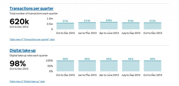
The 82 new overview dashboards show quarterly data for transactions and digital take-up which was not shown in the Transactions Explorer. This provides a bit more insight into how the service is performing.
Home sweet home?
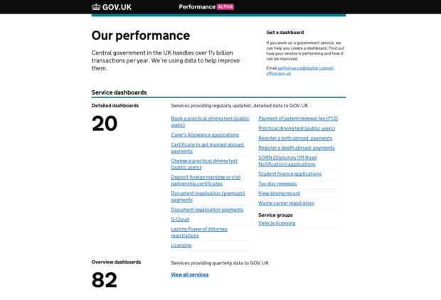
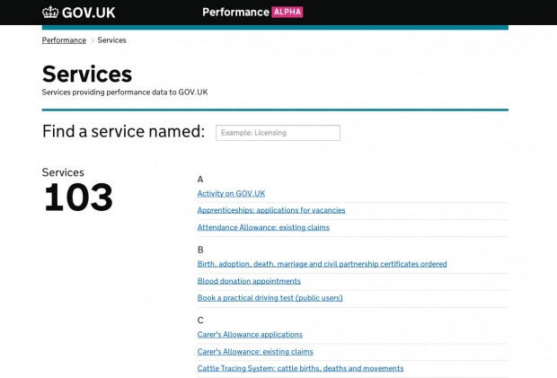
We knew that to successfully transition 82 dashboards to the Performance Platform we would need to make it easy for users to find the dashboard they are looking for, so we made some tweaks to the homepage and brought back the services page. This is a temporary solution, but we hope a filterable list on the services page which lists all the dashboards will make it easy enough while we work on designs and search.
What else?
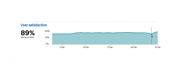
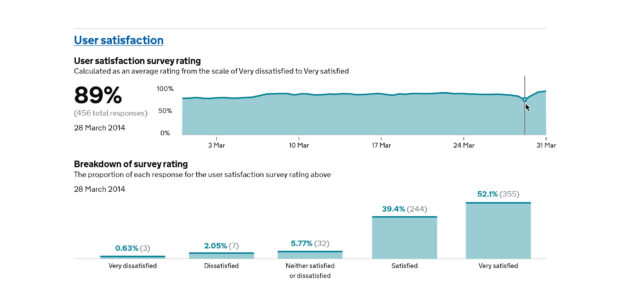
We've also released a dashboard for Patent Renewals, an Intellectual Property Office transaction and one of the exemplars. The dashboard is one of the first to have user satisfaction data which is taken from the done page surveys on GOV.UK. At the moment this visualisation shows the average response.
We are already working on improving this to show the breakdown of responses from very satisfied to very unsatisfied and that will be released soon.
This week has been really exciting for us as a team. Releasing 83 dashboards in a day is more than we did in the whole of last year. We will need to spend some time iterating and improving what we have, but expect to see even more dashboards on the Performance Platform in the coming weeks. In the meantime, take a look at the new dashboards and let us know what you think.
Join in the conversation on Twitter, and don't forget to sign up for email alerts.

4 comments
Comment by Ric posted on
With the number of services increasing, is there a way to compare best to worst performing or is this something that is planned? For example: taking a random selection of services it seems that digital takeup has been relatively static. Are there some services where it is increasing more than others and if so why?
Comment by Matt Harrington posted on
In the Transaction Explorer you can sort departments by transactions per year. You can also sort high volume services by digital take-up, total cost, cost per transaction and volume. We are working on some analysis at the moment which we hope to blog about next week. A CSV of the data is also available.
Comment by simonfj posted on
Whew! That's impressive.
One question, now that you've got a pretty slick system in place.
Will/are you sharing what you're doing/have done with the local.gov guys?
Obviously it makes sense to standardize these approaches in gov as much as possible, so that we can 'raise all boats' (domains) to the same technical standard (and don't have to reinvent wheels).
Comment by Alice posted on
Well done GDS