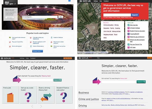
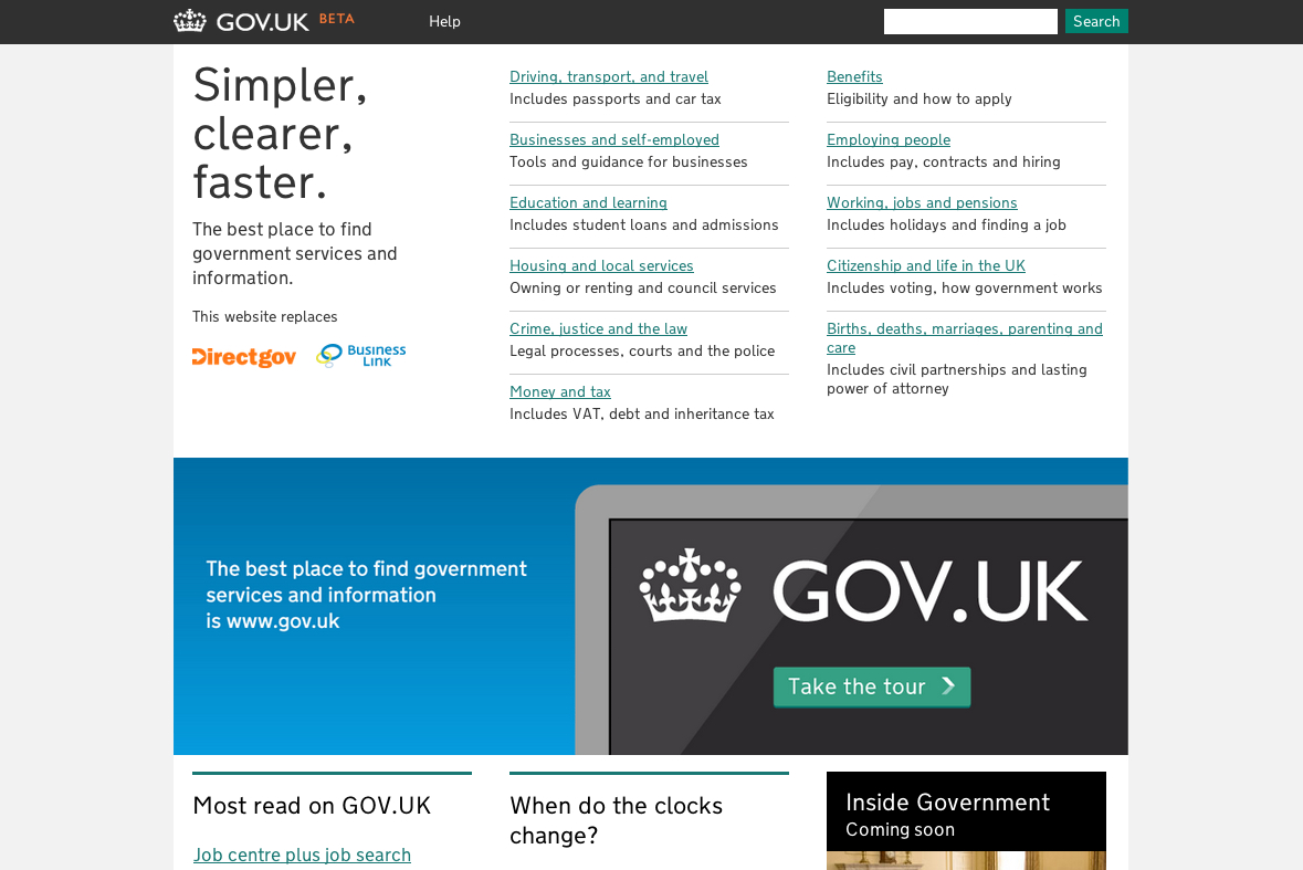
Yesterday we released the latest version of the homepage. It’s significantly different from any of the other homepages we’ve released so far, but it’s the one that’s tested the best and the one we’re happiest with.
Back in April last year, when a small group of people were starting to think about an alpha for GOV.UK, the expression “Google is the homepage” was coined. This came from data that clearly showed users begin their journey on a search engine, usually Google, and then search for ‘bank holiday’ or ‘minimum wage’. Ideally they then arrive at the page they’re after with the information presented in a clear, simple way and then they finish their journey.
So we espoused the “Google is the homepage” mantra and created simple, clear 'landing' pages.

People often misunderstood this to mean we thought the homepage should look like Google. We compounded this problem by making the homepage look like Google. Partly this is because the alphagov team ran out of time, but it’s also because we were thought that search would be the easiest way for people to find information, so we promoted that on the homepage.
But in testing the site, we started to find something else.
Over time a clear picture began to emerge from user testing. The people who visit the homepage do so because they are lost. They're not on the right page, and they're not comfortable using search, so they go to the homepage to try and help them find what they're looking for. By browsing, not searching.
We were right that 'Google is the homepage' for about 65% of users, but we needed an alternative for everyone else.
So we began to redesign not only the homepage but the bread crumb navigation, the category pages and the structure of the categories themselves, iterating on our original designs to help those people uncomfortable using search.

The homepage now contains a very clear, very simple set of categories that enable you to quickly find what you were looking for. It also serves as reassurance you're on the official government website, something else users who were lost required. The search box is still there in the top bar, and people who are comfortable with search know where to find it.
The new page tested really well.
This may seem like an obvious decision, too obvious to warrant a blog post. But this story illustrates one example of how we're analysing data, making product decisions, iterating, user testing, iterating again, user testing again, and then if we're wrong we change that decision.
We’ll keep testing this homepage after it goes live on the 17th, to see how it stands up to millions of people using it every month. If we find it needs to change again, then we'll change it.


18 comments
Comment by O que funciona para o Google pode não funcionar para você | Neurônio Digital posted on
[...] Tradução livre de trecho do artigo Why we’ve changed the homepage [...]
Comment by Web Technologies | gov.uk goes old school posted on
[...] The reason for this dramatic, step is based on user testing and the discovery that: The people who visit the homepage do so because they are lost. They’re not on the right page, and they’re not comfortable using search, so they go to the homepage to try and help them find what they’re looking for. By browsing, not searching. We were right that ‘Google is the homepage’ for about 65% of users, but we needed an alternative for everyone else. Ben Terrett, GDS blog [...]
Comment by Jon Flitton (@Flitmonkey) posted on
In the old days we had these things called books. At the front was a contents page so you could find the relevant section. Then later on - i guess - someone added, at the back, the index where you could search for what you wanted. They were around for a long time and had lots of testing - not many abandoned the contents page.
Comment by Finding your way around GOV.UK | Government Digital Service posted on
[...] user feedback was “No browse navigation”. Once we tested our assumptions about search and the homepage against users it was clear we had to iterate towards something better with browse too. I think we [...]
Comment by Working towards launch | Dafydd Vaughan posted on
[...] past week, we’ve released (and written about) the new homepage design, updated browse categories and the removal of the search ‘auto suggest‘ feature. [...]
Comment by Matthew posted on
'Rubbish' doesn't feel like it should belong in 'Housing'.
On the general design, it reminds me of a bad council website from about 4 years ago. That's probably not a good thing!
Comment by James Geddes posted on
Yes! I love it. Thank you. Search works in precisely two cases: (1) you know exactly what you're looking for (personal desktop); (2) there's some clever way to order the results (Google PageRank). "Subset sites", like this, are neither. Browse is right. Browse is how to find what you need when you don't know what you need. Browse teaches you what to look for. Brilliant.
Comment by Dan posted on
I think the new site is relying on meta data heavily. None or very few signs and icons whic hare most importanht for the average web user to visualise the layout of the site. The category headings/topics are not accurate and contain services belong to other topics. I appreciate your new selling point saying a lot simpler, cleaner and faster but it is not because it looks very basic with some links in the middle content column, no banner in the header to make it more official and it is not simple to find information or your way round in the current design. This is all good for the average person with average IT skills but what about those with less IT skills, the elederly , disabled and visual impairment users. Please make more use of icons and signs to help the latter group of users.
Comment by Sara Head posted on
I know elderly and disabled people who are 'the average person with average IT skills'. I don't think being elderly or disabled or visually impaired or etc. means you have any fewer IT skills than anyone else does it?
Comment by Dan posted on
Sorry was meant to say special attention needs to be given to the needs of diffrent groups of potential users i.e font size and colour control for the visual impairment etc.
Comment by spydergrrl posted on
Since Google is the starting point for so many visits these days, deep-linking users into the website, I'm curious as to why you aren't using a mega menu? Why the reliance on the breadcrumb, effectively forcing users to go to the homepage or search? Are you planning to add mega in the future, to enable people to access the categories and subcategories no matter where they find themselves entering the site?
Comment by Graham Lee posted on
I think this looks really good - much better than the previous version.
Some of the categories may need refining.
Breadcrumb trails are sometimes fairly long - eg for lasting power of attorney:
Home -> Births, deaths, marriages, parenting and care -> Lasting power of attorney, being in care and your financial affairs
And there are some anomalies in the categorisation - eg mental health tribunal doesn't belong in 'Reporting crimes and getting compensation'.
Also, not sure if debt and bankruptcy info belongs under 'crime, justice and the law' (esp as teaser tax for 'money and tax' says 'Includes VAT, debt and inheritance tax', but I'm sure this can be improved with time and testing.
Comment by Tim Blackwell posted on
It's a huge improvement on the earlier iterations. Only remaining niggle is the scratchy font - worse in IE9 and Firefox than Safari, but intermittently present in all three.
Comment by Tony O'Grady posted on
Hi,
interesting change in homepage 'philosophy' - I'm glad you're being so open about the process although I was surprised to see such a significant change this close to launch. On the other hand, this late change shows you have belief in your testing/feedback mechanisms and that your constant delivery model is working.
Regards the suitability of a blog post - such a change is only obvious after the test results and reasoning have been explained.
Good luck on the 17th.
Tony
Comment by Jeremy Hurst posted on
Search engines evolved to where Google is today, and this was down to practical results based research that suggested the majority of people are prepared to use a search box if it is made simple for them to use, and if the end results are filterable acccording to the user preferences. Most of the successful websites online today follow a similar format, allowing customisation of results to cater for individual requirements, and personalisation is increasingly prevalent that will only become more so over the next few years.
What you seem to have done here is to take a step backwards, and the menu based interface reminds me of the old Yahoo! or DMOZ interfaces, which is not necessarily a good thing. This may have detrimental effects when you unleash it on the general population, as there are infinitely better ways to allow browsing around a complex data driven website. If the user is unclear of which directory headline he/she should select, they could easily get lost within the site, and while the site does have a search, the options within the search are extremely limited if somewhat non-existent.
Take a look at the search function within http://www.businessanswers.info which we designed about two years ago - the filtering options allows for some very advanced search queries, it can trawl for information from approved other websites, and the Business Link consultants (who the site was designed for) could augment the knowledge base with more specific answers, enabling the database to become self learning.
While I appreciate that you could design anything because if the public wants to find out information they are going to have to use this site, it would be interesting to see what would happen if there was any 'competition' from a site that was developed with some more focus on user experience.
Comment by Chris Jones (@MyFavouriteCake) posted on
I'm not sure there are "infinitely better ways to allow browsing" as you state. If there were, then I'm sure you could provide some more examples. Or any of us could for that manner, with proof of what's actually working.
I'm also not sure about the example that you chose. Having looked at it, I think you're also doing this incorrectly. Your "Ask a question" search box, doesn't seem to be geared to allow actual questions to be asked. For example, if I ask it "when do I register for vat? " I get 0 results. Searching for VAT alone, provides me with some hits however.
I feel like I do have to stick up for the GDS Team here, as quite simply they are doing their best to understand the needs of their customers. They already said the search box provided the functionality for 65% of their users. The fact that they are measuring what their users needs are is way more than most companies do.
Comment by alexcoley posted on
Looks like Directgov five years ago without the orange.
Comment by Owen Boswarva (@owenboswarva) posted on
I agree with Alex's comment. It's nearly there but you need to bring back the orange.