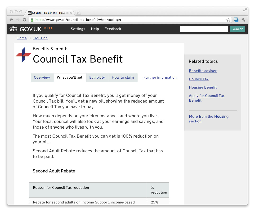
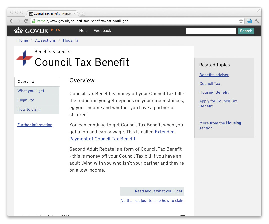
We’re doing a lot of user testing over the summer, and Sarah Prag has a quick update on a couple of things we’ve already changed based on what we’ve learnt so far.
Thanks to our colleagues in the Insight team we’re benefitting from a full programme of user testing this summer, using a range of methods. Kate Cook and Nick Breeze from that team will be sharing more about the approach in a separate post, but I wanted to share a few quick headlines about things we’ve already started to change or work on as a result of the testing.
One clear message coming through is that users really like the style and presentation of the information on GOV.UK - praising the language used and the lay-out of the content. So we’ll be continuing to write more content using the Style Guide and formats that we’ve developed.
Where we do need to focus some attention is on helping users to find and navigate around the content, and there’s a lot of work in progress to make this as simple and intuitive as possible.
In the last week we’ve added a “Home” link to the top of every page, to sit alongside the “All sections” link. Before we added this the only way back to the home page was to click on the GOV.UK logo, but we’ve found in testing that very few people realised they could use that.
We also discovered that people were confused by some of our content (Guides, like this one) having tabs for chapters vertically down the left, whilst other content (Benefits, like this one) were laid out with horizontal tabs across the top. We’ve therefore switched the navigation tabs for Benefits to the left, to be more consistent and will now be able to make further iterations to both of these formats in tandem.
We know that our search results aren’t yet as helpful as they should be, and the testing has confirmed that, so work in underway behind the scenes to improve this. In the meantime a change will shortly go live which will simplify the way we present search results. Previously there were two links in each result, one to the content and the other to the section it was associated with, but this was a bit of a red herring which led users down the wrong path. We've therefore removed the section link from search results and also from the listings on our browse pages. The brightly coloured format icons next to every result were also a distraction so these have gone too.
These are just a couple of things we’ve already changed off the back of the first round of testing, with other work still in progress. There’s been a second round this week which has highlighted some further improvements we can make and with two more rounds planned over the coming weeks you can expect to see a lot more iterations!


12 comments
Comment by Rebecca Buckingham posted on
Have you done any eye tracking on your top level pages to test hotspots ? We're redesigning kent.gov.uk and are following a similar IA to the excellent GOV.UK.
If there's evidence to back it up, we may locate content on the landing pages in line with hotspots. For example, do people tend to home in on the top left content but miss stuff in the middle column?
Comment by Introducing today’s release | Government Digital Service posted on
[...] product team have been focused on helping users to find their way around GOV.UK. As I mentioned in my last post, user testing over the summer has shown that the style and presentation of the content goes down [...]
Comment by bibibaby posted on
Would be very interested in finding out the results of those questions about right-hand nav too. Interesting blog, looking forward to reading about the methodologies.
Comment by Steph Gray posted on
+1 for Jukesie's question: to what extent do users (a) expect the right hand side of a page to be about related stuff; and (b) ever look at/use it?
Comment by Emma Cleary posted on
Interesting post, incidently, we have done user testing on our wolverhampton.gov.uk website and the same users issue occurred. We are looking to make the same changes i.e. home button, refreshing the left hand nav and improving the search, amongst other things. Willing to share our user testing research when the conclusions are signed off, look forward to seeing your findings too, especially if there are other similarities.
Comment by Jukesie posted on
I'd be interested to know how your use of the right hand 'Related topics' menus fared during the testing?
Comment by LizH posted on
Navigation - the navigation confuses me as well. It is apparently flat - so perhaps thinking people can treat it like You Tube and search for something amusing and then keep clicking on related content. BUT I'm currently migrating from Business Link, and I looked at the International Trade section. To be able to understand what the section was about and where different aspects of International Trade fitted together I found the following pages very useful:
http://www.businesslink.gov.uk/bdotg/action/layer?r.l1=1079717544&r.l2=1087336649&r.s=m&topicId=1087335890
http://www.businesslink.gov.uk/bdotg/action/layer?r.l1=1079717544&r.l2=1077717231&r.s=m&topicId=1079717544
http://www.businesslink.gov.uk/bdotg/action/layer?r.l1=1079717544&r.s=tl&topicId=1077717231
http://www.businesslink.gov.uk/bdotg/action/layer?r.l1=1079717544&r.s=tl&topicId=1084228483
http://www.businesslink.gov.uk/bdotg/action/layer?r.l1=1079717544&r.l2=1084228483&r.s=tl&topicId=1084228526
By using these pages I started to understand about International Trade; they also helped me to decide what to read and in what order. Where are the equivalent pages on gov.uk?
Comment by Etienne Pollard posted on
Hi Liz
I don't have the exact mappings to hand for those BL guides, but the information they cover is handled by the guides and tools listed in this category: https://www.gov.uk/browse/business/imports-exports
Etienne
Comment by Learning from user testing via Government Digital Service… « Kind of Digital Exchange posted on
[...] Learning from user testing via Government Digital Service…Learning from user testing [...]
Comment by Jan Vertonghan posted on
Most of the points raised here point to people not liking change. There is a format to writing and creating sites, and users are unsettled when such 'rules' are not adhered to. These rules you learn and strong with the force you will be
Comment by jon posted on
Very funny post indeed. Strangely folks didn't get on with the non standard elements, shocking news. Maybe with the masthead logo a bit of breathing space and less authoritative use of colour would have helped. good luck with the project - really shaping up.
Comment by Fats Brannigan posted on
' ... we’ve added a “Home” link to the top of every page, to sit alongside the “All sections” link. Before we added this the only way back to the home page was to click on the GOV.UK logo ... '
This post is a spoof, right? I mean, you have all built websites before, haven't you?