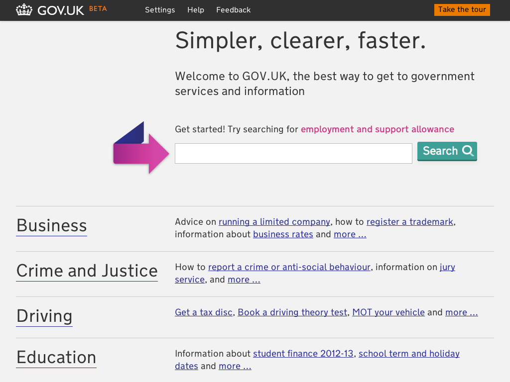
After we launched the iteration of GOV.UK two weeks ago we received a lot of feedback via Twitter and email regarding the changes we had made to the visual design of the site. Alex Torrance, User Experience Designer at GDS explains how that feedback is being used to shape a homepage that meets the users needs.
The majority of the feedback we have received over the last two weeks was about bugs or issues. Measurable, definable and – most importantly – reproducible problems that we can log and fix. You have already seen how we have responded to the feedback about the font and worked to fix those issues. However some feedback, especially regarding visual design, is more subjective and is harder to respond to.
"I also believe that the colour scheme of the website should be red."
As the homepage redesign was a radical departure from the previous design, it provoked a lot of feedback, both positive and not so positive.
The carousel received the most negative feedback, including issues affecting browsers and OS combinations we hadn't anticipated in our testing and people raising usability issues, as well as more subjective feedback regarding the design of the icons, the validity of the carousel as a navigational tool and differing opinions on whether the carousel should automatically scroll or rely on user interaction.
"The carousel is something of an unnecessary gimmick at present"
We also did some guerrilla testing which revealed that people weren't aware of the browse sections below the carousel, and didn't scroll. As one of our priorities for the user experience of the site relates to navigation and discovery of content this is something we needed to address, so in the latest iteration released yesterday we have made the sections more prominent, which will hopefully expose areas of the site to users who would prefer to browse rather than search.
We will be listening to feedback and conducting user testing over the coming months and will be iterating the homepage design regularly. While we are in beta we want to experiment with different ideas and designs and work our way towards a homepage that meets the needs of our users.


2 comments
Comment by Tom posted on
I've been involved in some similar kind of work and also started with a Carousel. The feedback was similiar, and also it was found to slow the site down. Removing it and refocusing the page improved things a great deal
Comment by Bank Holiday story – is it really simpler, clearer, faster? | Government Digital Service posted on
[...] GDS talks a lot about meeting user needs as the defining principle behind GOV.UK, and, of course, one of GDS’s design principles is to design with data. We already have data from many existing sources, such as usage from existing sites, A/B testing, search data and user feedback. [...]