The GDS accessibility team has had a busy few months preparing for an influential upcoming law.
The Accessibility of public sector websites and apps: new duties and regulations, which comes into effect on 23 September, states public sector websites and apps must be accessible to all users, especially those with disabilities.
Part of our preparations included a consultation to give users a chance to respond on the regulations. It's always the aim of GOV.UK to be as accessible as possible, and specific GOV.UK guidance on consultations says it should be targeted to the audiences affected. Therefore, this consultation and response needed to be published in accessible formats.
To do this, we worked with a content designer to make the wording understandable, provided multiple ways to respond and provided a British Sign Language (BSL) and Easy Read version. We also made sure the online survey was accessible.
Working with a content designer
GOV.UK content should always be written in plain English, so a content designer helped turn some of the policy-heavy wording into simpler language.
For instance, we changed some headings to show more clearly what would be affected. 'Summary’ went to ‘What is this consultation for?’ and ‘Timescale’ changed to ‘When the changes are planned to happen’.
Ideally, a content designer should work on the consultation wording from the beginning, rather than editing it down once it’s been written. We also published it in HTML, rather than PDF, to increase the accessibility of the consultation. We previously blogged about why content should be published in HTML and not PDF.
Using BSL
BSL is the most common form of sign language in Britain and has a different structure and syntax to the English language. We provided a consultation overview, information and questions, the means to respond and the response in BSL.
We found best practice when choosing a BSL supplier was to pick one that:
- used an in-house qualified BSL translator to be as accurate as possible, ensuring a quick fix to any issues
- provided captions on videos
- provided the option to split videos up to allow users to access the most relevant information
Creating an Easy Read version
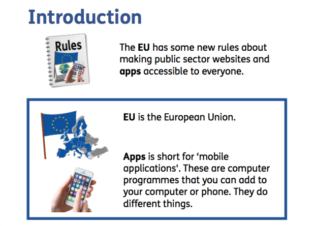
Easy Read is a format that uses pictures to support the meaning of text. It uses short sentences and simple words to focus on the core information. It was developed for people with learning disabilities to clearly understand information.

We provided an Easy Read version of the Consultation Overview, Consultation Information, Consultation Questions and Government Response.
We found best practice when choosing an Easy Read supplier was to pick one that:
- co-produces Easy Read documents with people with learning disabilities
- quality checked the content with a learning disability charity
We used a company that created Easy Read documents from stock imagery as we found the costs of illustrations was significantly higher.
Choosing an accessible survey tool
There were multiple ways of responding to the consultation questions - an online survey, by telephone, through BSL video or e-mail. Providing people with choice is always a positive for accessibility.
It was helpful for us to use an online survey tool as it made analysing the data more efficient. We made sure the tool we used had performed a web audit on accessibility and had acted on the report. The audit tested against the Web Content Accessibility Guidelines 2.0 AA - advice which explains how to make websites accessible for disabled and older people.
When choosing which tool to use, look into the accessibility of a platform as early as possible and always ask for evidence to support a company’s claims.
Lessons learned
The person running the consultation must understand its target audience. This will help determine the format it’s published in and how people can respond.
A consultation with a broad audience should be made as accessible as possible using the different formats. With a narrower audience, consultations must offer an alternative version, if requested, within a reasonable timeframe.
We also found it’s not possible to publish all formats of the consultation at the same time. Consultation wording is often not signed off until the last minute, and you cannot create your BSL or Easy Read version without this official confirmation.
We were able to publish the HTML version immediately, but had to explain to the audience that BSL and Easy Read versions were still to come to manage expectations. Easy Read usually takes a few days, and BSL one to 2 weeks, to create a translation. But we decided it was better to give the majority of people longer on the consultation, than to delay publication while waiting.
We found the Easy Read version was helpful to a lot of respondents and not necessarily just for those with learning difficulties. It was read as a quick and simpler version.
When content is accessible, it helps everyone.
We are always keen to improve, so please let us know of any examples of accessibility consultation best practice in the comments.
If you would like more information about this work including costings please email accessibility@digital.cabinet-office.gov.uk.


7 comments
Comment by Joshue O Connor [GDS] posted on
@jennybillingham +1 to Mallory. There is no point in the repetition of something if it's found inline within page content. As mentioned, within Acrobat they can be hidden as artifacts using TURO tool. However if useful/unique then they will need suitable text descriptions.
As a rule of thumb, always remember the purpose of the document and what the reader needs to take away. If something seems superfluous, it likely is and can be hidden. HTH
Comment by Chris Moore MBE posted on
It amazes me when it is non-screen reader users that make these decisions. I can’t confirm if these images convey anything different from the actual text, but in most cases Easy Read images support the text to provide context.
For example:
A bank may use an image of someone inserting a debit card into the top of a ATM, but the primary text may say something like “You can use your bank card to get money from a cash machine”. The image is conveying someone inserting the card into the cash machine, which is located towards the top.
Another example could be from the NHS. The image could be of someone having an injection into their arm given by a nurse, but the text may say “You will be given a small needle”. The image conveys where the needle will be inserted (arm) and by a friendly looking nurse.
How will I be able to perceive the content of the image if it is hidden from me?
HMRC are experimenting with making Easy Read content in HTML format, which can still be printed out. The HTML version is easier to keep up to date and reflows better on tablets and mobile devices.
Comment by Amenity Applewhite posted on
Thanks for the excellent-as-always post!
Regarding your audit on accessibility, what tools did you use to test and what metrics did you use for comparison? Most importantly, what tool did you end up choosing? Here at the City of Austin, we're evaluating digital form platforms and finding that most vendor solutions have less-than-stellar accessibility.
Comment by Alistair Duggin posted on
At GDS we have been using SmartSurvey to create online surveys . SmartSurvey have created a theme for us that makes our surveys look consistent with GOV.UK. We asked them to get a 3rd Party Accessibility Specialist to do a full accessibility audit (WCAG 2.0 to level AA), to fix any issues that were identified and to get a re-test and for them to share the audit reports with us.
Comment by Amenity Applewhite posted on
Thanks, Alastair!
Comment by jimmybillingham posted on
We've published several Easy Read documents recently at the Department of Health and Social Care, and have had discussions in our team about whether the images in them require alt text.
I can see that your documents don't have alt text for the images, meaning they fail the Acrobat accessibility check. We've reasoned that they wouldn't require alt text because the images are there to aid comprehension of the text, so it doesn't really add anything to also explain the images in text - is this your thinking too?
Comment by Stomme Poes posted on
That would be my thinking (that the images should not have alt text, for their meaning is repeated in the text near them. They should have alt=""). For Acrobat, you would have to artifact those images.