I’ve just got back from speaking at a workshop for Norwegian government web editors on how GOV.UK keeps its focus on user needs and maintains content quality. I thought I’d share some reflections on the visit.

The most important thing I learnt was we’re not only changing the user experience in the UK, GOV.UK is helping users internationally. During the visit I was amazed by web editors’ interest in the detail of what GOV.UK does and their passionate commitment to follow the same user needs approach.
‘Less but better content’
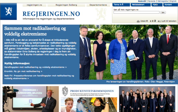
Web editors organised the event just after they launched a private beta of the latest version of their website. They want to make sure they question why content is published on the new site so that it serves user needs better. Their slogan is: ‘Less but better content’.
The current site has 500,000 web pages. There are also cross-departmental topic areas, as on GOV.UK. However, the software that maps these is no longer supported. Search needs improving.
Central content and style standards
The Norwegian government doesn’t use a single, approved style guide, as we do. There is a ‘clear language’ programme (the Norwegian equivalent of plain English) sponsored by one of the departments, but nothing to say that all departments must use it for web content.
However, one of the editors explained that content written by departments was still full of ‘stop’ words:
By that I mean the words used are too technical, unclear or full of jargon and the user stops reading.
From what I saw, many news stories were written for public consumption, but consultation titles and summaries weren’t in plain language.
Web editors’ aims
Guttorm Aanes, who coordinated the workshop (and is the Norwegian Ministry of Justice’s web editor), explained:
Gerry McGovern spoke to us last year and said there are 2 types of web editors: editors and put-it-uppers. In the past we were told to ‘put it up’ and did so but we want to use more of our time being real web editors. We want to stop working in silos and write for the user.
Most web editors I spoke to recognised the importance of a central editorial function and agreed style standards, and how these complement a user needs approach. As a result of the workshop, they’ve started to work on a centrally agreed style guide.
GOV.UK’s work recognised
In the workshop’s afternoon session, Ove Dalen from Netlife Research outlined some of the work his company has been involved in, including the redesign of the Norwegian Cancer Society site (publicised internationally by Gerry McGovern). Ove explained that their approach to changing the content design of the website was based on GOV.UK’s user needs approach.
GOV.UK fans
Camilla Pettersen, web editor at the Ministry of Climate and Environment, said afterwards:
We’ve followed the development of the UK’s Government Digital Service and GOV.UK from the beginning. You’ve been an inspiration to us. Now we’ve learnt more about how the site developed and your approach to user needs and content quality, GOV.UK’s Norwegian fan club is even bigger.
What I learnt
Some of the other things I took away with me were:
- follow what web teams in other countries are doing – successful solutions don’t stop at national borders
- a vibrant content community spreads good practice and improves editorial quality and the user experience
Join the conversation on Twitter, and don't forget to sign up for email alerts.


4 comments
Comment by Jacob Jarnvall posted on
in Sweden, multiple municipalities are also doing their best to adopt the GOV.UK design principles and follow the same user needs approach. You guys can take pride in what you have achieved.
Comment by John Wills posted on
Really should be making the concept and process go viral in local authorities as well. A common web approach across the levels of national and local government would be a magnificent development. Oh such potential joy. Was saying the same early doors back in 2005 as an employee of Worcestershire County Council and the same thoughts are still with me now as a retired member of the public.
Comment by An NZer posted on
It is great to read about the approach of GOV.UK, I am confident that you will continue as well as you have been going so far. I hope that the New Zealand government are watching and do something, they are behaving laggardly with many websites still restricted to only Internet Explorer which only runs on the Windows operating system, in most cases their sites are incompatioble with current versions of IE too.
Comment by Henrietta posted on
It's really great to read about other governments watching GOV.UK and the impact this is having on global communications. I worked with editors from Germany, Spain and New Zealand when transitioning over content from the Environment Agency to GOV.UK - I don't know if this was intentional but the result will be a new internet language.