It’s the holiday season, and as millions of people head off on their travels the importance of a single source of authoritative and accurate travel advice becomes particularly relevant.
The Foreign and Commonwealth Office (FCO) completed their transition of content to GOV.UK back in March, and their detailed foreign travel advice for 225 countries and territories gets around one hundred thousand page views every day from users all over the world.
Figures like this, along with recent developments in the Middle-East and Africa, prompted me to investigate how people are accessing this information and how users’ behaviours and concerns might be reflected in the aggregated pageviews. With this in mind, I built a tool to show me more.
A Global Vision
Data about different countries naturally lends itself to a map-based approach. One can immediately get a feel for trends across the world and get an instant indication of the causal link between news events and traffic.
Before I go into any details regarding the visualisation, I’d like to stress that this is a quick mock-up with none of the gloss or testing you’d expect from a production piece of software. As such, expect a few issues and visual glitches here and there.
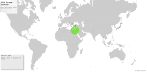
Disclaimers aside, let's start with a screen grab:
This is a simple map of the world with a deceptively large amount of information. In a nutshell:
- the size of the circles are proportional to yesterday’s pageviews to that country’s advice pages
- colours reflect the percentage change in views compared to the day before, with the brightest green signalling the greatest increase in interest
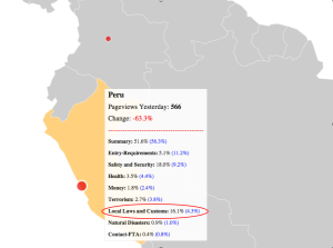
- if you hover over a circle you will see a breakdown of the pageviews across the different subsections of that country’s travel advice (the bracketed values show the average for all countries)
- a country is shaded dark grey if there has been an unexpectedly large number of people looking at the ‘Contact Foreign Travel Advice Team’ section, as this could indicate that information is missing from the advice
If you click on a country it’ll zoom in, and if you click on any of the circles you can see the previous 14 days of pageviews data for the ‘Summary’ section. This gives a little more context, especially for countries which have short periods of high traffic volume.
I've included a screen grab of the breakdown hover as it clearly displays cases in which there is a specific bias towards certain sections. In this instance, we see a marked interest in the 'Local Laws and Customs' section of the Peru guide which ties in directly with the recent news story relating to the detention of two British citizens for alleged drugs smuggling.
Travel advice is always changing, so I’ve also included a small text box in the bottom-left which displays the latest updates. This is updated three times a day and might tell a slightly different story to the data on the map, which are totals from the previous day.
The Usual Caveats
I’ve really enjoyed building this. I’m currently hosting it on my Github account, so feel free to make a pull request if you have any improvements. As I mentioned, It is reasonably clunky and there are numerous bugs (the biggest being its dislike for Internet Explorer). Chrome, Safari or Firefox can -mostly- handle the way I’ve made it (using Mike Bostock’s excellent D3 javascript library).
Feedback is always welcome. Enjoy!


3 comments
Comment by Daniel Cogan posted on
We've used the FCO tool three times since it started, and it really is a great piece of technology. Although we didn't actually intend on visiting Egypt, shortly after the new tool was launched it was interesting keeping a close eye on the situation there through the FCO app to see about the affected areas!
It did come in handy for a trip to Turkey. As you say, it's great to have all of the information in one place and the FCO have done a fantastic job designing this part of their website!
Comment by Jim posted on
This seems like a really interesting tool. Mixing graphical representation with raw data can make the numbers seem less abstract. You've used a good example to highlight this with the Peru case. It would be an interesting digression to see the time-lag between a story first breaking in the media and the respective FCO page receiving its optimal hit rate.
Comment by Daniel Collins posted on
Thanks for your comments Jim.
Your point is a good one and could certainly be looked at. It will depend on such things as the location of viewers and local report times (could also look at any direct referrals to the travel advice). Conversely, I find it interesting how the visualisation can point you to a news story as this has happened to me several times.