Some user needs are easier to meet than others. It doesn't take much research to confirm that most people searching for 'bank holiday' care most about when they can next enjoy a long weekend.
But what if a user needed an organ transplant? Amongst many other priorities, they'd want as many people as possible to register with the NHS Organ Donor Register. How might GOV.UK help meet this highly-sensitive user need?
Since Christmas GDS has been working with colleagues from the NHS, Department for Transport, Department for Health and the Cabinet Office's own Behaviour Insights team to run experiments to learn how GOV.UK might increase the numbers of people choosing to register as organ donors.
Testing different prompts
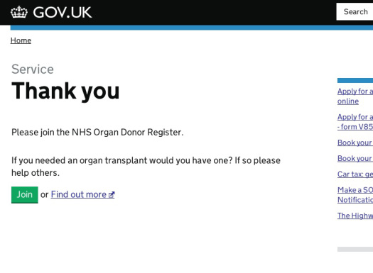
We started by adding a very basic text link to the organ register from the final 'You're done!' page at the end of all successful motoring transactions on GOV.UK (e.g. renewing your tax disc).
The GOV.UK publishing team then took the opportunity to develop a basic A/B testing capability. This allows us to trial several different messages simultaneously to see which is most effective.


We're conducting this as a formal experiment with colleagues from other departments, and so I won't give away too much detail. But suffice it to say initial indications are exciting.
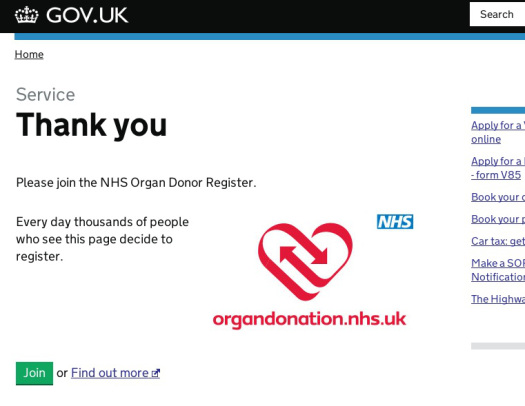
One small change to this one page on GOV.UK has lead to around 10,000 additional people joining the organ donor register each month. This one page is now the third biggest source of new registrations, behind doctors surgeries and the DVLA.
Given each additional donor might save or transform up to 9 lives, it's an experiment we're keen to continue, and I must thank my colleagues from across government and the NHS for the opportunity to participate.


21 comments
Comment by Claire posted on
Tom, are you now able to give an update on this and the success of the different pages? And any other examples of A/B testing? Or links to other relevant articles?
Comment by Tom Loosemore posted on
Hi Claire
Thanks for the nudge (groan). I'll do a quick blog post to update. Might take a couple of weeks, so pls bear with me.
-Tom
Comment by Mark Hulett posted on
I'm also very interested in your experiences with A/B testing and any "worthwhile" reads you can recommend.
Comment by Benjamin Rusholme (@benrusholme) posted on
I assume this follows these transactions due to the risk of death from motoring collisions, since most transplants are needed for reasons unrelated to motoring. Should that be stated?
Is the most persuasive prompt the winner of the A/B testing, or are there ethical considerations for the phrasing used.
Comment by baragouiner posted on
I'd be interested to know whether the National Assembly for Wales's decision last month to introduce an opt-out system for organ donation led to a spike in registrations, from Welsh citizens or indeed from the rest of the UK. The UK media gave a Wales story some half-decent coverage for once; this might have helped plant the issue in people's minds and made them more open to the call to action on GOV.UK.
http://wales.gov.uk/newsroom/healthandsocialcare/2013/130702organdonationbillpassed
Comment by Mili posted on
I did recently register (again) as an organ donor using the link at the end of the tax disc process and thought the idea was awesome. What I do think is a problem though is that there doesn't seem to be a feedback loop in that process - no permanent confirmation or record that I can keep of my registration, no clear way of changing my preferences (e.g. if I was no longer happy for certain organs to be used, etc.). The information seems to go off into the ether and it's quite hard to find out what you're registered for and how to change it. Maybe the next phase?
Comment by Lou posted on
Has anyone measured if there has been a spike in registrations following TV dramas such as Casualty/Holby City which feature donor story lines?
Comment by Andrew Robertson posted on
Good point, I thought the same. Presumably clicks from the thank you page to the registration page on the donor site are the measure of success (and you can only get to the thank you page after completing the online transaction?). No doubt other awareness campaigns have helped prompt people to click through but running the two versions of the thank you page at the same time for different samples (assuming it is simultaneous) should give comparable results.
Comment by Robert Lee posted on
I've done the same simple A/B testing on a home page promo item, and found that more descriptive text with more specific call to action creates higher clicks than a simple text message. In the above case, the inclusion of the logo would help focus attention. Indeed, at some point in the future further A/B testing (call it B/C testing) could also be done with a refreshed message.
Comment by Elizabeth posted on
My guess is also the second screenshot - was it a deliberate decision to use "page" rather than "website", in the same way that hotels encouraging guests to reuse their towels use "room" rather than "building"? I wonder if including the trusted NHS logo also reassured people?
Comment by Penny Walker posted on
Yes, I wondered about that too. That is a second difference. Tom says "one small change" so I wonder if there is a version of either of these messages which only has 'one small change', which will be revealed to us later?
Comment by John posted on
Given that academic studies have taught us the best verbal nudges in this sort of situation, did anyone suggest that further A/B testing was unnecessary as showing some users the less convincing message might be equated to running the risk of not saving multiples of 9 lives? I know it would run counter to your testing regime, but it gave me pause for thought.
Comment by Matthew posted on
My guess is it's the text that says thousands of people register.
Comment by Penny Walker posted on
That would be my guess too. But I'd like to not have to guess. 🙂
Comment by Bart posted on
Isn't it the giant red logo that's making the difference? In the first screenshot the small text on the left just looks like a standard easily-ignorable confirmation message. But the second one has a giant red logo to the right of it, which makes you want to read the text to find out why it's there.
Comment by Penny Walker posted on
So go on, tell us! What's the difference that makes the difference?
Comment by Mike posted on
Penny, I think it's the second page stating that '...thousands of people...' that makes the difference as Matthew has stated below. It's believed that us humans always like to go with the pack mentality, possibly from survival techniques thousands of years ago, and making people believe they are in the majority works better than singling them out.
I think a similar experiment is detailed in the book 'Yes!: 50 Scientifically Proven Ways to Be Persuasive' which can be found easily online. An interesting read if you like that sort of thing.
Comment by Penny Walker posted on
Yes, I think the Milgram hotel towel experiment is the most well-known example, certainly in my field of eco-behaviours. http://penny-walker.co.uk/media/2010/04/VBCOP-ENV-95.pdf
I was hoping the author (Tom) would tell us rather than leaving us to guess. But perhaps that's his own little psychological trick to get us more interested...!
Comment by Mike posted on
Looking at your article it looks like I was teaching granny to suck eggs with my explanation! I'll take a read of that when I get a minute, I enjoyed the experiments in the book above, it's interesting how human behaviour can be manipulated! I'm even questioning if I'm commenting on here of my own free will now!!
Comment by Penny Walker posted on
Grandmas should be open to learning new ways to remove the contents from eggs! Always glad to be pointed towards interesting stuff. Will check out the book you recommend. P.
Comment by Paulpod posted on
That's extraordinary. Very interesting.