One of the first pieces of work I did at GDS last year was to create icons for different types of content on GOV.UK.
The icons (appearing as they did in various different guises) have been a part of the site since the alpha back in 2011, but this month we've removed them.
This post provides a bit of background on why we've made that decision.
The role of iconography on GOV.UK
This is the full collection of icons originally used across GOV.UK and Inside Government.
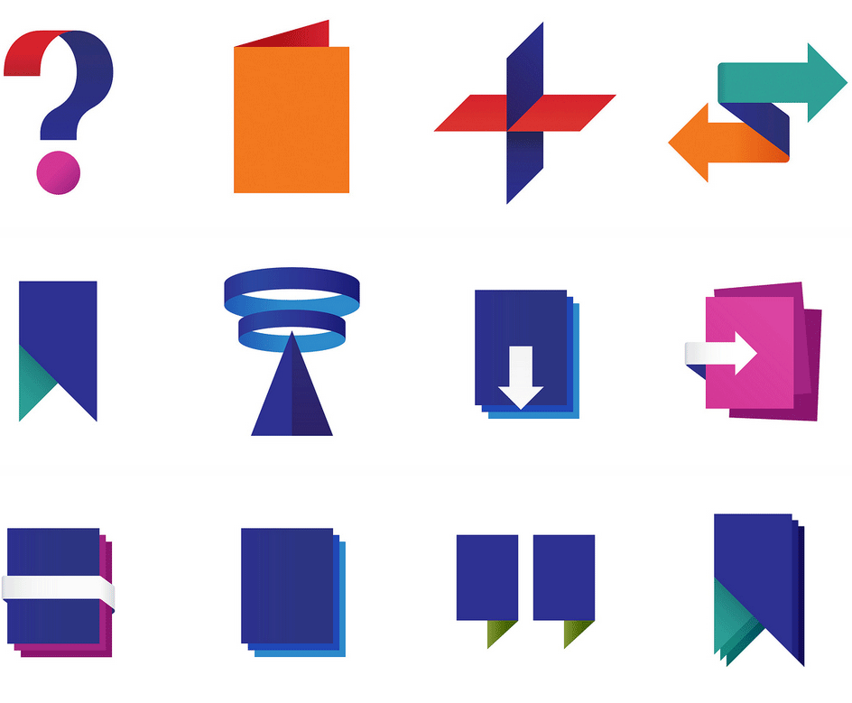
The original reason for having the icons was to provide a handy reminder of the different content formats. Each icon was intended to help users recognise the type of page they were on and to give them a cue as to what experience they should expect - and that they'd act as a reminder of that experience next time they visited a page of the same type.
Reckoning vs testing
Our agile approach to design means we work with the best information available to us at the time. We had no user data to work from when we first introduced the icons, so we based our decision on our judgement of what felt right.
However, over time and after lots of user testing sessions it became apparent that they weren't achieving the intended result. Users would often click on the icons, thinking that they'd "do something".
There's also been no direct evidence that they make pages (and how they are used) more memorable.
In short, we've gone from doing what we thought was the right thing to do, to testing how real people use the product.
Design changes
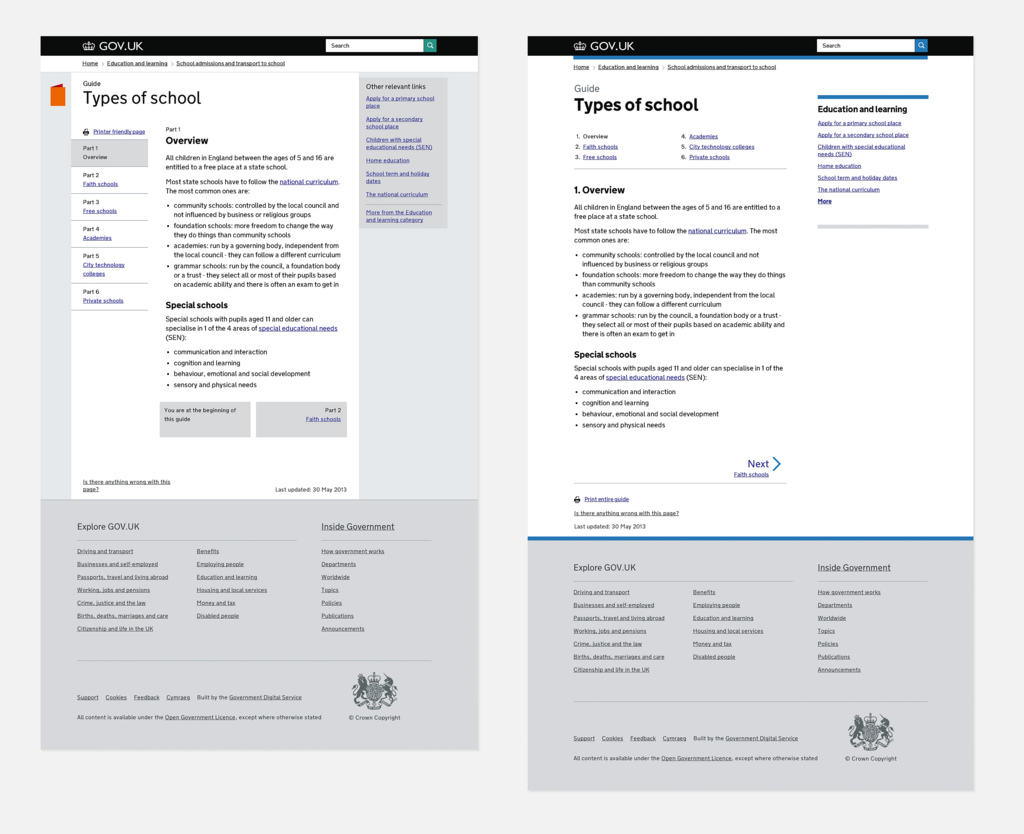
Subsequent user testing also showed us that some of the page layouts (in particular, for guides and their navigation) weren't working.
This led us to reconsider the visual design of the site to see what improvements could be made. As part of this iteration we made the decision to retire the icons and to bring in the stronger, bold typography.
These changes - along with other subtle layout changes (again, based on testing) - also helped bring the site more into line with other areas like Inside Government, the service manual and the design principles.
So far these design revisions have received positive feedback in user testing.
What this reminds us
As designers, we cannot be precious. The users of GOV.UK come first and we mustn't be afraid to undo previous work. Sometimes it's an essential part of the design process.
As Ben Terrett said about design at GDS in his post early last year:
"We won’t get it right first time round. We'll be putting stakes in the ground."
The whole point of user-centred, iterative design is that those stakes must move to suit the user. In this case those stakes are the icons.
It felt fitting as the illustrator of the icons that I also got to rewrite the CSS to retire them.


23 comments
Comment by New Digital Brands - Stanley Mathew posted on
Since you are retiring these icons, is okay if one could download 'em for personal usage without having broken any property rights?
Comment by @digitalsach posted on
Thanks for the post Guy, interesting - well done on killing them.
Almost all of the retired Gov.uk ‘icons’ are symbols - symbols that have to be learned to know what they mean - surely always bad for a public facing site?
"Our agile (yuk) approach to design means we work with the best information available to us at the time."
Perhaps a common sense approach is good too and an understanding of the difference between icon and symbol. Doesn't take user testing to get this - just a commitment not to create a problem in the first place.
# Both symbols and icons represent other things, but icon is a pictorial representation of the product it stands for whereas a symbol does not resemble what it stands for. Icons can be made of real objects only.
# A symbol represents products or ideas, whereas icon represents only items that are visible - concepts and feelings cannot be depicted using icons.
# Icons are restricted to graphical representation of objects and one can easily understand what they stand for - one has to learn what a symbol stands for, as it is not similar to what it stands for, egcross for Christianity, doves for peace, traffic signs, £ for UK currency
🙂
Comment by tartandigital posted on
I think it's much cleaner - it would be interesting to see the data and just what kinds of uplift you had in useability.
Please can you get the same team to work on fixing the useability of the Realtime PAYE submitter software - now THATs something that could dearly do with a fix 🙂
Comment by Dr James Bayley posted on
Nice point Tartandigital, I worked on BusinessLink which was ruinessly expensive in part because we did very extensive usability testing with real users _before_ releasing it. This blog post indicates that because an "agile" process was used the icons were inflicted on users and _then_usability tested. The authors does not suggest that they used A/B testing or any other automated measure to determine usability. Odd.
Comment by Alastair posted on
Icons can work but they need to be clearly explained & consistently used.
Web can be a problem as users can drop into content without passing thru any explanatory experience.
As ever GDS is good approach to do, test and think.
Comment by Phil Rumens posted on
Your post seems to say that you're retiring the icons due to poor page layout, rather than any particular dislike or dysfunction of them.
We're looking at what Manchester have done for their new site (http://www.manchester.gov.uk/) and are considering the same sort of icon based approach for one of the new sites we're developing.
Would you advise against doing this and if so do you have customer data to support the view, please?
Comment by Irene Melo (@IreneMelo) posted on
Hello Phil,
In my opinion, Manchester's icon approach is a bit overwhelming.
At the top of the homepage you can find an initial row of 4 black icons with white rims and very subtle red detail.
A second row shows a futher 5 icons, with different design style, colour schemes and sizes than the initial 4.
Then a red ‘call-to-action’ button with text too small, which, upon click, ‘extends’ the page and fills the screen with icons and small text.
As a user, I feel confused by the sudden contrast between a very dark ‘reception’ to the website, followed by a very bland mass of light grey-ness, pinpointed with icons that are too small and with too much detail to be of any use to help guide my journey. And the text is hard to read.
I feel that there is too much focus on icons rather than on clear, easy to read text.
As a general rule, I think images (icons or not) should be used to guide the user by providing context. The use of icons is effective when they follow conventions (such as an envelope for email address, etc) and I think that's probably why the icons in GOV.Uk didn't work out.
That being said, audiences vary and the icon approach at Manchester might well be working for their audience, in which case is a good approach.
Comment by Phil Rumens posted on
There's many things we won't be replicating from the Manchester site, it was only their use of icons that we are looking at for one of our new sites.
I agree that the non-standard icons used by GDS might have been a cause of the problem. Looking at them at the top of the page I'm struggling to work out what some of them are for, out of context.
I also agree with much of what you say about Manchester's site, but their icons are clear and it's easy to recognise what they are on the whole. If used to compliment, not as the primary indicator, personally I think icons are OK.
I notice you're following our @IChooseDigital Twitter account, and I hope you'll provide similar constructive criticism when we start to put stuff online for our new sites as I would very much value it.
Comment by leilani posted on
I actually disagree, a bit - I love their use of icons, but more because it feels like a 'character' element of the site; they're not being used as pure signpost navigation. I do agree that it feels overwhelming, and I'm not keen on that dark reception as you said nor the contrast. I think the overwhelming-ness could be better dealt with by a more thorough information architecture: there's no distinction between hierarchies of navigation, if that makes any sense. Some of those icons are broader than others, and the four at the top, while maybe the most used, don't make sense there. If more attention had been paid to grouping the information (and editing) in a way that made sense -- IE put council tax with benefits; libraries with sports & culture -- it would be a much more obviously useful site.
TL;DR, They could be better laid out and distributed, but the icons I find quite friendly and illustrative, plus they make good buttons for touch devices. It's the hierarchy of information and that navigation being so scattershot that bothers me most.
Comment by Sebastian posted on
Could you explain more about the decision to change the guide left nav? What did the user testing show? Thanks!
Comment by Guy Moorhouse posted on
Hi Sebastian, in short — in testing, a lot of users were missing the left hand guide navigation altogether. Also, sometimes, people didn't realise it continues below the fold when lots of separate guide parts are present.
There should be a more thorough blog post coming up on this, so keep an eye out in the coming weeks. Thanks.
Comment by Andy Pipes (@The_Pied_Pipes) posted on
Perhaps it was the execution of the icons which was confusing. I thought that the choice to use them in the first place was right. The ones above are hard to interpret, and so don't do the job they are supposed to - signalling content types without having to explicitly say "Here's a Guide". It's a shame they have to go IMO; I think they could have been better designed and have a simpler set - just for content types. But it's a minor detail. Generally I like the minimalise design on gov.uk, and think you're doing a great job 🙂
Comment by Tom dG posted on
Did you test a version with the icons, but without the grey sidebars? Having the icon in it's own visually distinct column broke its connection to the title, which perhaps contributed to the impression that it was actionable. Without the icons, there is now a lack of visual differentiation between the different areas of the site – are there any plans to address this?
Comment by Guy Moorhouse posted on
We've tested quite a few different versions over the weeks/months and in the majority of cases, the icons showed themselves to be mainly decorative (and often confusing) rather than functionally useful, hence the decision to remove them.
I'm not sure a visual distinction between different formats for it's own sake is as important as it seems. So long as it's clear what the user needs to *do* in a given situation. That said, of course we'll always be iterating on areas that are shown through testing and data not to be working.
Comment by Andrew Robertson posted on
Are there any plans to retire the references to 'this page replaces business link / directgov'?
Comment by Guy Moorhouse posted on
There’s no immediate plans to retire the Business Link and Directgov references, no. As there are still people who won’t yet have seen or used GOV.UK, it’s important we keep these for clarity. In time though when the new single domain is universally recognised, I expect there will be discussions about removing them.
Comment by andytervit posted on
Interesting article. I thought the icons looked great but the layout looks a lot cleaner without them. Proves that with good typography and a clear visual hierarchy, you don't always need the additional decoration.
Comment by Andy Tervit posted on
Interesting article. I thought the icons were great, but the layout looks so much cleaner without them.
Proves that with good typography and a clear visual hierarchy, you don't always need the additional decoration.
Comment by lenand posted on
Wonderful news. Icons are meaningless to elderly people and adds to their digital disengagement. Words are much better. See my gripe with Google Mail. http://wp.me/p14MGf-xN
Comment by Sarah Mills (@SarahMills719) # posted on
I think you must be commended for acknowledging your work as a continual process rather than a stationary revision. It's really admirable to change something which you put time and effort in to by accepting the alternative understanding and interpretation of the audience. I think the new lay out is clean and fresh and the stakes are definitely pointing forward.
Comment by Kate Evans (@kate_evans) posted on
Really interesting. I always liked the icons but wondered if they were pushing users to understand content types, rather than focusing on tasks. The new guide designs look very clean - positioning the chapters at the top works well.
Comment by David posted on
'..positioning the chapters at the top works well.' Guess you cant please all the people all the time. I prefer the chapters in the left hand nav - it feels easier on my eye. Different strokes...
Comment by William posted on
I can imagine that adding graphics like these is an easy temptation, but you've been incredibly disciplined and had the courage to get rid of them. It's no mean feat to make decisions like this as initially it looks to give a splash of colour, but in reality they're quite abstract - potentially confusing , and superfluous really. As you write: the design revisions have received positive feedback. well done 🙂