At GDS we intend the web to be the primary platform for publishing things like policy, speeches and detailed guidance, with any print documents taking a supporting role. As a consequence legibility online becomes hugely important, because the reader will be using these texts to either implement government policy or form opinions about it.
At the very least the material needs to match the legibility of the printed or pdf documents it is replacing - a job which webpages don't usually manage. Generally the internet has favoured universal access to material over the quality of that material, but at the moment here at GDS (like many other publishing organisations) we're wrestling over how we can combine the two.
Focus
"The designer should not be looked upon by companies as a means of accomplishing a purpose, but as a meaningful mediator between the maker and the user, between company and product. In the near future the surveying of man’s real necessities will become increasingly important: to understand what man really needs"
- Dieter Rams interviewed in Domus, April 1984
In designing these long-form documents for the web, it has been helpful to step back from thinking about the traditional elements of design, focusing instead on the core function - publishing meaningful words.
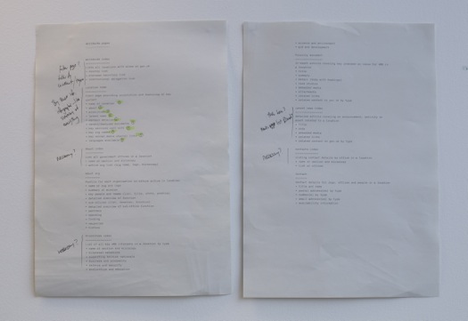
Working through our 30+ page templates for Inside Government, I wrote an example of each document type as linear plaintext in IA Writer, including all document chrome and metadata. With this Neil, Pete and myself could quickly discuss, edit and refine the content in a way that was true to both the act of authoring and reading text documents.
It has the added advantages of both encouraging natural-language interactions and producing an artefact which is very close to being an HTML outline - keeping the design process in-tune with the construction material without yet being bound by its constraints.

We divide navigation-focused pages into two categories:
- an index page is a complete list of documents in a linear order, with filters to allow the user to cut directly to areas of interest
- aggregation pages are more like traditional webpages, bubbling up different types of content from Inside Government on a common theme or publisher, such as 'Housing' or 'Department of Transport'
By separating the function of page-types in this way, we can concentrate on only providing relevant information - reducing distraction to help the reader with focus and comprehension.
Tone
Of course when designing for legibility, the greatest contributing factor is the writing itself. At the point of reading, a reader makes no distinction between the visual appearance of words and their content. Dense texts filled with long, elaborate sentences make things difficult in even the best-designed documents.
Whilst our content designers (editors focused on style) have done a wonderful job setting the initial tone of Inside Government, this is a publishing platform for the breadth of government, where ultimately each department will be responsible for writing much the content themselves.
This is where our typeface New Transport makes such a difference. For those living in the UK, the typeface Transport is such an omnipresent part of our environment that we don't really notice it anymore. So much so that it's easy to overlook the Department of Transport's consistent and functional restraint with language on road signs, a writing style that is indelibly linked to the typeface.
When we discovered Henrik Kubel was redrawing the typeface with variants appropriate for longer passages of text, I hoped that by using it we would somehow be able to piggyback on those pre-existing language conventions to encourage more straightforward writing.
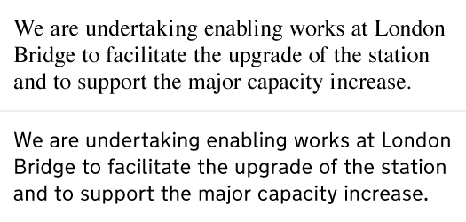
I've been pleasantly surprised to hear that (at least anecdotally) this is the case. Texts which would previously have seemed respectable in traditional document fonts like Times are revealed as opaque and clumsy in Transport. People have then rewritten these, un-prompted, after writers has seen them on the site.

Good writers - like designers - understand the value of consistency, so establishing that link with the stellar information design from the Department of Transport is encouragement in the right direction.
GDS has 10 design principles, but above all there is a single defining idea; 'Digital by Default'. When talking about long-form writing this is more revolutionary that you might initially think, as even commercial publishing industries (newspapers, books etc) still treat the web as a supporting platform to their printed documents.
We hope that by focusing on the content, and by using typeface, layout and style to shape the tone of each page, we can make the web the native home for all of the information people will find on Inside Government.


11 comments
Comment by Foden Grealy – A very good thing… posted on
[...] English that I can read quickly and understand readily. I love that the pages look smart and that huge care has been taken about the layout and small things like the choice of typefaces. I think it is great [...]
Comment by Ben B posted on
There's mention here of 30+ content types/templates. Without wanting the complete details, could you publish the list of the content types? I ask only because smaller initiatives (say, a town council) could use the list as a way of grouping the information types they publish.
Thanks
Comment by A quick tour of Inside Government | Government Digital Service posted on
[...] Designing for the long read on Inside Government [...]
Comment by What we know about the users of Inside Government | Government Digital Service posted on
[...] want the latest information and to be able to get an overview quickly, but they are also willing to engage in the depth and technicalities. That said, they will not tolerate jargon or [...]
Comment by Gerry Leonidas posted on
You seem to be suggesting that Transport made texts less readable than Times, which prompted authors to rewrite. It could be argued just as easily (with perhaps more anecdotal evidence, for the general point) that Transport made the texts *more* readable, since the authors were able to detect that the language needed editing. Either is open to investigation.
As you note in your last paragraph, readability is, ceteris paribus, a compound of typeface, layout, and style – so a simple typeface swap may be misleading. (For example, the ratio of x-height to linespacing in your image above is different for Times and Transport, which is a critical factor for paragraph typography.) I applaud your efforts, but I would like to make the point that a more nuanced approach when considering typefaces may be helpful.
Comment by mhurrell posted on
Hi Gerry, agree with both your points - for those reasons I deliberately chose to scope this post to the tone of the interface rather than the mechanics of typographic legibility. I don't think Transport itself is any more or less readable than other typefaces of similar proportions, but it does carry a cultural expectation of the type of information that it should convey.
That said, many web fonts are both badly spaced and not especially suited for the screen, which is compounded by CSS not really offering much in the way of fine-grained tracking control to compensate. With New Transport the high quality of Henrik's redrawing in addition to his openness to feedback about the spacing has made a difference.
Comment by frankieroberto posted on
"The affect of typefaces on sentences" - ouch. Embarrassing mistake for an article on writing... 🙂
Comment by Frances Berriman posted on
In this case, I believe "affect" is actually correct. Affect can generally be replaced by the word "influenced", as in... the influence of the typefaces on sentences. Effect is generally used as a noun which would mean "the impression of typefaces on sentences". Essentially, you could use either in this sentence and it would have relevant meaning.
Comment by Graham Lee posted on
Sorry - meant to say 'hence should be...'
Comment by Graham Lee posted on
Very good. However, isn't a more fundamental problem the fact that a lot of this information is far too verbose and longwinded in the first place, and hence be 'simpler, clearer, faster' (and shorter), like the so-called 'mainstream' content?
Comment by mhurrell posted on
Hi Graham, you're right and we're working towards that. Our content designers have contributed a lot to Inside Government and all writers will be encouraged to follow the GDS Style guide. That said, we probably won't see a huge change happen overnight. You can read more in this post.