In this post, Dean Vipond, lead designer at NHS Digital, describes how they adapted the GOV.UK Design System for use in their health and care services.

The GOV.UK Design System helps teams in government to efficiently design and develop services for GOV.UK.
It does this by providing guidance, code and examples that teams can reuse in their own services.
Everything in the Design System has already been tested for usability and accessibility, so teams can use it with confidence.
Because the Design System is an open source project, other organisations are also able to use it as the basis for their own work, saving them time and money.
A design system for health and care
The NHS has recently adopted a more user-centred approach to designing services for health and care.
This has resulted in the need to prototype and trial new types of services, as well as ambitiously rework existing ones.
Faced with this challenge, it was a natural decision for us to look to the work already done over the past few years by GDS – particularly the open and accessible GOV.UK Design System.
Taking a proven approach, as well as the publicly available design and code, as a starting point, gave us a huge head start, both in terms of design practice and stakeholder approval.
Adapting the GOV.UK Design System
People’s relationship with and perception of the NHS is very different to that of government.
The NHS identity is widely recognised. It’s essential that our users trust our services, so we had to understand how best to express the NHS identity through our design system.
We spoke with GDS early on in development. We sought advice on graphic design and typography, as well as how best to manage something intended to be used by many distributed teams.
Our GDS colleagues understood our reasoning for diverging from the GOV.UK Design System, and helped us figure out the best way to retain links with its foundations, without being bound to it.
For example, we consciously decided not to automatically inherit new updates to the GOV.UK Design System, because some may not be appropriate to the needs of our users, or match the NHS identity.
Instead, we have a process of considering each new GOV.UK release, and adopting those which make sense.
This allows us to continue to benefit from the research, design and code that goes into the GOV.UK Design System, while maintaining full control of our own.
Sometimes we had to adapt parts of the GOV.UK Design System to better meet the needs of our users.
For example, our research showed that sometimes users needed content on one long page, covering everything about, say, a medicine or a condition. On pages like this, users tend to scan, looking for particular pieces of information or advice.
We adapted the GOV.UK Design System grid (used for laying out pages), adjusting the measurements and breakpoints slightly, to suit our corporate font, and ensuring a comfortable reading experience for longer articles on mobile phones as well as larger screens.
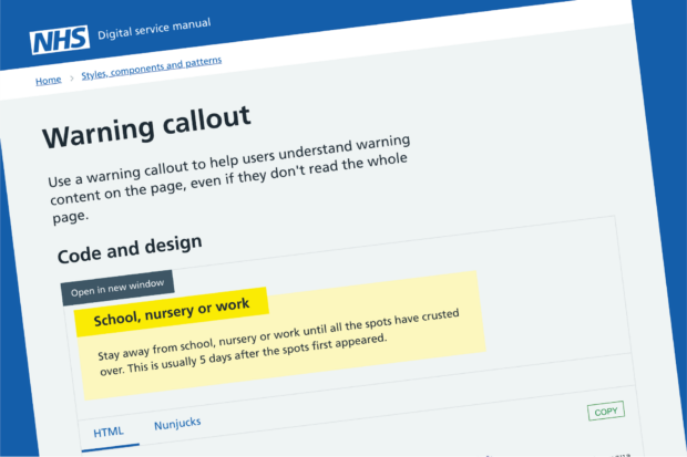
We also designed new NHS-specific components for guiding people to different methods of care (for example, GPs and A&E) as well as other signposting.
Testing and re-testing
The NHS is for everyone, so accessibility was central to our design approach. Not just because we should, but because it is the law.
We knew that the GOV.UK Design System components were already very accessible, so we were able to repurpose things like their buttons and text boxes, before doing our own usability and accessibility testing to check that they also worked for our users.
Starting from scratch would have taken much longer than the few weeks the team needed to do this work.
Feeding back to GDS
We were grateful for all the support, components and code we were able to take advantage of, but we wondered if we’d ever be able to feed back into the GOV.UK Design System.
We were playing a few years’ worth of catch-up in terms of the maturity of our design system. However, there is one particular area where we have had the opportunity to investigate further.
Like the GOV.UK Design System, we have a prototype kit that lets designers and developers prototype using the latest version of our design system.
We learned from our GDS colleagues that some users find installing the prototype kit a challenge.
A small team in NHS Digital did some dedicated research around the installation process of the NHS prototype kit.
They worked on documentation to guide novice users, and learned about the limits of different types of computers (for example, standard-issue corporate PCs).
Our findings and documentation have now been shared with GDS, so they can use it as the basis for updating the documentation of their own kit.
So now, it is not simply a one-way relationship of taking GOV.UK work and repurposing, but a community of knowledge sharing, that benefits all.
If you’d like to see how we are developing our system, all the documentation, assets and code is on the NHS Digital service manual.
Subscribe to updates to get an email every time we publish a new post.

