I have a new favourite form: HMRC’s Pay your self-assessment online. Enjoy!
But maybe before you do, you’d like a little explanation? OK, I’ll back up a bit and explain.

Making better forms isn't easy
I’m a forms specialist - I work with organisations to help them make their forms easier to fill in and more effective. These days, I’m lucky enough to have my dream job: I’m part of the team at GDS creating design patterns and other resources for people who design what we call “government services”. But just between you and me, I’ve yet to meet a government service that doesn’t have at least one form somewhere - so really, what I’m doing is helping the whole of government to make better forms. It’s exciting.
Only: making a better form isn’t easy. Even making a new design pattern isn’t that easy: we’re discussing over 100 of them on our design patterns hackpad, and we only publish a pattern on our Service Manual when we’ve got plenty of evidence from user research to justify recommending it. And the design patterns are only part of the job - designers have to do many other things, such as working out which questions on the form are really necessary.
I look for examples of good forms
One thing that helps designers: examples. They like to see what ‘good’ looks like, and that’s why the GOV.UK form elements have examples in them.
I’ve been collecting example forms forever, but as I mentioned: making a better form isn’t easy, and it turns out to be even harder to make a good form. I often find parts of forms that are fine - but there’s some detail or other that isn’t right. The patterns might be good but the instructions aren’t. Or both of them are fine but it’s weighed down with too many questions.
A good form lets you do what you need to - easily
A good form is legible and looks organised. It certainly can’t be a good form if you can’t understand the questions. But the real winner, the thing about a form that makes it truly successful, is if it lets you do whatever you need to do - easily.
A great form gets you to the point straight away
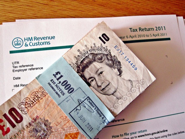
My new favourite form lets you pay your self-assessment tax online.
Paying a tax bill is a bit like going to the dentist: important, but not necessarily pleasant. It’s good to get it over with as little fuss as possible.
To get a tax bill paid, all you need to know is your UTR and how much you have to pay, both of which you can find on the tax bill. Click into the form, stick those two numbers in, type in the details of the card you want to pay with, and you’re done. That’s it. You can get directly to the point, straight away.
No log in. No nonsense. How cool is that?
Great forms save costs
Why bother making your form into a great form? Because they save costs.
This one has successfully reduced the costs of support calls. The old form got about 18 calls for each 8,000 payments. The new no-nonsense one is down to 1 call for each 8,000 payments.
How cool is THAT?
(If you’d like to try it, contact me and I’ll send you my UTR. I don’t mind in the least if you pay some, or all, of my tax bill!)
Follow Caroline on Twitter, and don't forget to sign up for email alerts.


5 comments
Comment by John Howarth posted on
I explored it Timothy - I entered a fake number and a £1 amount, selected my payment method and kept going. Whatever happened to data validation? 30 years ago the UK Government Department I worked for wouldn't let me code that poorly in COBOL. Gen Ys? Digital natives or digital pygmies I ask myself...
Comment by Timothy Wood posted on
Well Page 1 is certainly easy and simple. What a pity it isn't possible to explore the rest of this clearly world-beating form without actually entering data into the the first page.
I am strongly against online forms that do not let you have a prior overview of what is to come. I hope the form has some means of backtracking to the beginning (indeed to a point before the beginning) lest a particular answer needs to be reconsidered in the light of questions that follow.and that the whole thing can be trashed before any data that has so far been disclosed without user knowledge of its implications has been covertly harvested ... Why don't I trust you? Because I don't.
Comment by Mike Dearborn posted on
I just paid my last tax return in July. All I had to do was enter the HMRC sort code and bank account into my online bank account to pay. What were all the calls HMRC were getting, surely it's not different to paying anyone else?!
Comment by Ronan Fitzgerald posted on
What did HMRC use prior to that form? Did it have a lot more than two fields? Just curious as to what the journey was that ended with such an easy solution, and how hard it was previously!
Comment by Jenny Sliwinski posted on
I got all excited when I saw the self-assessment form had been redesigned - but then noticed it was just the pay part, not the file part. It's the filing part that is an absolute nightmare. I remember the old saying 'tax doesn't have to be taxing' - great strapline, if it were true! People are encouraged to start their own business and pay their tax honestly, but I can imagine filing a self-assessment can send people running in the opposite direction and not bothering. Not good for you or them. Small businesses can't afford to pay for help so they have to rely on their own knowledge (which is often very limited in the early stages of a new venture), and your help available online (which is extremely complex). Every year I dread it, every year I wonder if I've done it right (despite doing my best) and every year I worry that I'm going to get a knock on the door telling me I've done it incorrectly and I owe lots of money! I know I'm not alone here, and just wonder when the bigger monster is going to be tackled and tamed? Please make it soon.....! 🙂