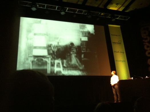
Last week, several members of the GDS team decamped to the south coast for the Brighton Digital Festival, in particular to the one-day conference dConstruct. Now in its ninth year, it’s gained quite a reputation for giving brilliant speakers a chance to deliver thought-provoking, insightful talks about a vast range of digital and non-digital stuff (mind you, I would say that; I spoke at it in 2011).
I took a couple of days off to attend this year’s conference - and sister conference Improving Reality - to look at our work at GDS through a slightly different lens.
Listen to users and build for the future
Maciej Cegłowski, founder of Pinboard, talked about the uses fandom continues to find for tools all over the internet, co-opting services like Delicious or Livejournal in completely unforseen ways.
His appeal to makers to listen to the people who use the services they build rang all sorts of bells for those of us who sit near print-outs of the GDS Design Principles. Still, it’s always good to be reminded that it’s the right thing to do; when you’re neck deep in an iteration which hasn’t been tested and you can't find a way out, chances are it’s time to put it in front of users so you can see where to go next.
Other validations came through talks by Luke Wroblewski and Simone Rebaudengo. Both showed the audience a selection of very different interactions than those we’re familiar with on GOV.UK - from internet-enabled objects to gestural interfaces.
It’s important that we remember to build something that can be built on; the GOV.UK you use today might bear very little resemblance to the GOV.UK you use on your smart watch in five years time. But if we make sure the information and services are clear, concise and easy to repurpose then you should still get a great experience.
Making the invisible visible
By far the biggest undercurrent of the conferences was the importance of making systems legible for users. Amber Case at dConstruct, along with Timo Arnall and many other speakers at Improving Reality, all came at the subject from different angles. Dan Williams, in probably my favourite talk, tied it all together wonderfully.

We’re surrounded by systems - like GPS, wi-fi and the internet - which render themselves invisible to most people. What you see is their effect, their function, but not the network itself.
Part of our job, as makers and designers, is to make those things easier to understand so people can use them effectively. We should make it clear what users are interacting with, what the implications are for them, and what happens to things like their data. We shouldn’t pretend it all happens by magic.
In a mundane way that means making sure our cookie notices are easy to read and understand, or showing how different bits of government join up together. But it also means things like being as clear as we possibly can be about what’s happening to a user’s information during a transaction, or during identity verification. It might also mean explaining more about how our infrastructure and tools work.
Back at Aviation House...
So, a great couple of days, leaving all of us with a lot to think about. For me, it’s a prompt that we need to do more to show how the things we build work; what systems and platforms they’re built on, and how they join up across government.
Thanks to all at Clearleft and Lighthouse for putting together two great lineups.
Follow Matt on twitter: @mattsheret

