Today we release the latest version of the GOV.UK homepage.
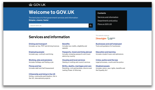
Since the last major revision of the page (which Ben wrote about last year), dozens of ministerial departments and other government organisations have joined GOV.UK.
Our new homepage makes it easier for people to find information issued by these organisations. We've also made several other tweaks in response to user feedback since launch.
More prominent site search and new navigation
The focus of the homepage should still be fairly familiar. We’ve retained the directory-style list of links to the most popular services and information, as this tests well for helping users to find what they need. We’ve also kept the list of most visited content.
But around one in ten visitors to the GOV.UK homepage use the search box to navigate the site, and we’ve recently been spending time improving the performance of site search, so we’ve increased the prominence of the search box on the homepage.

Easier to find information from government departments
The most significant change is the new area in the middle of the page called ‘departments and policy’. This replaces the old ‘Inside Government’ title - which we found didn’t really resonate with many users (we’ll be writing more about this soon).
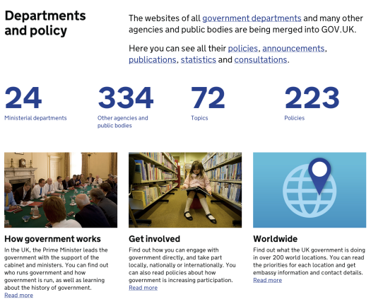
In this section we’ve included prominent links to departments, topics, policies, publications and worldwide content. Testing on the previous homepage showed that users often found it confusing to move between these areas and the GOV.UK homepage - we think these new links better signpost different destinations.
We’ve also tried to help out less experienced visitors by including links to information about how government works, and how to get involved.
Next steps
These changes all helped users find the information they needed more effectively during testing, but of course we’ll keep watching the metrics and reading your feedback to make sure every aspect of the homepage is performing well.
One immediate priority is to look at how the GOV.UK homepage can help users find out how government transactions and content are performing. We’ll also be focusing on the category navigation (eg ‘citizenship and living in the UK’) to make sure this makes sense to users, and looking at how we can incorporate topical content about government activity (of the kind that’s making national news headlines).
With just over 8% of users to GOV.UK visiting the homepage it’s critical we keep monitoring and improving this page to make sure it makes things simpler, clearer and faster.


12 comments
Comment by 365 days later | Dafydd Vaughan posted on
[…] Wales for the first time. Search has also had some big improvements, and the big search box on the homepage has […]
Comment by Tom McLaughlan posted on
I think the new site is excellent and keeps on getting better, which is good news for us users so many thanks. One question that's been bugging me though - why is your site different to the rest of gov.uk and why is it on WordPress? Will you be aligning it with gov.uk in the future?
Comment by Matt Sheret posted on
Hello Tom. We'll be moving the GDS blog over to the shared government blogging platform on GOV.UK soon - https://blog.gov.uk/
Comment by Tom McLaughlan posted on
Thanks for getting back to me so fast, Matt - and for the good news 🙂
Comment by Benjamin Rusholme (@benrusholme) posted on
I think the new homepage looks good and it is interesting to read about the thinking behind it. I agree with Tom that the use of imagery could be improved. I welcome the greater prominence given to search and like the simplification of what used to be separated as 'inside government'
Comment by Graham Lee posted on
The nav for public information doesn't look dissimilar to the old Directgov site. Plus ca change.
Why are the promo boxes are all plugging corporate info, and does anybody care that the website covers '72 topics' or '223 policies'?
It's high time you scrapped the welcome mat - practically every guide to writing for the web stipulates that you should never say 'Welcome to my website!'. This is just redundant.
Also, is it really still necessary to point out that gov.uk replaces two sites that were closed down nine months ago?
On the same lines, 'simpler, clearer, faster' may be a mantra that's had its day. This is only relative to what went before, and doesn't apply to most of the departmental information that's been moved across to the site.
Comment by John Ploughman (@johnploughman) posted on
I'd imagine that there's still a lot of traffic coming in from Directgov and Business Link redirects. So if users are expecting to land on them, it's probably only right that there's still a reassurance for them that they're in the right place.
Although the civil servants among us know that it's now GOV.UK, the public still don't. Talk to your friends and family and they still talk about Directgov. And setting up a search on Twitter for 'Directgov' soon tells you people still talk about it.
I wouldn't say that 'simpler, clearer, faster' has had its day as yet - with all those agencies to still move over (and not forgetting that accounts for the bulk of the content), there's still a lot more to be made simpler, clearer and faster. It's easy to forget that just because the big departments are on GOV.UK, there's still a whole world out there yet to move. And the challenge for all those is to make it simpler, clearer and faster - not to bring over the rubbish.
And when the time comes to stop comparing to what's gone before, let's hope we just think about it in the present tense - simple, clear and fast.
Comment by Graham Lee posted on
The motto has become shopworn through overuse: the government has been parotting it for well over a year now.
The gov.uk style guide says that the site should avoid spin and subjective adjectives, so it's odd that this is disregarded at the top of the home page.
Surely it's up to users of the website to decide if the information and services are 'simpler, clearer, faster'? (Again begging the question, compared to what? A website launched in 2004?)
Ultimately it's rather a 'vapid slogan' (in the words of the late Lord Bingham): would someone come to a website expecting it to be 'complex, confusing and slow'?
I've also noticed that other sites are starting to ape it: for example, Croydon Council's site now boasts that it's 'faster, smarter, better' - another sign this it's fast becoming a cliche.
Regarding the old logos, the sites in question closed down nine months ago, and I doubt that many lose a lot of sleep worrying about what happened to them.
Comment by stephenjmccarthy posted on
Rod and Tom,
Thanks for your comments.
Rod:
You raised some very good points and they are items we already had in motion to change and should be amended very soon.
Tom:
We are going to continue to test these images to see how they resonate with users.
Cheers
Stephen
Comment by SimonL posted on
@Rod raised a valid point about "Read more" links and accessibility, but you haven't answered. My belief is that screen readers often collect links together and read them out of context - so "Read more. Read more. Read more." means nothing to blind users - what will they "read more" about?!
Comment by Tom dG posted on
Thanks for the insight on a very crisp new design, which is let down slightly by the rather sludgy pair of photographs illustrating the 'Depts and Policy' part of the page. Looking at the wonderful illustrations and photographs on other parts of the site, I'm sure you could make a better selection!
Comment by Rod posted on
I really like the new GOV.UK homepage, but the three features under depts and policy are counter intuitive compared to the rest of the site, where every other photo is a hyperlink to the story.
How government works
Get involved
Worldwide
Also is "Read more" acceptable as link text? I'm genuinely curious as all guidance on accessibility and seo suggests otherwise?