As the first Data Scientist in GDS it's my responsibility to make tools that help our teams extract and communicate insights from the sometimes overwhelming amount of information we collect every day.
The position is a new one in GDS and reflects the importance of detailed data analysis that uses a combination of tools centred around numerical computation, processing large amounts of data, machine learning techniques and statistical analysis.
Today I’m writing about a new tool I’ve built to help GOV.UK analyse page performance in more detail.
A journey through GOV.UK
A few months ago, we released the Content Explorer as an addition to the Performance Platform. This tool provides a snapshot of how pieces of content are performing using bespoke engagement measures across the different formats (Guides, Answers, Smart Answers and Benefits). The strength of this approach lies in its visualisation of the data, giving a quick indication of performance, spotting the best and worst extremes of performance, and understanding relative importance based on weekly views.
While this works at a high level, the Content Explorer only gives an overview of the previous seven days. For more general audiences, that’s a reasonable compromise between communicating about performance and displaying a meaningful volume of data. But if we're to use this information internally to make our use of feedback from users faster and more efficient, we need to dig a bit deeper. Mapping the longer-term trends of content performance alongside other information would help give a complete picture of all potential influences on how users find our work. This is essential in allowing us to make continual improvements to our products.
GOV.UK Content Dashboard
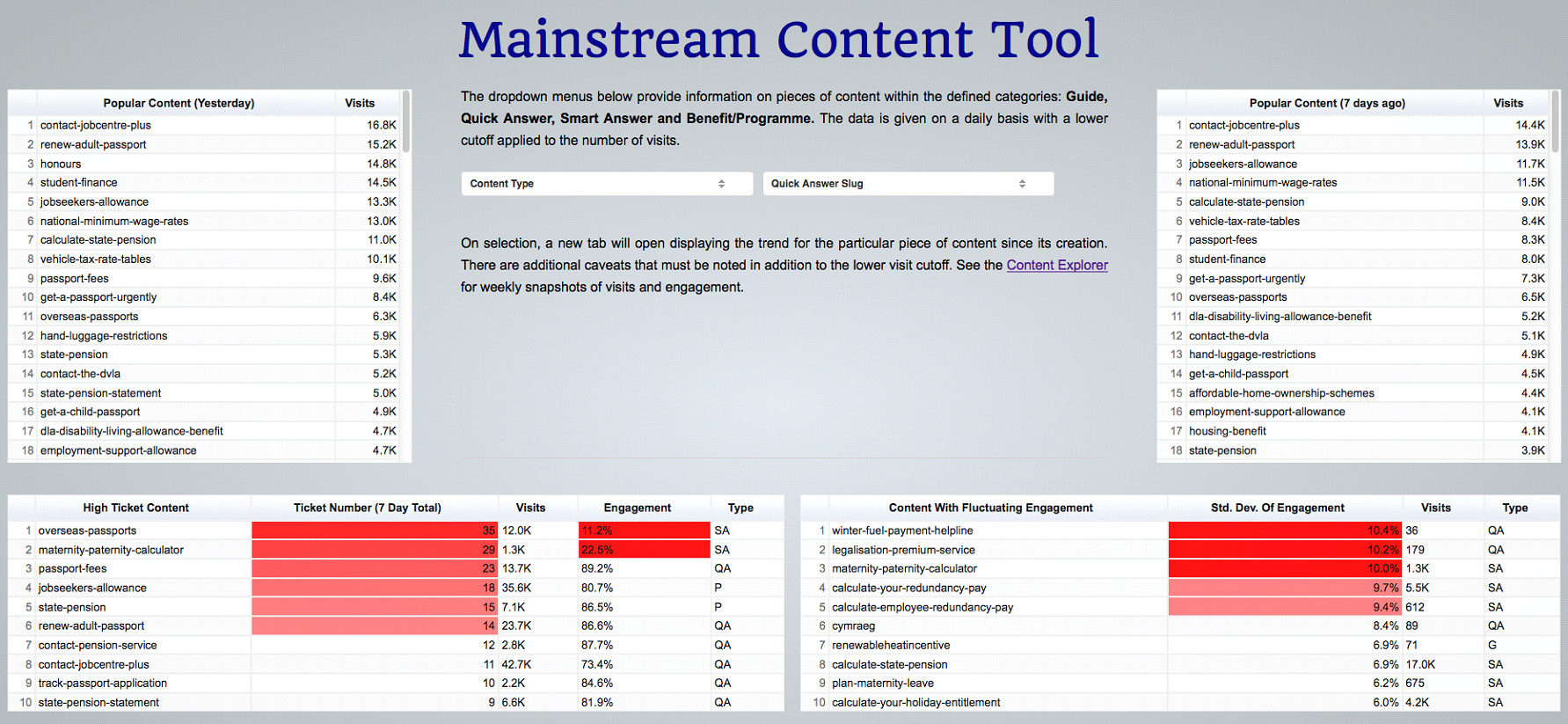
With this in mind, I created an internal dashboard primarily focused on the needs of product managers and content designers here in GDS. These people need to have access to up-to-date information on specific pages and want alerts if there are technical difficulties or missing, conflicting or even ambiguous information contained within particular pages.
The front page highlights the most popular content from the previous day compared with the same day in the previous week. There are also tables displaying the content with the highest number of issues (logged via the ‘Is there anything wrong with this page?’ link at the bottom of every page) and content whose engagement levels have changed the most over the past seven days.
These are both important metrics and they provide us with a daily update on approximately 600 unique pieces of content on GOV.UK. More importantly, this one dashboard isolates problem pages in a more sophisticated manner than just looking at average engagement.
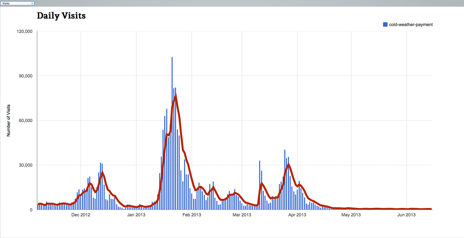
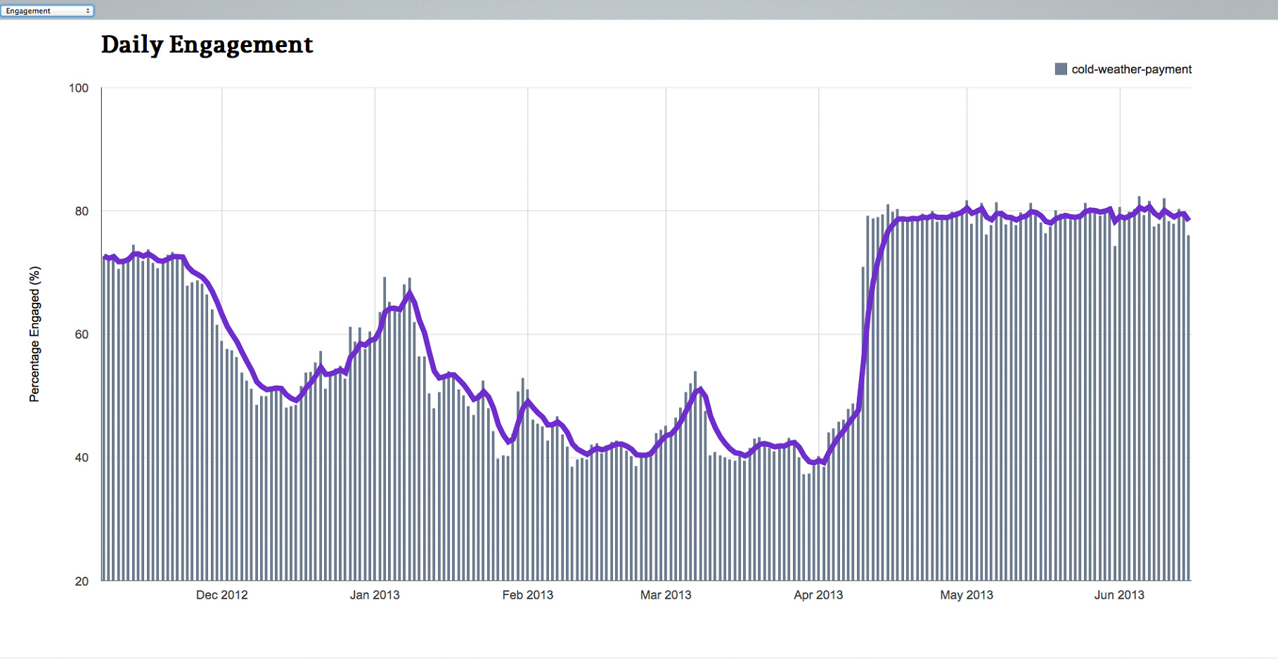
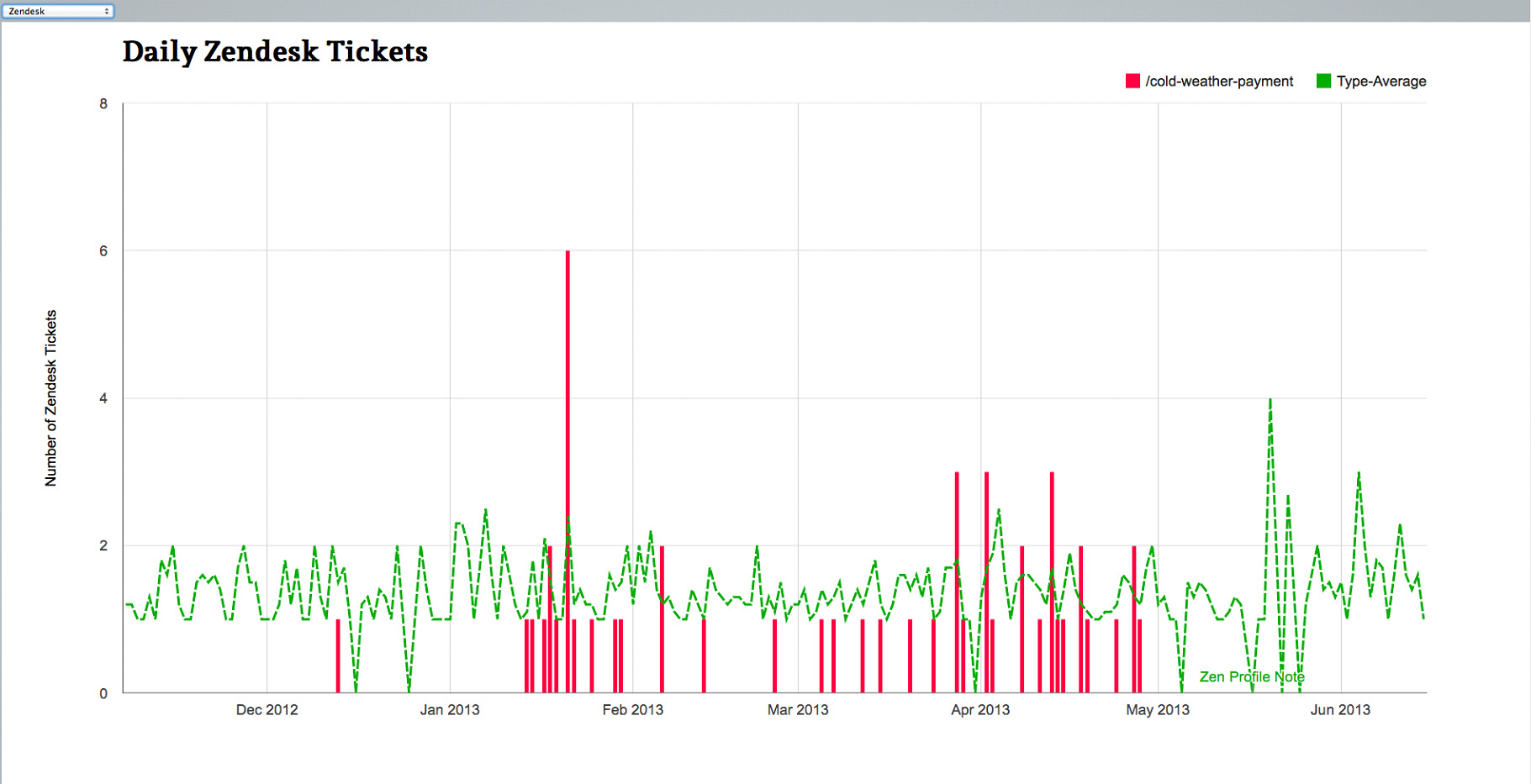
Dropdown menus allow users to home in on interesting pages (or just any page they’re interested in) and look at their historical performance. Users can easily access trends for:
- visits
- engagement
- support tickets (users’ comments on page issues)
- page update history
- performance comparisons between items in the same format
Using this tool, the GOV.UK editors are able to quickly gather and review all the information they need to improve content using specific user feedback as well as inferences drawn from figures on user engagement.
The tool will be extended to cover the departmental content on GOV.UK in the coming weeks. At the moment it's an internal prototype, but we hope to link it to the Performance Platform and make it publicly available later in the year.
In my next post I will talk a bit more about the tools I used to build this dashboard and the reasoning behind presenting data in a dynamic way.


6 comments
Comment by How to use analytics to test a hypothesis: Universal Credit case study | Inside GOV.UK posted on
[…] always looking at the data to see how our content is performing. The tools we’ve built show us trends and changes in usage – but what happens when we want to dig a bit […]
Comment by Matt posted on
Do you have any examples of data analytics currently being used in government? Programmes where large datasets are not only being presented more readily, but where modelling can be performed?
Comment by Daniel Collins posted on
Hi Matt,
Data analytics/analysis is being performed daily across numerous government departments. My post is concerned primarily with our web analytics source as this is well-established and produces considerable volumes of data. Regarding the visibility of large datasets, I would recommend looking at data.gov.uk and the Open Data Institute however these are primarily concerned with making the raw data available (not analysis/modelling).
In future posts, I hope to promote such work whether it is done by myself or elsewhere in Government.
Comment by Jim posted on
Very interesting stuff! This tool looks really powerful and useful. Looking forward to the next post.
Metrics! 🙂
Comment by Shaona Mukherjee posted on
It's amazing to see the power of data science! Being in the online marketing domain this tool can be of great use.
Comment by wtpayne posted on
Good stuff. Keep it coming. 🙂