Today we’re releasing an updated version of our Performance Platform dashboard, the tool that shows analytics data about how GOV.UK is being used.
Today’s updates focus on improving the usability and readability, building on prototypes that were built through the summer, and I want to tell you a bit more about why we’ve made them.
Provide the right level of detail

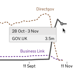
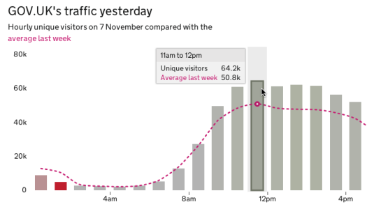
With today’s release, we’re introducing interactive hover overlays that allow a user to inspect the the data behind the graphs. These allow you to get the numbers being shown, rather than approximating from the scale.
The hovers are important for us to enable our Design Principle #4: Do the hard work to make it simple. We’re designing our graphs to be simple, clear and concise; we’re avoiding ‘chartjunk’ that invades so many graphs. Having hovers allows us to achieve this, yet still provide the detail when you need it.

There’s another bonus to having these hovers - they encourage people to interact and actually explore the data. See something interesting in one of the graphs? Hover over it to find out more.
We’re hoping this will help people start to get a ‘feel’ for the data and thus a deeper understanding of what it describes. For future iterations we’re looking at ways of layering additional contextual information about why something might be interesting.
Label the data, not the chart
For our graphs, we’re labelling the data itself, rather than relying on a legend. We think this is the right way for us to approach making data accessible to a wide audience because the direct labeling is easier to read and has a closer relationship to the data it represents. Using the same colour for labels and hovers as the data means that the relationship to the data is further strengthened.
Getting the raw data
For the technically minded, you can get the source data we’re using to draw the graphs as json.
The feeds are here:
- headline narrative text
- yesterday’s hourly traffic and comparison average
- weekly visits to GOV.UK, Direct Gov and Businesslink
- weekly unique visitors to GOV.UK, Direct Gov and Businesslink
format success metrics(renamed content engagement)- content engagement metrics
(Note on these urls: these are the internal urls we use, and are subject to change. 'Format success' 'Content engagement' in particular is an evolving concept, and our 'success' 'engagement' criteria for this may be updated as we learn more about actual usage.)
Besides these raw feeds, we’ll look to providing a more accessible output of our source data soon.
Feedback
We’ve already had some great feedback on the dashboard, which we’re listening and responding to. Since launching GOV.UK we've had a large amount of web analytics data, which we’re interrogating in order to surface the most useful information.
We’re rapidly iterating on what we have, focusing on better mobile support, and giving easier access to data. We are also preparing some new stuff to go along side the launch of Inside Government. Using the d3.js library we can produce some really interesting visualisations, which will help our users better explore the data, and these hovers are just the first step.
We’d love any feedback you have on what we’ve done so far. You can also follow our twitter account @gds_datashark
---
Updated 19 December 2012: 'Format success' module was renamed to 'content engagement'. Blog post updated to reflect this and give correct url.


8 comments
Comment by The Race to the F1 2012 Drivers’ Championship – Initial Sketch « OUseful.Info, the blog… posted on
[...] and maybe pushing all but ALO and VET into the background? (GDS do some nice work in this vein, eg Updating the GOV.UK Performance Dashboard; this StoryTellingWithData post on stacked bar charts also has some great ideas about how to make [...]
Comment by Open Webstats from GovUK « OUseful.Info, the blog… posted on
[...] up, the Government Digital Service/@gdsteam posted on their Updat[ed] GOV.UK Performance Dashboard, which you can find: Performance Platform [...]
Comment by David Read posted on
Any ideas why you have 15% less visitors than Business Link and Directgov had?
Comment by Peter Jordan (@peterbjordan) posted on
We are analysing trends at the moment. But we know there is a seasonal effect that visit numbers start to drop off in the autumn. If we compare GOV.UK against Directgov and Businesslink for the equivalent period last year, GOV.UK is higher.
We're looking at other factors - like traffic from search.
Comment by David Read posted on
Where is the source code for this?
Comment by Rob Young posted on
Hi David,
It's all on github. The frontend code is here (https://github.com/alphagov/datainsight-frontend). For the various other components that pull the data together your best bet is to go to the alphagov github organisation page (https://github.com/alphagov) and search for 'datainsight'.
If you have any questions or comments please feel free to reply here or, even better, raise an issue on the relevant github project.
Comment by David Read posted on
Great, thanks Rob
Comment by Ed Horsford posted on
Hi Malcolm,
It sounds like your computer doesn't know what to do with json files. The file is text, so should open fine with any text editor.