Following the successful release of GOV.UK a couple of weeks ago, I wanted to share some of the work we've done to support users on mobile devices (smartphones and any other portable devices with a modern web browser).
It's a pretty detailed look at the approaches we've taken, and what we learnt along the way.
Overview
In his post about designing GOV.UK, Ben Terrett said that
‘Government websites are needs driven and what people want to do is get in, get what they want and then get out. Quickly.’
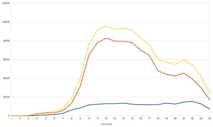
This is even more the case for users on mobile devices. As this graph of the day’s visits to www.gov.uk at launch shows, mobile devices are always available and always being used. (Mobile visits in blue, desktop in red with total visits in yellow.)
Source: Google Analytics
This presents an amazing opportunity for government services to answer a need at the same time or place it happens.
The approach myself and Alex Torrance took to mobile is really to make sure the design decisions made so far carry across intact when accessed this way.
In order to achieve this we aimed to:
- Keep what’s there as much as possible (do less)
- Make sure content is arranged to best fit the device
- Maintain the order of importance so the most important content is seen first
- Only make functional changes that solve a problem the device introduces to existing interactions
Responsive design
When the Beta was launched in January we took the decision to use responsive design for mobile support. This means there is no separate website for mobile users: everyone uses the same site that ‘responds’ to displaying on different size screens and devices through extra CSS (and some JavaScript).
A quick note on the last point: all the text in our CSS and JS is compressed and the files gzipped meaning the actual increase in file size this results in is minimal (currently around 6KB or 5%).
It also means each page on the site will only exist once and, importantly, on one URL. It’s important users can use the same URLs to access the site anywhere without the experience being inhibited or degraded by the device they use.
Ben Welby wrote recently about the growth of smartphone users in his post on the devices we supported at launch. Judged purely by the usage data from Directgov and Businesslink it was clear the mobile devices used were dominated by smartphones.
Directgov had about 10% of their access from mobile and since the GOV.UK launch this has only increased:
Figures from the first week (October 17th - 24th):
| Visits | Percentage of total visits | |
| Non-mobile | 5,658,644 | 75% |
| Mobile | 1,433,461 | 25% |
Source: Google Analytics
Designing on mobile
When looking at how to approach designing for mobile and tablets we tried not to focus on resolution, designing instead for physical size and use.
Screen size
Screen size is not the same as resolution. Retina displays are just the start of the confusion that surrounds this subject, with a wide range of resolutions and screen sizes existing across mobiles and tablets. What’s really important to ask is how physically big the screen is first. From there we can start to look at how to use that space.
Device usage
Mobiles and tablets are held while being used. With mobiles a common use is to hold the phone and use the touchscreen with the same hand, the thumb touching and scrolling the view.
Small changes can make a big difference here, for example ensuring important touch targets span the width of the screen, making them accessible by thumb from both sides.
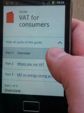
Fingers (and thumbs) are larger than the cursor on a desktop computer. Mobiles can detect the area we intend to touch to a fine detail but it is still important to give touch targets enough space to be both obvious and distinct from their surroundings.
There has been lots of excellent research done on this area, as collated in this article by Luke Wroblewski from his Mobile first book.
The benefits of accessible pages
When considering the extra requirements users of different devices have we found a lot in common with work already done on accessibility.
Both mobiles and tablets can be used so that the distance between the screen and the user’s eye is changing all the time and the screen is viewed in a variety of lighting conditions. Motor skills can be stretched by asking us to perform precise touch interactions and cognitive abilities tested by busy environments having an effect on our reading ability.
GOV.UK was designed from the off with clear, uncluttered pages and typography that reads well from varying distances. Links and buttons are clearly marked and given size and space.
The design principles include guidelines on controlling the order of information so the most important part is the first thing you see while more complex concepts are broken down into simpler parts.
The original design already considered the effect of varying disabilities on access to the content. Because of this, most of the work we did for mobile devices centred around making sure this work carried across and was allowed to be as effective.
Set breakpoints at the limits of designs, not resolutions
This is important and ties into our intention to change as little as possible.
Breakpoints in responsive design are traditionally the defined measurements at which pages will switch from one format of display to another.
Assigning breakpoints between set page sizes only makes sense if your designs are static. We design in the browser, meaning those designs are built to be more fluid in how they occupy the space given.
Despite this every part of our pages is, like anything, designed to work within certain limits. When these limits are passed and the part no longer fits the space it occupies, we need a new design.
For example our guides pages have three columns: a main one to hold the document’s core content and two others to hold associated navigation within the format and other related links.
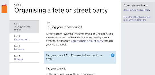
This makes sense when you have a lot of screen width but what made content in the main column readable stops working when that column’s width drops below a certain amount. This was most obvious on tablets so when viewed on these types of screen we move the right-hand module to below the main column which gives it the room it needs.
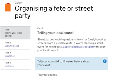
Notice how the main column and that for the left-hand navigation both stayed within the boundaries they were designed for and so were left alone.
Likewise when you get to mobile dimensions we move the left-hand navigation into the main column and use JavaScript to control the vertical space it occupies.
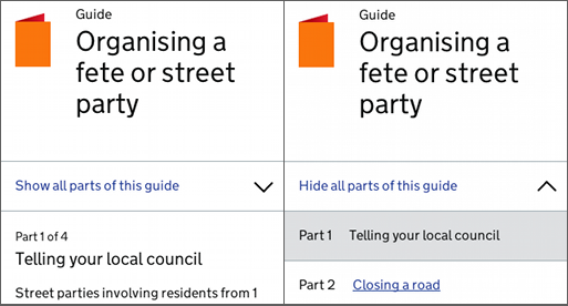
In this context showing the navigation was shifted into the main column and so was no longer able to work inside its original limits which is why a new design was implemented.
The text size is also lowered to make sure the ratio of words to screen size is retained.
Progressive enhancement
Web designers have used ‘progressive enhancement’ on desktop sites for some time to deliver the best experience to all and ensure whatever capabilities your browser has, the content is always available.
We wanted the same benefits and so built this approach into how we apply responsive design to the pages.
First we write CSS inside media queries to arrange content more appropriately. Where required, we then apply JavaScript to change the structure of the pages and on occasion add extra functionality. For example the search box at the top of the page has some JavaScript applied to hide it until needed, to save vertical space.

So the site can appear in 3 different ways:
- Desktop view
- Mobile CSS view
- Mobile CSS view with JavaScript enhancements
At each point the page content is available, all that changes is how optimised it becomes.
This has already proved to be important as we found an issue with some collapsible tabs on an earlier version of Android meaning the mobile CSS version worked but the tabs were all shown instead of being able to be toggled on or off.
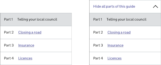
The issue has since been fixed but in the meantime the page was still usable and its styling optimised for mobile screens. This means if a device is failing to render the site as it should this won’t be disastrous and importantly won’t stop users getting what they need.
Only optimise when it adds something
Smartphones and tablets are perfectly capable of displaying web pages as you would see on a desktop computer. Responsive design is not a fix for this but rather an alternative to the default of interacting with a desktop format of the page through dragging and zooming in and out.
Responsive optimisations are only applied when it is proven they will be a better alternative to the above.
A good example is our https://www.gov.uk/trade-tariff app. The app receives far fewer visits than the average from users on mobile (around 1.99%) and those visits occur almost entirely during work hours (9am - 5pm). This shows what was commonly known; that the trade tariff (outside of our making it into an app) has always been a resource used as part of a work process that happens in an office, on a desktop computer.
Because of this we serve users the full desktop format on all platforms.
Keep iterating
The devices we are currently testing against are listed in this blog post, but we are well aware how quickly they will be surpassed by newer models.
The amount and variety of mobile devices is only increasing and with it so will the needs of our users but this way of working enables us to change along with it.
So, we'll continue to monitor how the site is being accessed and used. However it changes, we will ensure this access is never limited by the choice of device and that our designs make the most use of the method of display.


2 comments
Comment by gardenerfrank posted on
Nice blog. As a UX working on another Government website redesign I do wish I'd had the freedom to do some of this. When you work in a Waterfall environment as I do with Project Managers seeming to multiple by the week you don't get the chance to implement these ideas in full. I asked for a workshop to be organised - I got a conference! I ask for access to content development - I got none.
It's worth saying to any web team about to embark on a Government project to get these UCD design principles in front of stakeholders as soon as poss - selling it's benefits and asking for the web team to drive the project and not the business. We are run by stakeholders with little or no experience of web projects and the resulting progress has been very slow, piecemeal and at times dangerously wrong (four weeks to beg the client not to include IE6 in the targeted browser list and grand UI design ambition without the content to justify their inclusion)....and so on.
Sell UCD and a more agile means to work. Going strictly Waterfall is like trying to run through glue and is so ill-suited to web design in all its forms.
Comment by Hoover posted on
Well that was clever. I just opened .gov.uk on whatever is the native browser on a Galaxy SII, and it automatically opened Opera instead. I presume that's intentional?