In the past couple of months, we’ve been making it easier to browse the site. I’m going to cover a bit of what we’ve done to improve things and tell you a little bit about why it's changed. Since early on in our beta, we’ve had a breadcrumb-like navigation indicating what “category” the content you are viewing is in. We created this to help people landing deep into GOV.UK from, say, Google, to understand the full scope of the site. But this wasn’t a breadcrumb navigation in the way it is widely understood on the web; it was there just as an indicator, rather than being meant as navigation.
Learn from observing users
Once we started user testing the navigation, we realised we were probably being too radical, pulling out ahead of users’ understanding a little too far. We needed to turn our “breadcrumb trail” into a more traditional design pattern - revealing the category and sub-category that a piece of content lives within.  When either of those links are followed, a user lands on a page listing everything that also lives within that category or sub-category. This means they can effectively “zoom in” and “zoom out” of the site, helping to orientate themselves and find alternatives to the content they are already on if they land somewhere in GOV.UK that doesn’t answer their immediate need. We learnt about the dangers of not supporting a browse experience from the alpha prototype of GOV.UK, where number 3 of our Top 10 Problems via user feedback was “No browse navigation”. Once we tested our assumptions about search and the homepage against users it was clear we had to iterate towards something better with browse too. I think we have achieved that, although we will of course be reviewing how successful they are and making further improvements when we see they are needed.
The 'related' box
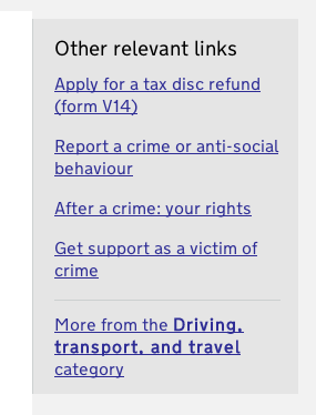
We’ve had the 'related links' box almost since day one. We find in user testing that participants are continually drawn to it, which is a good sign, as it is also there to assist their orientation and journeys around the site. But its greatest strength is also its weakness - it has to support several types of user journey:
- A user has landed on a piece of content, and from scanning the title and the content, they realise they are in the wrong place - the related box provides links to similar content, one of these is likely to be what they need
- A user has finished with a piece of content, but they have a further need to access more content in a similar subject area. For example, a tool to help them find out if they are entitled to the benefit they have just researched
- A user has finished with a piece of content, and they now understand that their need is more sophisticated than that particular content provided for. They now need to “dig deeper” into government information on their topic. For example, they are an industry professional who needs regulatory information
These could all be classed as onward journeys, and therefore it lives over to the right of the content, implying this moving on from where a user currently is. It's also why we've changed its name. 'Other relevant links' feels like a more accurate description of what users are seeing in the box (although if you've seen any good alternatives elsewhere on the web, let us know).  We’ve found users see, understand, and use the links - and it appears to be genuinely helpful - but we are keen to improve it further in the future to support these varied user journeys. In fact we’ve tried continually to reinvent the box over the past few months but so far none of our alternative ideas have convinced us as much as the current solution to take them as far as user testing.
Reality bites
We’ve done a lot of testing with users with all sorts of requirements and backgrounds and they’ve informed a lot of iteration of features, but until we have data from millions of people using what we’ve built we won’t truly know what works and what needs improving. All that starts on 17 October. Everyone in the UK has a differing range of requirements from the government, a vast range of confidence and ability when using the web, and all access the web across an ever-growing range of devices. We have a duty to support all of this and so we will continue to iterate as and when we identify how we can do better. Onwards!


7 comments
Comment by Ben Brundell posted on
I have to ask...I know you have discounted meaningless icons, but did you feel any need to add imagery (icons or photos) to the category pages?
Comment by One size does not fit all | Government Digital Service posted on
[...] example, we couldn’t have gotten the new browse pages for GOV.UK released on time if we hadn’t worked together. Myself and Jamie Cobbett [...]
Comment by Nathan Wall posted on
The latest iteration of your design looks great. I'm wondering though if you've done any research on how users find their way through the new grid layout on the topic page.
I've done similar designs on other sites in the past and found that 50% of users will read across each row, and 50% will read down each column. Your design is subtle, even though the heading for each section is quite prominent, there is nothing to guide a user's eye to suggest how the page should be scanned.
I also totally agree with your thinking around the "Related box" we're going to facing very similar issues. Being able to orientate themselves quickly definitely adds to a user's perception of trust and usefulness and gives them a reason to come back to the site.
Good luck for 17 October, your team has done an amazing job. Keep the insights coming, we're only just starting our journey here in New Zealand.
Comment by Etienne Pollard posted on
Interesting point - we expect to make changes to the browse pages once we get enough data on how real people use them, and we'll definitely blog about that when we do it.
Comment by jgulian posted on
In New Zealand we’re planning to redevelop our newzealand.govt.nz website, and we’re having a lot of the same conversations around navigation that you’re discussing here. These things are universal. We’re watching your work closely and really appreciate the open discussion of the issues. Best of luck on 17 October!
Comment by Jared @ NZ Govt Web Toolkit posted on
In New Zealand we’re planning to redevelop our newzealand.govt.nz website, and we’re having a lot of the same conversations around navigation that you’re discussing here. These things are universal. We’re watching your work closely and really appreciate the open discussion of the issues. Best of luck on 17 October!
Comment by Etienne Pollard posted on
Thanks Jared! I've been looking at your web toolkit and would love to chat about how you've approached that - although perhaps after next week! Could you drop me a line at etienne.pollard@digital.cabinet-office.gov.uk?