Last summer, Max Gadney and Matt Biddulph briefly joined the GDS team to bring their experience and insight to an early stage product for measuring the performance of digital public services. Max explains how they developed a prototype to demonstrate the potential of visual data.
Our Brief
Richard Sargeant, Director of Performance & Delivery at GDS, asked us to create a prototype for how we might use data to improve public services.
His number one goal was to initially show how GOV.UK usage data could represent success or failure in a way that prompted people to take action.
We were asked to address immediate design decisions ahead of version 1.0 but also to look ahead to future iterations. We were to use real departmental data (predominatly from GOV.UK) in Matt’s path-finding and my visual prototyping.
Our methods - Users, Data and Pathfinding
In order to design anything you need to understand it's parameters - its users, materials, context etc.
Users
Understanding what the users require is key to developing any software - our aim here was to avoid making any assumptions about what to present, and to ensure our solutions were based on solid evidence and an understanding of definite user needs.
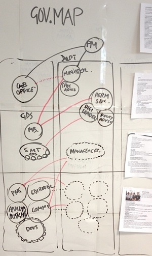
We worked with the data analysts to understand the different roles within the departmental hierarchy and their needs of the data. We constructed a rough 'organisational mapping' showing key information routes and customers. At each node were key types of people, such as 'analysts' or ‘ministerial advisers', and made personas of them, concentrating as much on what they need as how they share and act on it.
It became very apparent to us that senior people in the team need clear, concise insights which need little explanation, and it was only the analytics team or product owners that regularly needed the extra layers of detail and functionality.
Data
We needed to understand the data we were working with, including questions like:
- how far back did it go?
- which departments owned what kind of data?
- what time intervals existed across the various data sets?
Crucially, we needed to understand which data sets were required to answer the questions being asked by the main user groups.
We listed all the data we had and created a taxonomy of internal, external reporting needs. This went some way to showing what the common elements were as well as where we would need new types of data.
The first thing we did with any source of data was to extract a representative but manageable sample of the full dataset. We'd then iterate on this sample, creating designs in Illustrator and translating as faithfully as possible into live code. Once we had something plausible, we'd take it back to the owners of the data as soon as possible for feedback.
We wanted to start working with live code as quickly as possible. After checking requirements for browser support we decided to use the excellent Javascript library D3 ("Data Driven Documents" - http://d3js.org/) to create client-side visualisations using SVG. The use of the vector-based SVG standard for graphics, now supported by the current version of all major browsers, allowed us to create visualisations that take full advantage of the maximum resolution of screen, mobile devices and print.
We created visual screens, working code and design instructions for v1.0, our 'minimum viable product’.
Product Summary
Below is an overview of what we produced for version one.
a) User-relevant Hierarchy
We based the main structure of pages on the different levels in the organization and their differing needs of detail.
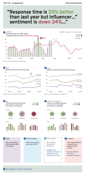
Simple headline messages at the top of the page, which can also be used on large screen displays, with more detail as the user scrolls down.
Horizontal navigation between pages, or dashboards, allowing users to view different sets of information.
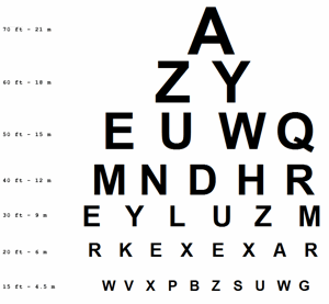
This design approach was loosely based on the optician eye-test chart - where everyone can read the letters at the top but the information becomes more complex and requires more time to decipher as you move lower down the page.
b) At a Glance information
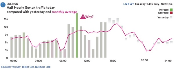
Our main goal was to enable action from this product. We wanted the visualisations to only really shout out when there was something to say so we decided that most data display should be neutral (grey) and only go green (good) or red (bad) when something was particularly noteworthy and stood out from the norm.
We also removed any elements which were at all possible to remove without detracting from the usefulness of the graph such as axis lines and markers.
Matt wrote some code that increased the colour the further away from the baseline we got . The result is data display that differs from the visual cacophony of many business intelligence tools where reds and greens compete for attention.
c) Enabling the analytics team - Social Design
Social Design takes the relationships and workflows of users into account. The key ‘insight enablers’ in this team are the analysts and we wanted to add their voice to the product and connect them to the end users through the product.
The 'why’ and ‘what' labels do this - echoing questions the users have about this data.

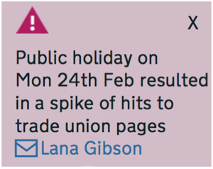
We demonstrated how some of these annotations could be automated by calculating significant deviations from the data set. We help users quickly spot the most interesting points on the graph and help them satisfy their curiosity about the data.
The 'i' button also contains functionality that prolongs the life of the data and the learning journey of the users - here we have features that allow them to further publish, interrogate and talk about the findings.
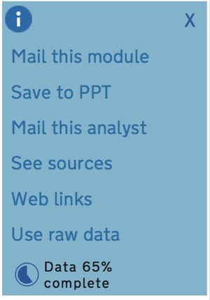
This social design approach encourages people to get the best out of their analytics department - and the data insight platform as a whole frees them up to have the conversations they should be having.
d) Modular design
The Data insight Platform is a collection of dashboards. These dashboard pages do not need to be too crowded as each user would have just the ones they needed. The pages consist of data modules from a library, each with the most appropriate visualisation for the data.
Working with GDS
The team at GDS are focussed on building a product management culture, using agile delivery techniques, developing code in short sprints, providing demos to the whole team, and regularly releasing new code, all backed up with frequent user testing and data analysis.
We developed our ideas, designs and code within the same environment which means this is not a prototype that will remain on the shelf.
The end results of our work have already been handed over to the Data Insight development team who are building our designs and ideas into the first release of the product coming later this year.
Initially the product will provide some basic insights into the performance of GOV.UK, but in the coming months the team will be releasing new modules and dashboards as the variety of data sources and transactional services that use the data insight platform increases.

8 comments
Comment by Jonathan Baker-Bates (@gilgongo) posted on
Interesting stuff!
The choice of a daily chart in the screenshot of Dashboard version 1.0 is interesting. Are people able to get much value from a daily view? I would have thought at least monthly would be better, since daily movements (unless traffic is very low) tend to be nearly random, no?
This also reminds me of a problem I've had in the past: that all web traffic charts looks the same. The basic "anatomy" of an individual site's chart is also pretty stable over time. This means that you get "desensitised" to the traffic chart, because it looks the same every day you see it. It also suffers because in looking at it, you have to control for the fact that hardly anyone views the site on Saturday night, for example. That information is just noise because it's not going to change in a hurry. This makes me think there must be a better of way of representing traffic such that casual viewers can spot things that are significantly out of bounds, or make useful comparisons.
Very interesting too that you built in expert commentary. Do you have any plans to allow viewers to ask questions about specific things they see on the dashboard? Having a "back channel" like that would be really useful in fine-tuning both the design of the dashboard and the commentary within it.
Oh, and one more random thing: the (rather huge) top panel with the textual info about response time - would that not be better served with the addition of a target indication (eg "+5% above target" rather than just "20% better")? I would have just used a bullet chart for that and displayed more data in the remaining space.
But big props for sharing all this!
Comment by James Thornett posted on
Hi Jonathan,
You'll see from the beta version of the platform which is now live at https://www.gov.uk/performance/dashboard that we are not using response time as a metric at the moment. This was used merely to illustrate the design idea in the images on this blog post.
You are of course correct that a daily view does not change considerably from day-to-day although the idea that changes might be 'random' is one that we are very keen to test.
For example, we saw a huge spike in hourly traffic to GOV.UK in the late hours of Saturday 27th October with people using the internet to confirm the UK time change from BST to GMT.
We are interested to see if other seasonal factors or events in the news have an impact on the usage of GOV.UK from day to day.
Thanks for your suggestions on new features. We are definitely thinking about how we could enable users to ask questions of the data and uncover more that is of specific interest to them.
Hopefully you'll see these and more new features coming soon!
James
Comment by Updating the GOV.UK Performance Dashboard | Government Digital Service posted on
[...] updates focus on improving the usability and readability, building on prototypes that were built through the summer, and I want to tell you a bit more about why we’ve made [...]
Comment by How is GOV.UK performing? | Government Digital Service posted on
[...] on the prototyping work we did in the summer we are starting with one dashboard containing five modules of [...]
Comment by After the flood » Government Digital Service – Dashboard tool posted on
[...] is a full write up on the GDS blog of our recent work with them and I have added a few more reflections and some more examples below [...]
Comment by David posted on
For me, one of the leaders in the field of visual data representation is Jer Thorpe - blprnt.com - I find his work particularly impressive with real world examples of how data visualisation can be used.
Comment by andeggs (@andeggs) posted on
Will this be open sourced?
Comment by Rob Young posted on
The frontend part of the application (where the charts are rendered) is currently open source you can check it out on github (https://github.com/alphagov/datainsight-frontend). The data collection parts are currently not but they will be. Is there a specific aspect you're interested in?