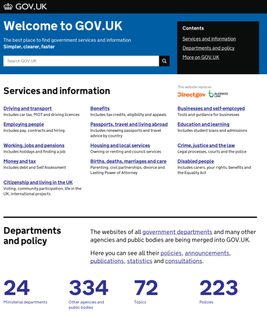
We introduced a new version of the GOV.UK homepage a few weeks ago, and since then we’ve collected lots of data about what’s working and what improvements we can make.
We thought we’d share some of the headlines here. You can find the full analysis over on the Inside GOV.UK blog, the best place to follow what’s going on behind the scenes of GOV.UK.

Use of search has climbed
We wanted to increase the number of people using our improved search, and the redesign has been successful on that front.
Comparing the full week after the new homepage design release with the week before, we saw 40% more searches from the homepage, with weekly searches rising from 82,000 to 115,000. Some 19% of visits to the homepage led to a site search from there after the redesign, compared to 13% in the week before.
More people are looking at departments and policy
The most significant design change is the new area in the middle of the page called ‘departments and policy’. We wanted to increase the number of visitors to more specialist - but still important - parts of the site.
While visitors to the homepage generally follow popular links to Services and information (what we used to refer to as ‘mainstream’ content), the 21st to 40th most visited links from the homepage show more interesting trends:

(Key: green = Up, red = Down, Yellow = No change)
The links promoted in the new Departments and policies box (what we used to call Inside Government) are now gaining more page views from the homepage, especially policies, worldwide and topics.
Of course, the number of visits to and from the homepage is impacted by many more variables than the design of the homepage, but on this first benchmark it looks like the redesign has been a success - leading to greater use of site search and more visits to important sections.
We'll keep iterating
We’ll continue to monitor the overall visits trend to the homepage and the popularity of links from the page. And we will be using analytics data to help inform work on improving category navigation.
If you want to stay up to date with that analysis - and the improvements - head over to the Inside GOV.UK blog at insidegovuk.blog.gov.uk


1 comment
Comment by Quango Girl posted on
If gov.uk's fit for purpose, why do you feel the need to close the Student Finance England website at http://www.sfengland.slc.co.uk?
This used to have a full Information Architecture before you made us take out the content and it went into far more depth than the gov.uk version. We can edit the content without waiting two weeks for sign-off; and the design and content meets the needs of students and their families.
If gov.uk presented meaningful, structured and current information to students, SF England would have died a natural death through lack of visits. You seem to be conceding that gov.uk can't do what a dedicated government website can do.