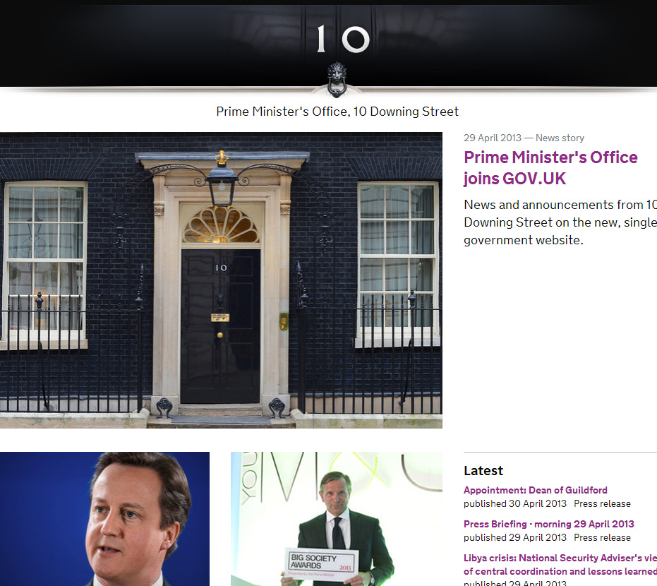
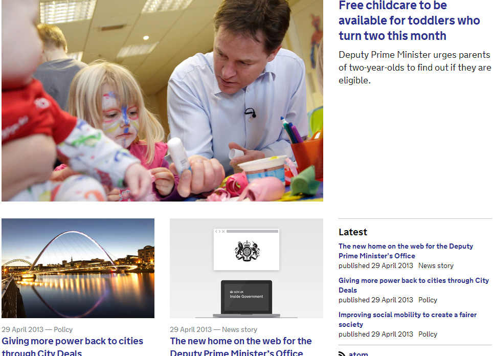
Today, the offices of the Prime Minister and Deputy Prime Minister join every ministerial department on the Inside Government section of GOV.UK. Anthony Simon, Downing Street’s head of digital communications explains more.
If you’re familiar with the format of ministerial departments in their new online home on Inside Government, then you’ll probably notice some differences in the way that content for the Prime Minister and Deputy Prime Minister is presented.
Number 10 performs a vital role in communicating news and information about the activity of the Prime Minister, which needs to be reflected online. But it must also acknowledge the rich history of 10 Downing Street, which boasts 275 years as the official residence of each of the UK’s 53 Prime Ministers.
The black door of 10 Downing Street, famous the world over, is perhaps one of the most iconic images of government. It was incorporated into the design for the outgoing Number 10 website and gave users instant recognition that they were entering the official website of the Prime Minister. You'll notice that this has been retained on GOV.UK, giving the user the same degree of recognition and gravitas.
As before, the user can still go behind the famous black door for a virtual tour of 10 Downing Street, or read historical articles and biographies about every Prime Minister in history. The recent death of Baroness Thatcher has served as a reminder, if one was needed, about the intense public interest into how our Prime Ministers have shaped the way the United Kingdom exists today and its place in the wider world.
The new web presence for the office of the Deputy Prime Minister continues to reflect its main priorities. These include City Deals, Childcare, Tax cuts and jobs. All this information is easy to access alongside details of the ongoing activities and announcements from the Deputy Prime Minister.
Even though the new content areas for the Prime Minister and Deputy Prime Minister do look somewhat different to other areas of Inside Government, you will notice a consistency with the GDS philosophy of putting the user’s need at the centre of everything they do. This means there are simple links from news stories to relevant topical and policy information from other government departments; designed to avoid confusing duplication. Content will also display correctly across a wide variety of devices, from smart phones to full-sized desktop computers.


2 comments
Comment by Matt Matthias posted on
I can understand why some might see the need to make the Number 10 page different but I think it's a nervous step towards departments dictating the standards rather than understanding the benefits of it being standardised. Number 10 may well have an history other departments don't have but is it fair to say that it's in some way 'better' or requires special treatment? I'm not sure. I just went to the pages and was unpleasantly surprised to see customisation. Furthermore why does the office of the Deputy Prime Minister have a special header? Surely this office doesn't have any special history or requirement for customisation, especially since the header looks like it was designed with little forethought for aesthetics (to put it nicely).
Comment by baragouiner posted on
The Prime Minister's page states:
"It is possible to email the Prime Minister’s Office using the link above. If, however, ... you wish to be assured of a direct response to your query it may be better to write to Number 10 using the postal address above. Responses to emails cannot, unfortunately, be guaranteed due to the volume received."
Are there any plans to review this approach in order to meet user needs?