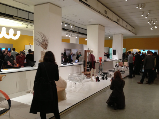
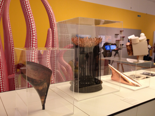
The Design Museum’s annual ‘Designs of the Year’ awards exhibition launched last week. As usual it’s an eclectic mix of architecture, fashion, digital, furniture, products, transport and graphics. Category winners and the overall winner will be decided by a jury and announced to the public on 17 April 2013.
Until July you can visit the show and look at the Shard, Thomas Heatherwick’s Olympic Cauldron, the Raspberry Pi, the dresses from Anna Karenina (which have already won an Oscar) and a table which costs £100,000. You can also see how your benefits might be affected by a change in circumstances, read the Dept of Health’s latest consultations, browse the Ministry of Defence’s latest news, discover how to set up a business or find out how government works.
That’s because we’re delighted to announce GOV.UK has been nominated in the digital category.
You can’t enter these awards; all the projects are nominated by a panel of experts. It’s a great honour to see the Civil Service recognised among such global design talent. A project on the scale of GOV.UK couldn’t happen without the collaboration of everyone across government and this nomination is really for all of us.
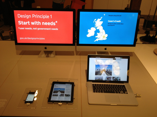
Websites in museums don’t really have a happy track record, but we still wanted to create something of the experience of actually using GOV.UK. So we created a few things I’d like to mention:
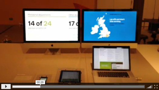
There’s a laptop set up in the museum, pointing at GOV.UK (so you can’t jump off anywhere naughty). We wanted to show that we’ve designed the site for use on many screen sizes, so we built a web app that mirrors exactly what you do on the laptop, on a tablet and on a phone. Tom Stuart who built this has written about the process here and of course the code is on GitHub. Although we made this for the exhibition we’re already thinking of other ways we could use it, given that it’s web-based. It could be a great way to demonstrate services to a large group for example.
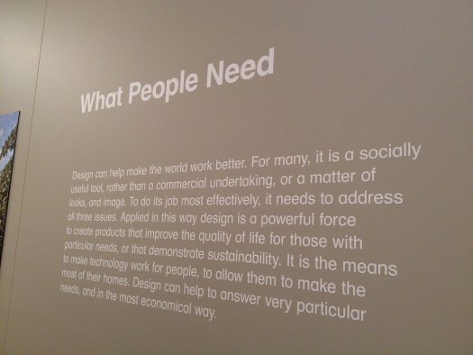
I’m pleased we were placed in the "What People Need" part of the exhibition. We wanted to show the basic things people are using GOV.UK for: jobs, benefits, schools, passports. So Edd Sowden made a map that shows which pages people are looking at on GOV.UK and where they are. That’s also on GitHub.
Tickets are available here and the show runs until 7th July.
Read more here:
Design Week
Dezeen
The Guardian
Creative Review
Images courtesy of Ben Terrett, licensed CC-BY-NC-ND on Flickr.
