Today we have released part 2 of the GOV.UK beta - INSIDE GOVERNMENT. You can see our other post today for more on what this is all about and why it matters. But here, we’re going to take a quick canter through some of the features and our thinking behind them.
The INSIDE GOVERNMENT name
If you’ve been following this blog, you’ll have heard us refer to this part of the GOV.UK project by its various internal project names of ‘Whitehall’ or the ‘corporate platform’. The public name we’ve settled on is INSIDE GOVERNMENT - we’re hoping it will let people know that they’re not in the main ‘citizen’ part of the site. This isn’t the place you come to renew your passport, this is the inner workings of government.
Responsive design
We’ve baked in responsive design from the start of this project, building the page layouts to a fluid grid which re-aligns the content for different display sizes. This means this site works - properly - on whatever size screen you use to access it be that a phone, tablet, computer or something else. (We’ve got a little bit of tidying up left to do to make this as good as it should be).
Department pages
On GOV.UK, all department homepages are presented in the same way, with the same navigation and common formats. This makes it simpler and clearer for users who might need to find information from or about multiple departments - they’ll no longer need to learn how those different sites work.
Policy definitions
We’ve also adopted a consistent and (we hope) relatively clear way to describe government policy. We think of it as ‘encylopedia-style’ and hope it will make policy more accessible for those who aren’t immersed in the intricacies of how government works. We’ve talked about the difficulties of doing this before.
For example, here’s how higher education policy is currently published on the BIS website.
And here is how it looks on GOV.UK. We hope you’ll agree it’s clearer and more accessible. It will also be kept more reliably up to date: links to all the news, speeches and publications that relate to each policy appear on the page automatically as they are added to the system.
Over time, we hope to make these policy definitions even clearer. Having a live website to point at will make it easier for us to develop this together with subject matter experts in departments.
Tags - topics, ministers and organisations
One of our principles is that people shouldn’t need to know how government works in order to make it work for them. If you’re looking for a policy or announcement, you shouldn’t need to know before you start which department or departments might be responsible for it.
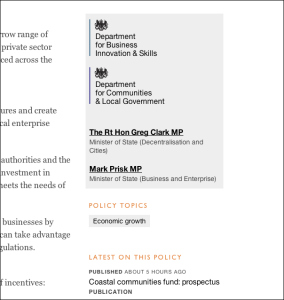
However, once you’ve found the content you need, it should be clear which ministers and organisations are responsible for it, to strengthen accountability and make it easy to find other relevant material. We’re achieving this by associating content closely to the people, topics and organisations it relates to, and showing those relationships wherever you are on the site. (We also hope it will gently educate people about how the government jigsaw fits together - they don’t have to know this stuff but it can’t hurt.)
In future, all this rich interconnected goodness will be available as open data so that other people can do interesting things with it.
The UK and the world
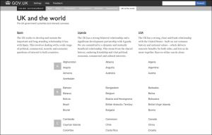
We’ve also created a space that gathers information about the UK government’s interests and policies relating to the rest of the world. This is a shared area where departments like the Foreign Office, Ministry of Defence and the Department for International Development will pool information about their work overseas.
Built just for government
Some of the stuff we’re proudest of is the stuff you won’t see. Under the bonnet, we’ve created a custom publishing engine properly tuned to the needs of multiple users and publishers across Whitehall, and built specifically for the kinds of things governments produce.

And we’ve modeled the system to respond quickly to Cabinet reshuffles, elections and machinery of government changes: updates to ministers and organisations can be applied across the site in the blink of an eye.
Smart features to help publishers
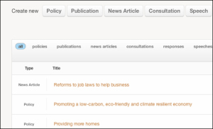
We’ve introduced features like our built-in fact-checking tool to make the process of producing content smoother.
We’ve tried to make the software as simple, flexible and intuitive as possible. Our users have been saying some pretty nice things about it (while pointing out lots of ways we can improve it too, of course).
Publishing speed
And it’s fast. We road tested our system by asking three people to publish the same page (including some formatted text, a table, some links and images) to GOV.UK, a WordPress blog and Directgov. On average, publishing to GOV.UK was 2.5 minutes faster than WordPress and 11 minutes faster than Directgov. We’ll be running more tests like these during the beta.
Evaluation and feedback
To find out whether INSIDE GOVERNMENT is achieving its intentions, we’ll be monitoring its performance throughout the beta.
Analytics will be collected to tell us about traffic and usage. Structured testing will be carried out with users both public and in government to help us understand whether we are meeting the standards of usability we aspire to. And, of course, we will seriously welcome feedback and commentary through the usual channels of email, social media and our GetSatisfaction account.
What do you think?
There’s lots more we could write about, but we’re far more interested in what you think of it. Please have a look around and give us your reaction.


9 comments
Comment by A quick tour of Inside Government | Government Digital Service posted on
[...] Inside Government – a few highlights [...]
Comment by Inside government – the DH website in the GOV.UK beta | Digital Health posted on
[...] INSIDE GOVERNMENT – a few highlights [...]
Comment by Considering the case against WYSIWYG | Digital by Default posted on
[...] Mike Nolan talked about and then more recently GDS talked a little about how they had built the INSIDE GOVERNMENT publishing tool and it sounded like a pretty similar idea of moving away from a generic, one size fits all editing [...]
Comment by After the watershed – five reasons why nothing can be the same since the launch of Gov.uk/government « BASIC CRAFT posted on
[...] best guide to the project and the site is Neil Williams, the gov.uk/government product manager. But before I lose you to him, you might spare me just a [...]
Comment by Neil Williams posted on
Spoken like a man who has been there!
We've measured what we can measure and legitimately compare, which is the software end of the process. But, as it happens, we are also doing things both within the software and in the editorial process to try to reduce the friction in creating and clearing content. For example, we've built functionality into the software to capture comments from subject matter experts on draft content, reducing the amount of to-ing and fro-ing that currently happens by email with ever-expanding copy lists. Anecdotally, this is already making a big difference to the web editors.
Comment by Paul Johnston posted on
Congratulations Neil. I commented on your earlier post and expressed some scepticism about the idea of trying to capture all of government policy in a simple and up-to-date way. Of course, trying to capture literally everything would be crazy, but what you have done looks great to me. It is simple, clear but really compelling. Very impressive.
Comment by alan mather posted on
Speed is a funny thing. You don't say how fast your publishing was, just that it was faster than the others. Trouble is, people don't write articles for government websites quickly, the approval chain doesn't let them through the gate quickly and so, being quick at the last gasp is a bit like walking a marathon and sprinting with 100m to go. It sure looks impressive but doesn't materially alter the end to end time.
Comment by What is inside INSIDE GOVERNMENT? #govuk « Digital by Default posted on
[...] me though the real interesting information came in a blogpost from Neil a little after the launch. Anyone who knows me knows I have issues with ‘content management systems’ and have [...]
Comment by Introducing the next phase of the GOV.UK beta | Government Digital Service posted on
[...] our separate blog post today for a tour of some of the [...]