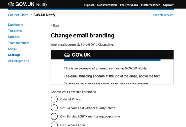
At GOV.UK Notify we currently have 7,000 live services. That’s 1,700 more than we had a year ago. The more users we have, the more important it is that they can do things without our intervention.
How we prioritised branding
Over the course of a year, we received 567 requests to change email branding. That’s roughly equivalent to 2 support tickets per working day.
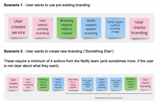
Adding branding on GOV.UK Notify used to be a fairly manual process. Services had to fill in a form that would open a support ticket, and we would work with them to update their branding. If we already had the right logo, we could apply it straight away. If not, we would ask for the logo, text and optional background colour.
This approach worked when Notify was small, but it didn’t scale well. It also had some other drawbacks: users had to wait to use their new branding, and they had no way to preview email branding before it was set. Once we changed it for them, a user would have to send themselves a test email to see the new branding in action.
We decided to make this process more self-service, to reduce the time and effort spent on support and to give our users a better experience.
Before
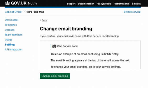
After
Doing the hard work to make it simple - one step at a time
This feature is a prime example of doing the hard work to make things easier for the users.
Although making the whole feature self-service was a very large and complex piece of work, we wanted to deliver improvements as soon as possible.
We tested some prototypes with users to refine our ideas, and drew up an action plan. We split the work into several stages, taking into consideration factors such as impact on the support team, complexity of the work, and also potential issues related to quality control for logos uploaded by users.
First, we built 2 new flows. One to let NHS services pick NHS branding by themselves, and another to let central government services pick GOV.UK branding.
Then, we created ‘branding pools’ - a set of approved branding options for each organisation. This allowed services to choose any branding from their organisation’s pool, as long as we have it on our system. This feature had the most moving parts, and it took us a while to build it all.
If we didn’t have a particular logo on our system, a service would still need to open a support ticket to ask us to add it. These are the most complex tickets to solve, because getting a logo in the right quality and aspect ratio can sometimes be quite a task. Also, the user only gets to see their new branding when we’ve already applied it. If they don’t like it, there’s more support work to do, and a longer wait for the service before they can use their new branding.
To improve this, we built a way to let users upload their own logos and preview their new branding. This was the trickiest problem to solve. We had to maintain a balance between empowering our users and maintaining some quality control. After all, poorly-branded notifications can damage recipients’ trust in government communications.
We settled on letting users upload and use their new branding straight away, while also keeping an eye on newly-added branding options to ensure they meet quality standards. To make this easy, our app sends a daily digest of new branding options to be reviewed by our team. We’re also happy to help if users need extra support when updating their branding.
Cross-discipline collaboration
Letting our users set their email branding by themselves required collaboration across all disciplines in our team. From designing the prototypes, testing them, and analysing the results together, to the many conversations to figure out how to solve some thornier problems along the way.
A lot of work went into interaction and content design, so that we could support our users in adding high quality branding. This includes guidance on writing helpful alt-text for logos. Our users can also preview their new branding embedded in a mock email or letter before they start using it.
We held a retro for the epic to ensure that we capture any learnings about how we work together, and bring them into our future projects.
Conclusion
Letting our users set their own branding took a lot of time and effort, but it was definitely the right thing to do. Especially as the number of services using Notify continues to grow.
Branding requests used to account for 8% of all support tickets. Processing an average of 2 branding requests a day took up a lot of our time. Now we can use that time to answer other support tickets, or work on developing more new features.
Try Notify now if you work in central government, local authority or the NHS. Or contact the team if you have any questions.
4 comments
Comment by Sam posted on
Thanks for this article, I particularly liked the information about "doing the hard work to make it simple".
Do you have any feedback from users following the changes?
Comment by The GDS Team posted on
Hi Sam,
Some early feedback from service teams suggests that users find the new process faster and more convenient. The team will monitor usage and feedback so that we can iterate this feature. If you've tried it and have any thoughts, please get in touch with the GOV.UK Notify team.
Thanks,
The GDS Team
Comment by Mike posted on
This is a useful article.
Could it be extended to show each of the individual customisation screens?
Comment by The GDS Team posted on
Hi Mike, thanks for reading.
If you'd like to get a better idea of how this works in practice you can set up a Notify account. You can see who can use Notify here. We've made the process of adding branding as simple and clear as possible for our users but if they have any trouble they can always raise a support ticket.
Thanks,
The GDS Team